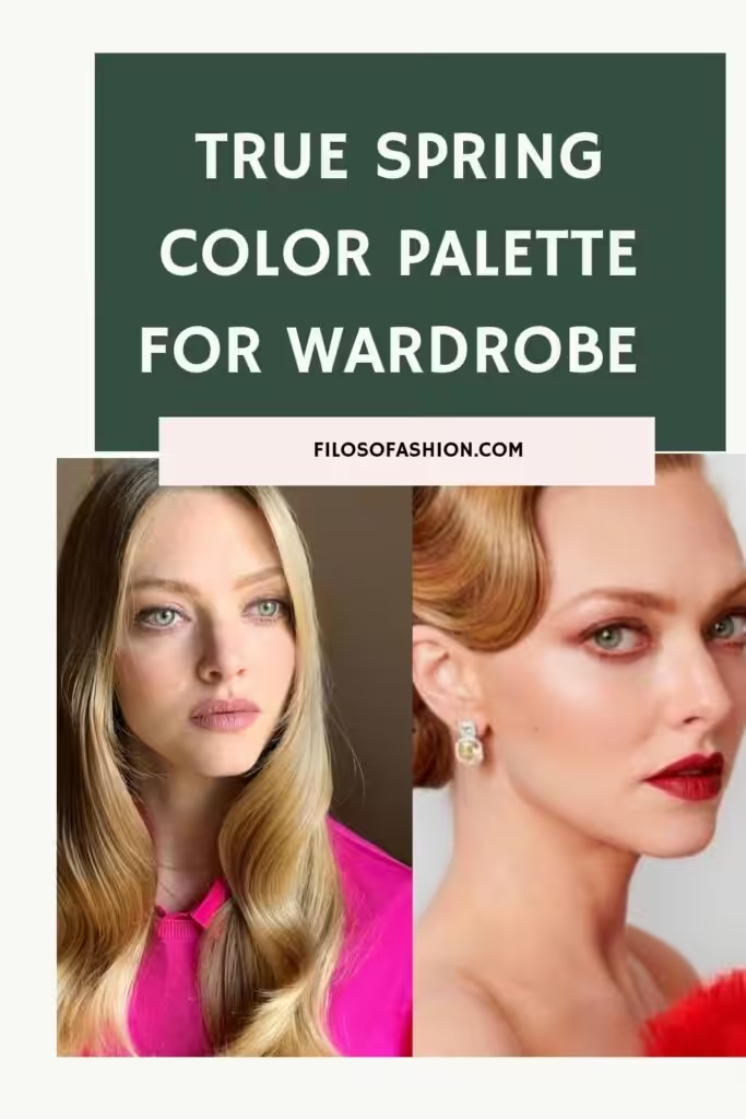
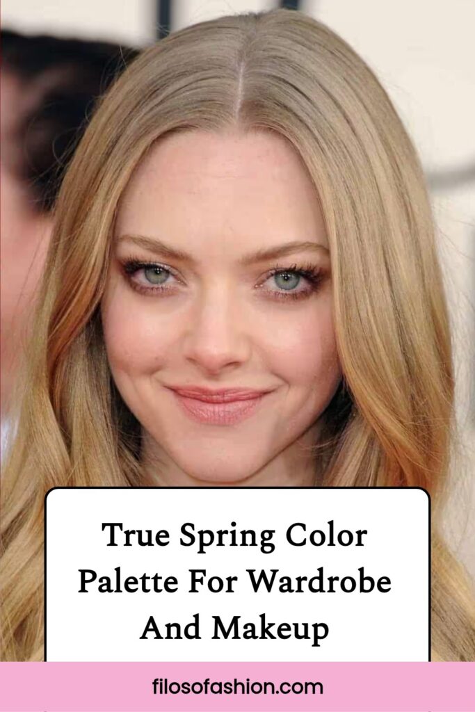
True Spring Color Palette For Wardrobe And Makeup

Are You Wondering If You Are A True Spring Color Palette?
I got you covered with these answers from a stylist and artist
The True Spring color palette is the apogee of the whole spring chart conglomeration.
Spring is predominantly warm and bright in colors, while its owner’s main features are subtle and clear.
This central part of spring is the peak of true color development.
It’s like a raw and fresh apple from the tree, covered in the morning moisture.
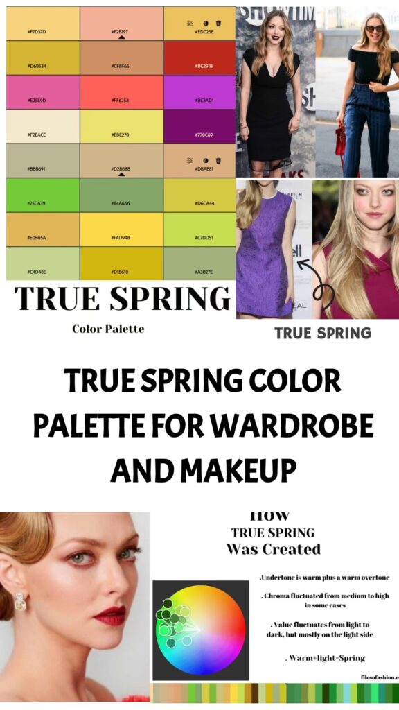
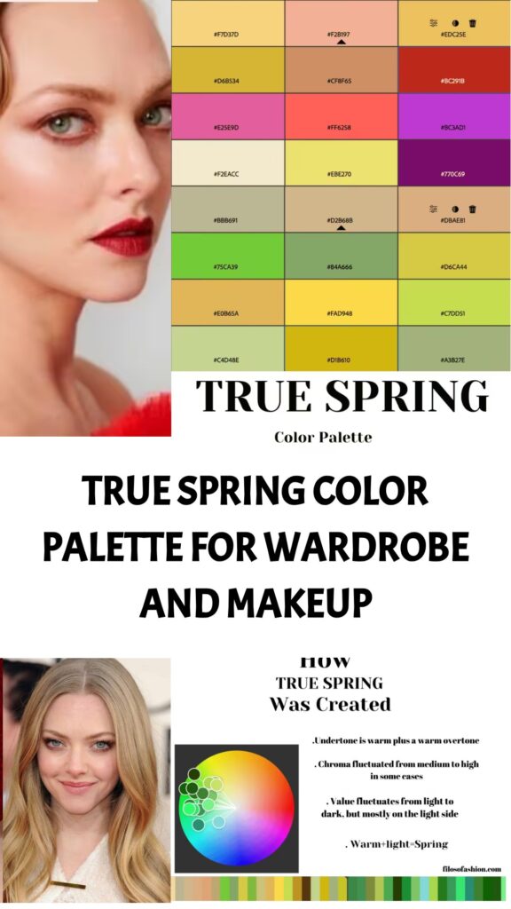
How True Spring Was Actually Created
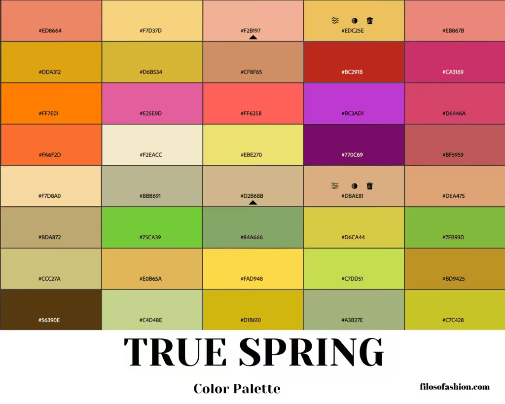
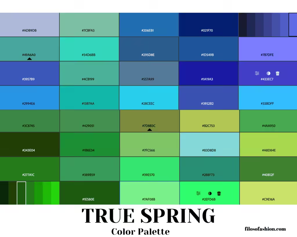
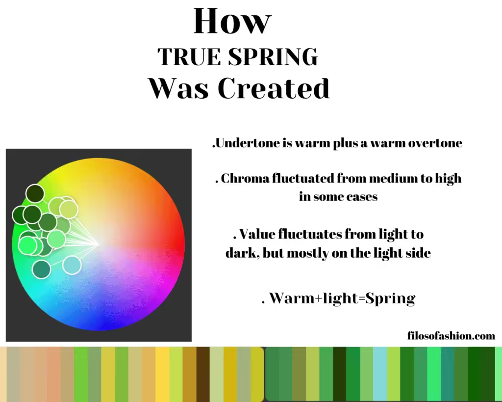
In contrast, the colors deviate from green to bright red, creating the vividness and radiant glare of spring.
True Spring is right in between Bright Spring and Light Spring, making its colors deep and rich.
All the undertones are warm, and the harsh line of contrast becomes precise but still narrow.
Characteristics Of True Spring Color Palette
Imagine the beginning of April; it’s the middle of spring already, and the sun is already hot with its golden sunbeams.
People are bathed in the honey sunlight, and everything is becoming yellowish in our surroundings.
The trees are bright green, and the grass is not just green; it’s intensely bright in color.
The sky is becoming golden, and there is a warm hue in the air.
It’s the prime season for ripe fruits like mango and papaya, the cherries are blossoming, and the strawberries are vividly red, varying from a slight coral to a deep burgundy red color palette.

It’s a warm palette, even though it has a slight medium contrast between the skin color and the very complementary features.
This is why we need to balance it out with compatible warm shades and undertones.
The central color palette is always a peak of true shades, and in this case, it’s warm and golden.
So here you have already checked the colors on the palette and figured that not all colors will suit you (so now you are doubting whether you are a True Spring at all).
Don’t worry, not all colors from the palette are meant to fit your appearance.
The main thing that will concern you and the True Spring palette is that you need to figure out if your skin is a cold or warm type, because Spring is predominantly warm.
To read more on the seasonal color analysis in detail, read this article.
How to find out if your skin type is warm or cold?
That is really easy to do!
The fastest way to understand what your main type is is to face yourself in the mirror and play around with gold and silver jewelry.
For example, if you see that you have a slightly pinkish skin undertone and silver earrings suit you better, you are a cold type.
If you have olive-shaded skin and gold jewels suit you better, you are a warm type.
You do have a soft appearance colorwise, but it’s not completely true when technical resources say that your “features appear somewhat ‘greyed out’ or toned down”.
There are people with greyish appearances, but their blue eyes definitely stand out.
They are somewhat muted, but in general, you can clearly see that the color of the eyes does stand out from the whole picture of your colors.
Your true colors are “muted”, but if you add a perfect soft autumn color, your features (or at least one of them) will definitely stand out.
With the right palette, your features will be enhanced!
It might be true that the contrast between your skin, eyes, and hair is low to medium.
But the important thing is that a usual person who reads these statements will not be able to identify that contrast.
It’s difficult to figure out which chroma, hue, and contrast your own appearance has.
My advice to you is not to put so much attention on these “technicalities” and just go along with a simpler explication of what your palette is.
The Features Of True Spring Color Palette
Eyes
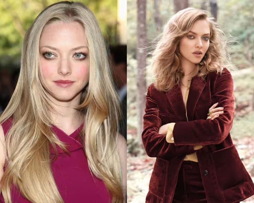
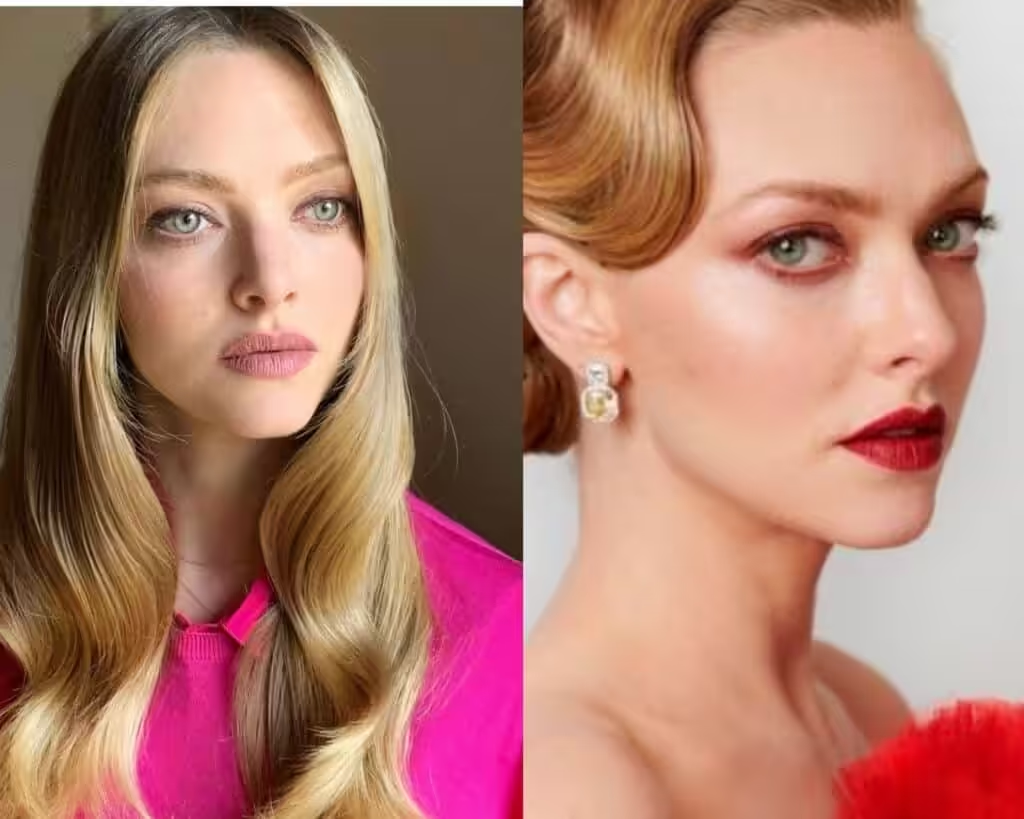
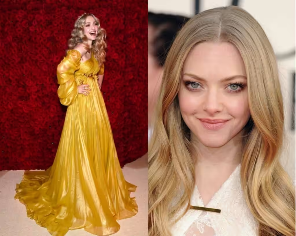
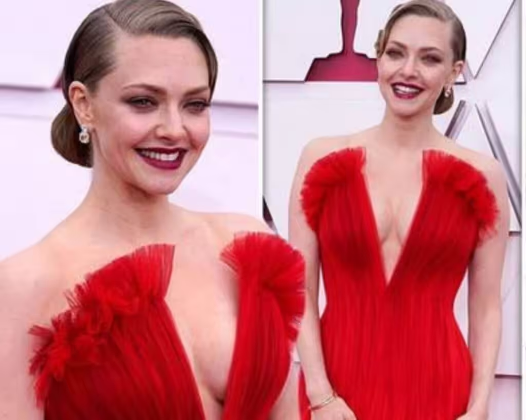
Spring eyes are always bright and clear, looking light blue, blue-green (turquoise), olive, and warm brown that are golden in an undertone.
Skin
True Spring is always lighter than hair; however, it’s still warm in an undertone. The most common shade is fair (in winter, that can even be ivory-light).
During the warm season, it can catch a slight tan and freckles and have a pink blush on the cheeks.
It’s not too dark, and it’s definitely not a “Latin-American” kind of skin.
Hair
Hair tones are warm and lingering to lighter shades like natural blond, dark blond, golden/honey blond, strawberry blond, red honey, or copper, honey-brown shades.
Often with highlights or uneven tones (darker on the roots and lighter on the ends).
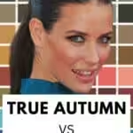
Am I True Spring or True Autumn?
I know what you would ask, “Why is True Autumn here?
Because those are the seasons that lie opposite to each other on the color palette chart.
They have the same kind of undertone, which is warm.
The only thing that distinguishes them is that Autumn is not highly or medium contrasted, and True Spring is.
In the realm of personal color analysis, this distinction plays a significant role in determining the best palette for each season.
A true autumn’s warm and muted tones reflect an earthy vibe, while true spring’s vibrant and clear shades evoke a sense of brightness and energy.
This true autumn vs true spring analysis helps individuals to better understand how to complement their natural features with the appropriate colors.
In contrast, the true autumn color palette overview typically includes earthy hues such as burnt oranges, deep olives, and warm browns, which harmonize beautifully with the natural warmth of an autumnal complexion.
Understanding these shades not only aids in wardrobe choices but also elevates personal style, allowing individuals to express their unique identities through color.
By recognizing the fundamental differences between these two seasons, one can curate a wardrobe that feels both authentic and flattering all year round.
In Autumn, colors are rich and deep, while Spring consists of bright and vivid hues that don’t bend in.
As the seasons change, the landscape transforms dramatically, showcasing a stunning contrast between the warm, earthy tones of Fall and the light, refreshing shades of Spring.
A deep autumn color palette overview reveals a symphony of oranges, reds, and browns, inviting us to embrace the cozy essence of the season.
These rich hues not only enrich the environment but also evoke a sense of nostalgia and warmth, prompting many to gather and celebrate the bounties of nature.
The latter ones contrast with each other.
How to mix and match a true spring color palette in your wardrobe?
In technical fashion materials, it is stated that you should only combine colors from one color palette that belongs to your skin tone.
When selecting colors for your wardrobe, it’s essential to consider hues that complement your natural undertones.
For instance, if you’re wondering what colors match olive green outfits, you might find that earth tones like rust, mustard, and soft neutrals create a harmonious look.
Additionally, jewel tones such as deep purple or teal can beautifully contrast with olive green, adding depth to your ensemble.
When considering colors that complement peach clothing, soft pastels like mint green or light lavender can provide a refreshing contrast.
Moreover, rich colors such as navy blue or charcoal gray can enhance the warmth of peach, making your outfit visually appealing.
Experimenting with various shades can help you discover unique combinations that elevate your style.
So, colors that work for a bright winter palette should only be chosen from the palette given to you. By selecting colors from this palette, you can create harmonious outfits that enhance your natural features.
Experimenting with bright winter color combinations can yield striking results, allowing you to express your style while staying true to the seasonal hues.
Remember, sticking to the recommended shades will ensure that your look remains vibrant and cohesive.
In contrast, the true summer color palette features softer, more muted tones that can beautifully complement those with cooler undertones.
By exploring these variations, you can add diversity to your wardrobe while still adhering to the principles of seasonal dressing.
Whether layering or mixing prints, integrating elements from both palettes can yield a chic and individualized aesthetic.
In addition, the soft autumn color characteristics, which embrace warm, earthy tones, provide an excellent contrast to the vibrant hues of the bright winter palette. Integrating these warm shades can soften your overall look and introduce a new dimension to your style.
By experimenting with layering bright winter colors alongside soft autumn tones, you can achieve a balanced palette that reflects both brightness and warmth in your outfits.
Additionally, incorporating elements from the deep winter color palette can further enrich your wardrobe, offering a richer spectrum of dark, jewel-toned shades that can make your outfits pop.
This palette works beautifully when combined with both the bright winter and soft autumn hues, allowing for a striking contrast that elevates your overall appearance.
By blending these diverse palettes, you can curate a unique style that is both captivating and reflective of your personal flair.
Harsh and way too bright/cold colors can create an undesirable effect on the skin, especially if you have a delicate/muted appearance.
But that may be right on the contrary, for you, bright and vivid colors are right for you!
I have already mentioned that dark/warmer colors can still be used for the lower body.
The main center is always your facial zone, which attracts the most attention.
So you mainly need to concentrate on the face and decolletage zone with your true winter palette.
You have to understand that even if you use all blue combinations or all dusty pink or creamy combinations in your upper and lower body.
It will be color correct for your skin, but still unflattering if your body shape is not a perfect hourglass shape.
This especially concerns those who have an ampler bottom-like pear body shape.
So that would mean that light pink pants will not be the best choice for your bottom line because they can make you look bigger than you actually are. Instead, opting for darker shades or neutral colors can create a more flattering silhouette.
When pairing with other items, consider how wardrobe color combinations with pink can enhance your overall look.
By judiciously selecting your pieces, you can maintain a stylish appearance without sacrificing comfort or confidence.
And this is what we are trying to avoid when constructing the perfect wardrobe.
- Inverted Triangle Body Shape: Capsule Wardrobe
- Pear Shaped Body: Capsule Wardrobe
- Apple Body Shape: Capsule Wardrobe
- Hourglass Body Shape: Capsule Wardrobe
- Rectangle Body Shape: Capsule Wardrobe
Styling For True Spring Color Palette





Neutrals For True Spring Color Palette
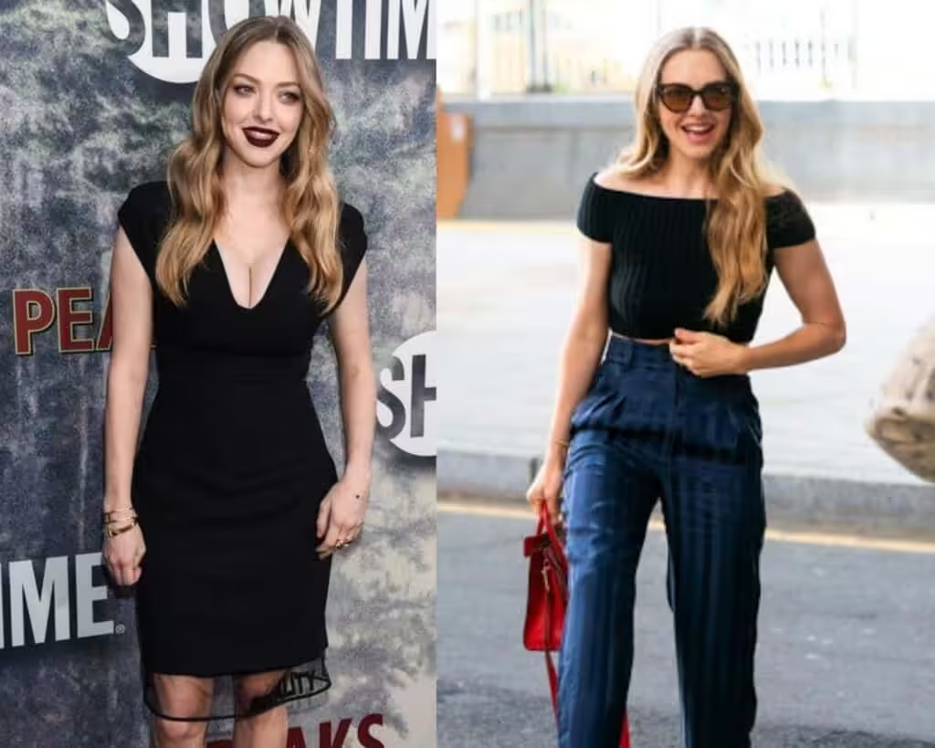
True Spring is mixed with winter colors, but when it comes to neutrals like white, black, or beige, it needs to be softened.
Otherwise, pitch-black harshness will wash your beauty out. I would suggest introducing softer tonalities like dark grey instead of crispy black and off-white instead of clear white.

Colors to Avoid For True Spring Color Palette
True Spring is not about coolness like during summer times. It’s warm and bright, so it’s better to avoid muted shades like grey and pitch-black.
Opt for vibrant hues that reflect the lively essence of the season, such as soft pastels or lively greens.
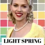
A light spring color analysis reveals that these shades harmonize beautifully with the natural light of the season, enhancing your overall look.
Colors that evoke freshness and vitality to truly embody the spirit of spring. In addition to your wardrobe, consider how your makeup choices can align with the vibrant colors of spring.
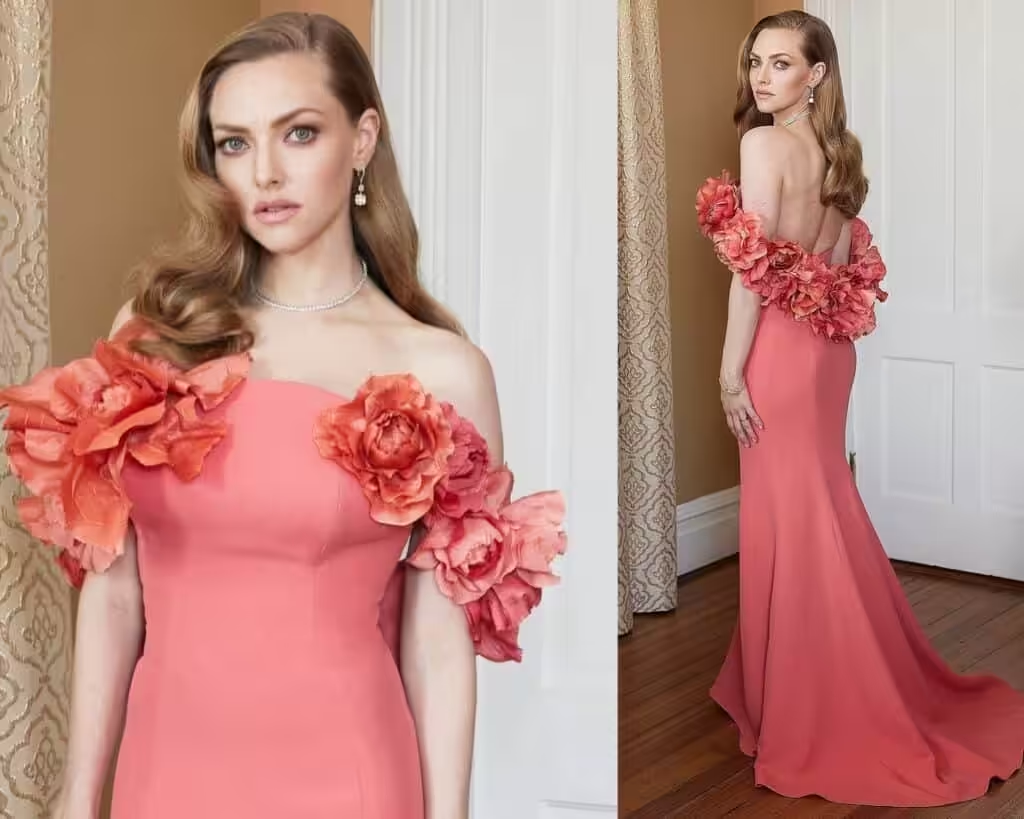
Incorporating shades of coral or soft peach into your makeup can enhance your natural glow and complement the season’s aesthetic.
As you transition into warmer months, explore summer makeup ideas and tips to maintain that fresh and lively appearance all season long.
The blue color palette might look unhealthy on you, so leave it alone for other color palettes.

Patterns & Prints For True Spring Color Palette
Patterns are usually used for upper body garments like blouses and sweaters, etc., or summer dresses. People rarely wear trousers with patterns; most likely, blatant colors are used.
As a True Spring type, you can wear prints, but those would need to be in the right color palette for you.
If you see a patterned fabric, you need to concentrate on the primary color of the whole garment.
There might be blue flowers on white, but you need to figure out which color is primary here. It’s primarily white, which is basic here, so you need to see if that primary color is from your True Spring palette.
It’s believed that True Spring needs to use low to medium contrasts because of the delicacy of natural beauty.
You might still go for low-level contrast, which would be right for you. However, there is always a solution for you if you didn’t find anything in this guide.
Jewelry For True Spring Color Palette
How could you fix your non-perfectly colored look with just one thing?
It’s a necklace, and for me it’s pearls.
Be mindful that pearls need to fit your skin color perfectly.
When you put something like a pearl necklace on your neck, you create a rough separation between the “wrong” color of your skin and the necklace.
So, the chain is going to be the primary color reflector for your skin color.
For example, I have a purple dress that does not really fit my skin color, and my face tends to look a bit tired with it.
You know it, especially if you have blue eye bags in the morning. It doesn’t make me look my best.
So I create a cut between the color and my face with a pearl necklace that perfectly fits my skin.
So the jewelry is the first color reflector near my face.
Check out my article: “How to wear a pearl necklace and where to buy it. “
As stated between gold and silver, I’d recommend gold as it’s warm enough for your skin tone.
Silver is appropriate if it is mixed with gold and looks primarily warm-toned.
Pearls need to be a cream-white color as it matches your complexion perfectly.