True Summer vs True Winter: Differences and Similarities In Color Palette

Are you wondering what the difference is between True Summer vs True Winter?
This article has all the answers!
Discover the differences and similarities of True Summer vs True Winter colors, as understanding true summer vs true winter can help you choose the perfect shades.
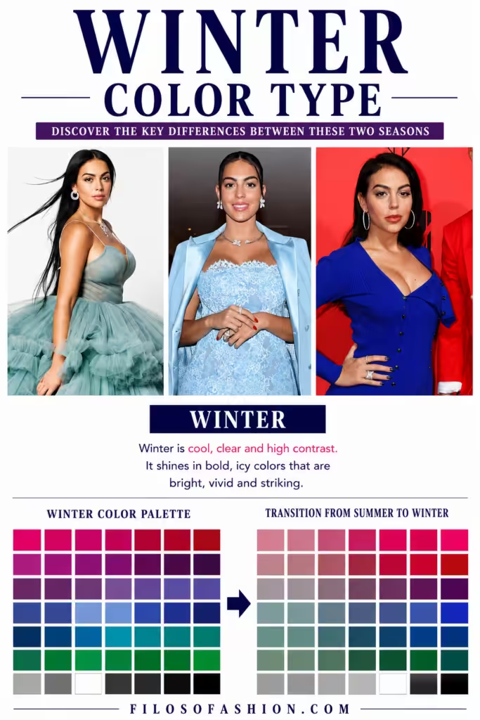
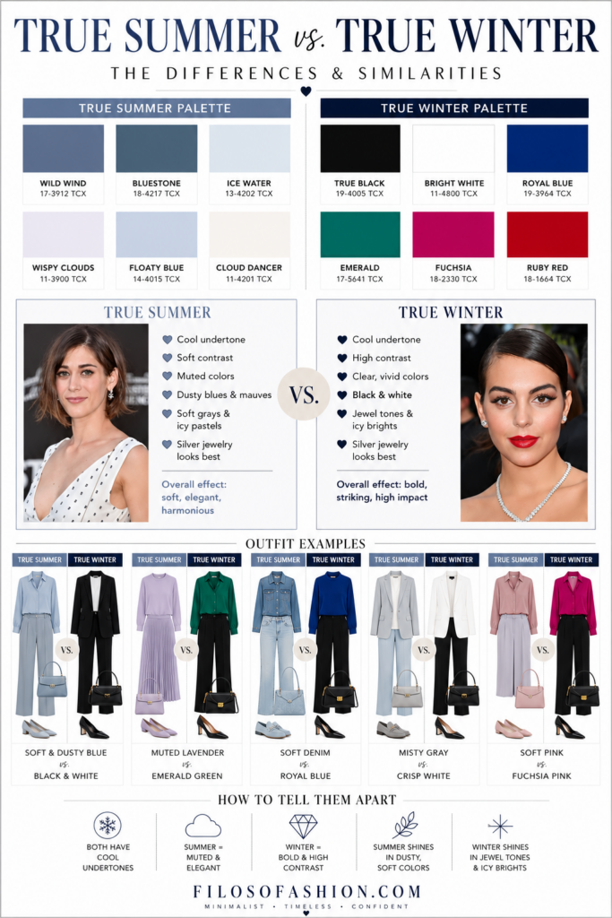
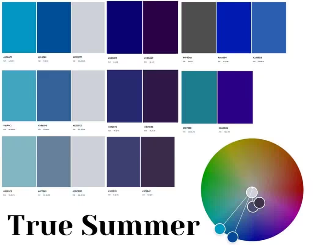
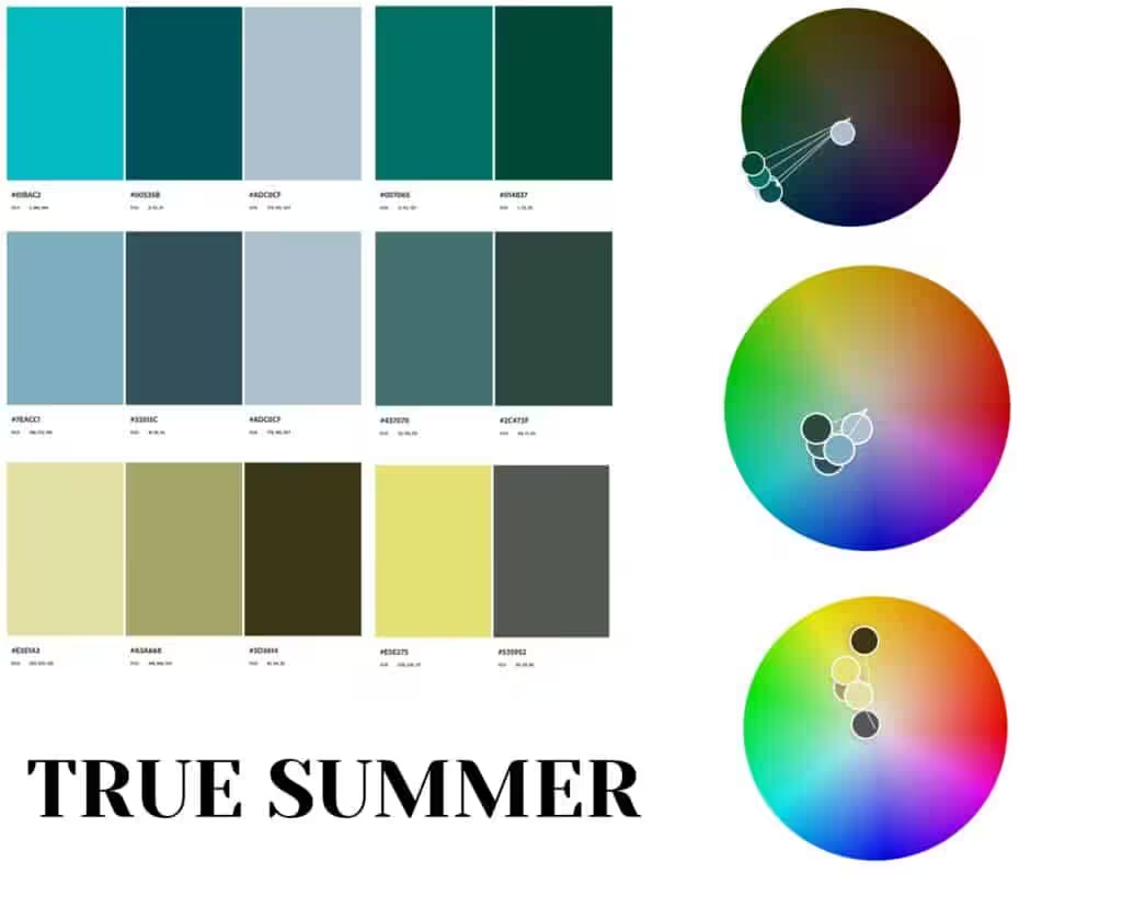
True Summer individuals are characterized by cool undertones and softer, muted colors, while True Winter types lean towards bold, high-contrast shades.
The true summer color palette explained highlights colors like lavender, periwinkle, and soft pinks, which enhance the natural beauty of those with a True Summer complexion.
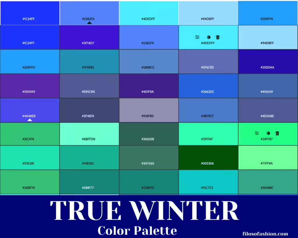
In contrast, True Winter palettes feature jewel tones such as emerald green and royal blue that complement their striking contrast.
These distinct characteristics also extend to the comparison of cool summer vs soft summer colors, showcasing how shades can greatly impact one’s overall appearance.
While cool summer colors embody a crisp and refreshing quality, soft summer colors embrace a more muted, blended palette that creates a gentle look.
This nuanced understanding of color types can help individuals select hues that perfectly align with their natural features.
It can be simultaneously defined as the most common palettes and the most diverse ones at the same time.
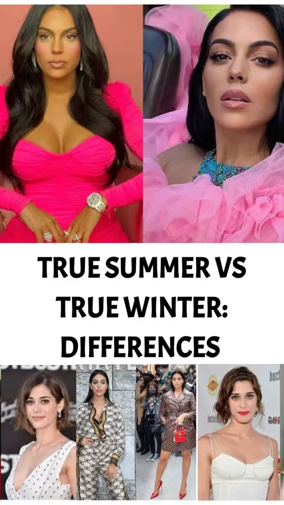
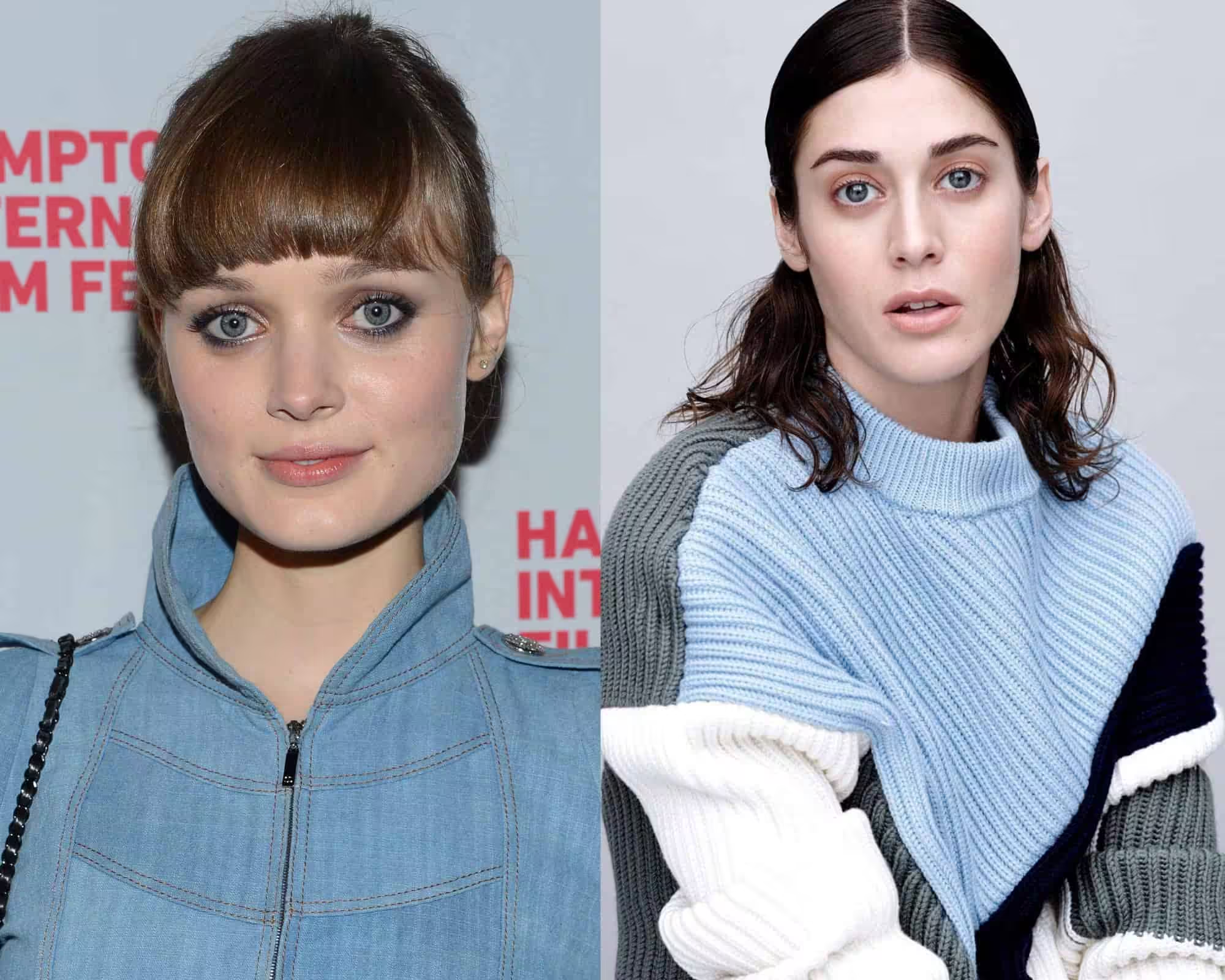
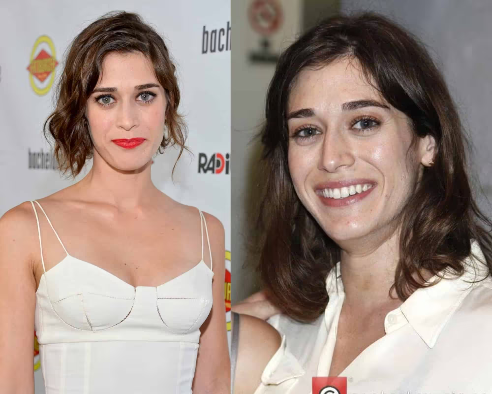
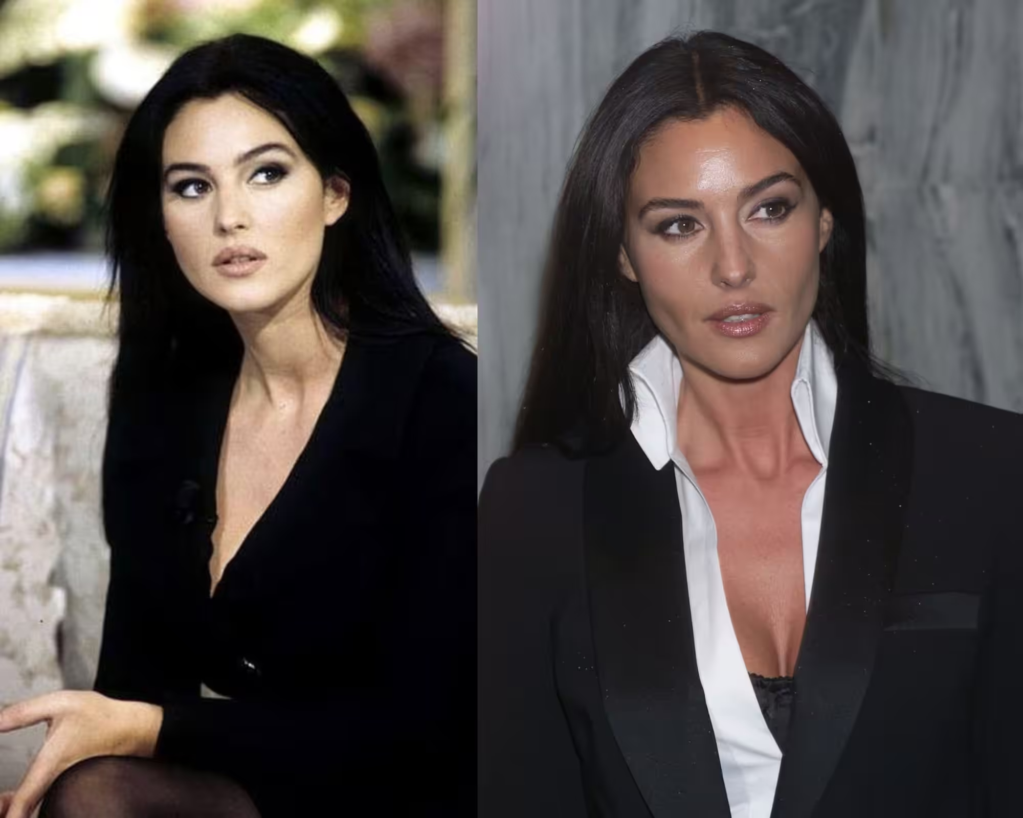
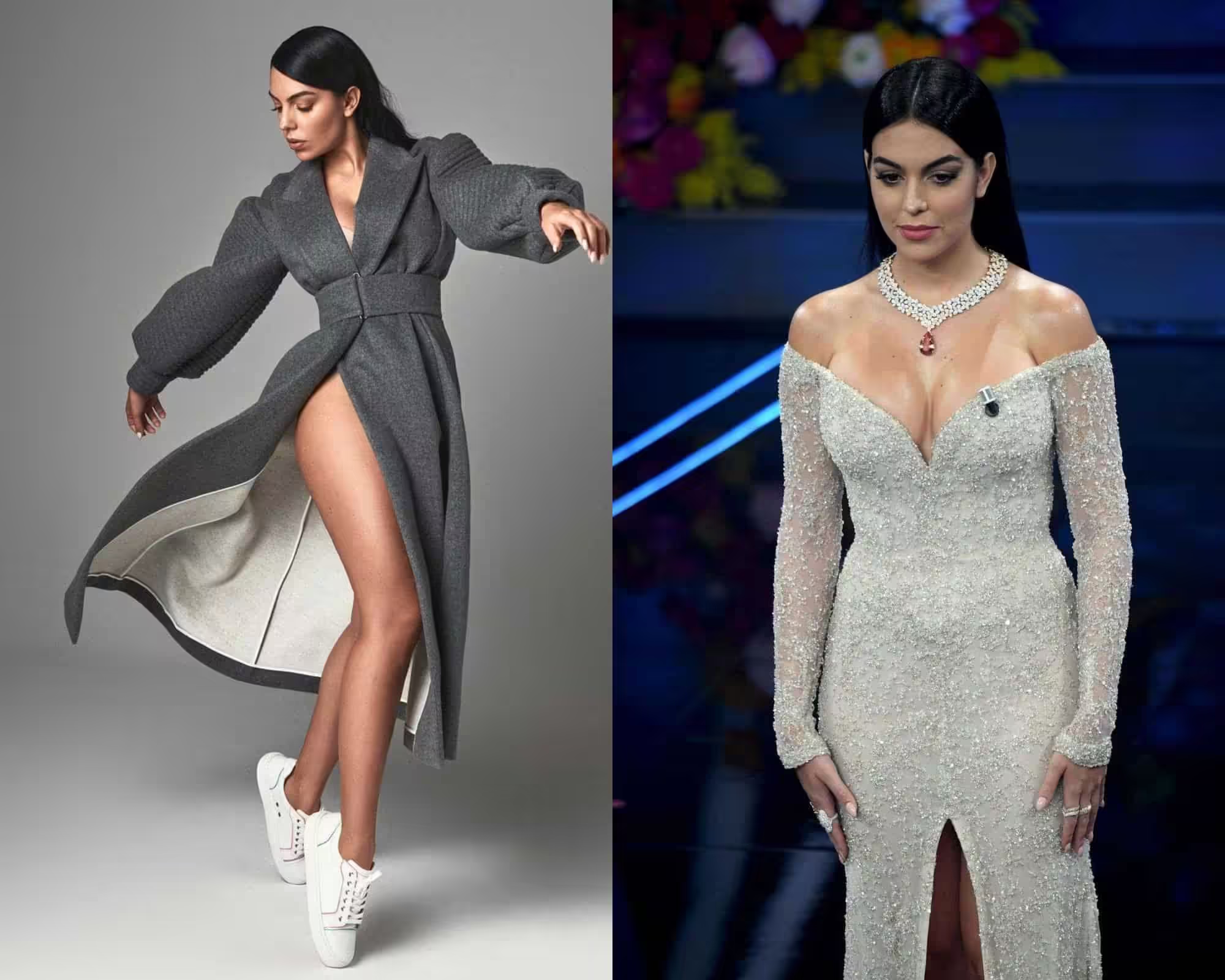
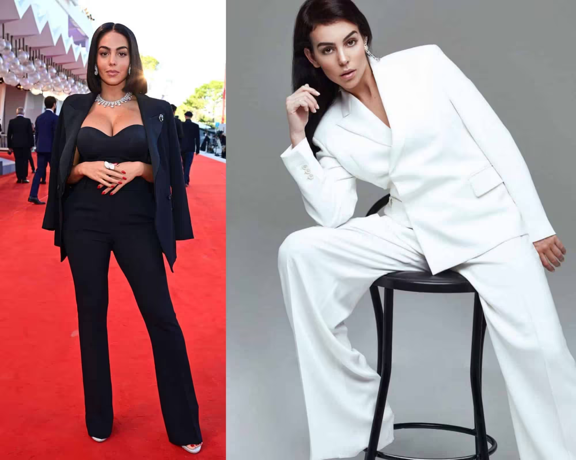
I will take Lizzy Caplan and Bella Heathcote as typical representatives of the summer color type and Georgina Rodriguez and Monica Bellucci as Winter types.
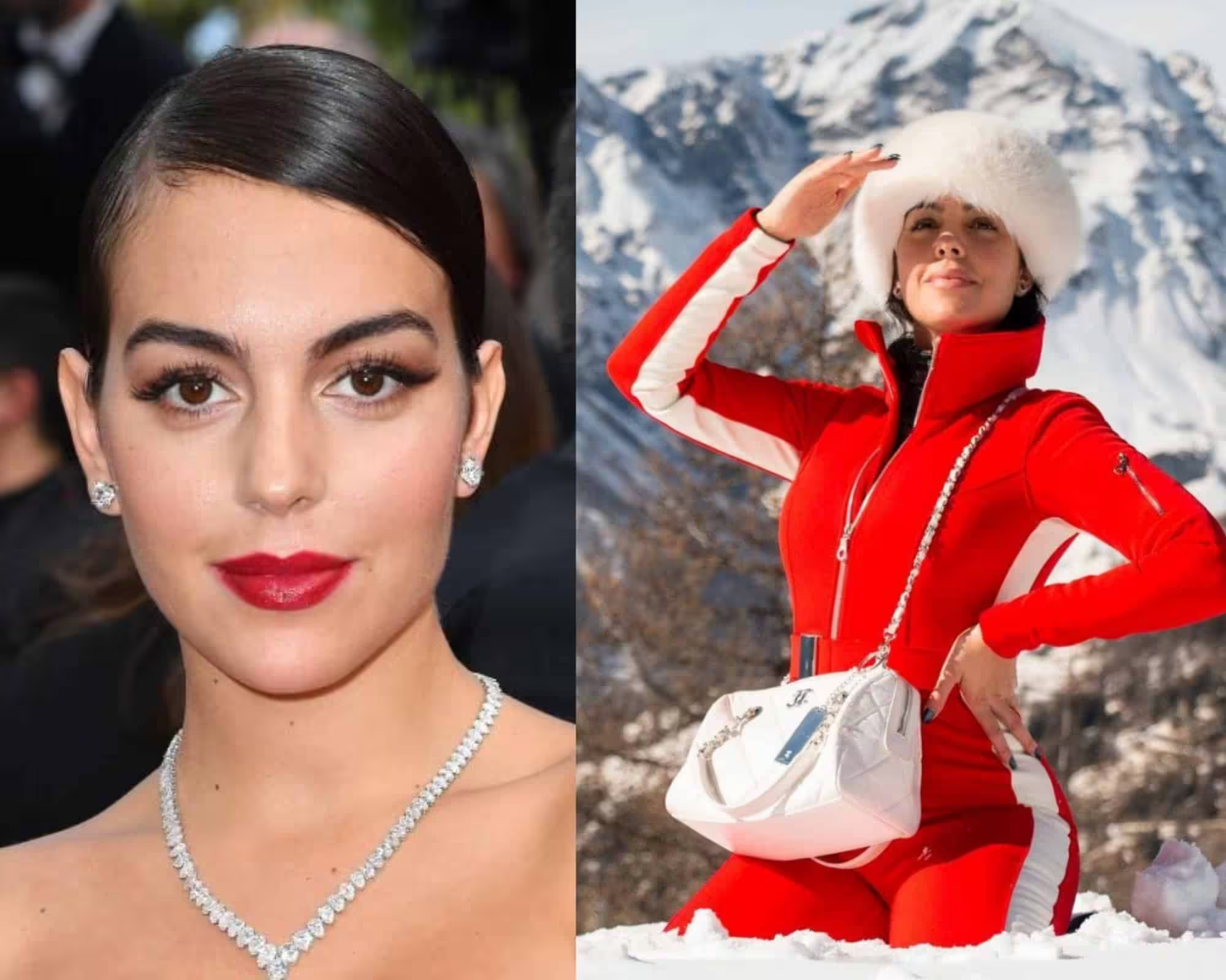
You can spot the difference in those pictures.
The hue and the contrast come first, and there is a clearly visible difference between the two types.

Skin tone is always the basis of color. In the case of summer, it is always a cold undertone.
The skin of the summer seems noble, fragile, and thin.
There are three main descriptions:
• very fair skin;
• skin of cold pink color undertone, in which vessels are almost translucent;
• cold light beige skin.
If a summer woman has freckles, they are grey or ashy. Also, like spring, this color tans well.
However, this is not a hard and fast rule. And there is a clear difference in how the True Winter tans and True Summer – the intensity is tremendous.
Note: Usually, stylists do not test for a color type until more than two weeks have passed since the person returned from vacation.
Because a tan, especially a fresh tan, makes the skin tone warmer.
SUMMER HAIR COLOR
As for the shade of the hair, there is also a fairly large scatter.
Naturally, we are talking about a natural shade of hair given by nature, not burned out and not obtained as a result of dyeing.
Natural hair color in summer can vary in any shade of light brown, from light to dark blond.
Hair may not be very light, like Lizzy Caplan, a contrasting summer with dark blond-brown hair.
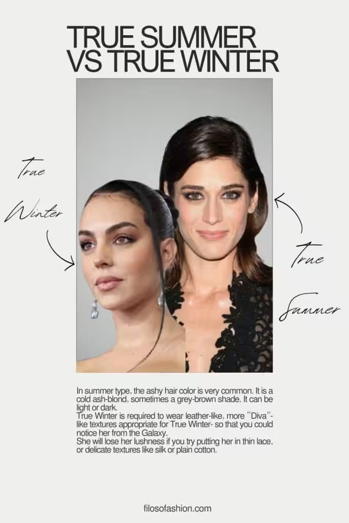
In summer type, the ashy hair color is very common. It is a cold ash-blond, sometimes a grey-brown shade. It can be light or dark.
It is summer women who dye their hair more often than others because this way, they look brighter and basically, they just add more contrast to their appearances.
Changing hair color can greatly transform a summer woman, and add brightness and catchiness, which her appearance sometimes might need.
SUMMER COLOR TYPE EYES
The eyes of summer can be grey-blue, grey, dark blue, green-blue, brown (from light to quite dark), or grey-green – there are a lot of options.
Summer is the most different color type in its external expression.
The photo shows another example of a summer color type: blue eyes, ashy hair, fair skin.
In addition, a woman of the summer color type can have brown eyes of any tone, from light to almost black.
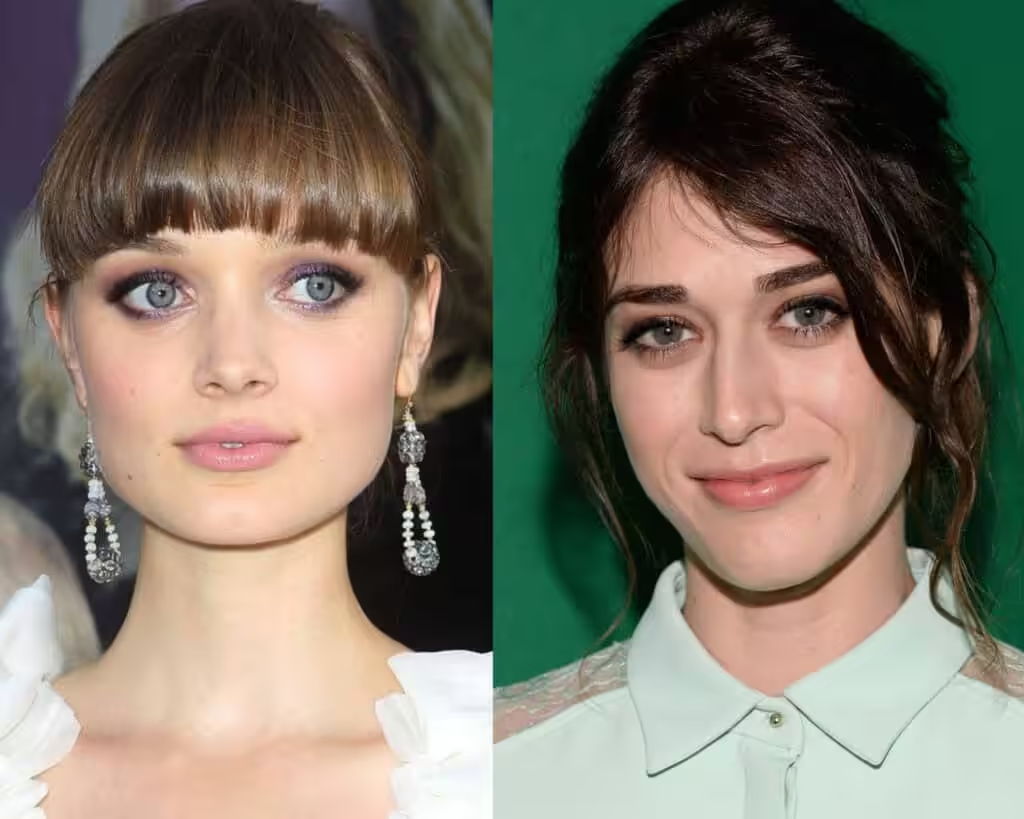
In the photo, we can see the differences in hair and eye colors.
The summer color type has another interesting feature: usually, they do not look expressive enough without makeup.
Therefore, the difference between the images of the same summer-type woman with and without makeup is very significant, perhaps the strongest among all color types.
Not all of them, but there definitely are different levels of contrast, especially those with grey natural hair tones.
True Summer vs True Winter: Differences
This feature makes the representatives of the summer color type the most in-demand on the runway, because they are like a canvas for painters.
Neither Monica Belucci nor Georgina Rodriguez can be molded into any image like Summers- they are limited by the brightness of color of their appearance.
A summer girl, depending on the color of her hair, makeup, and outfit, can change beyond recognition: she can be a femme fatale, she can be thinner and more refined, she can be anyone.
If the uniqueness of the spring color type was in magic, airiness, subtlety, and naturalness, then the uniqueness of the summer color type is that its representatives are very feminine, sophisticated, and diverse.
Their neutrality in color gives ample opportunities for creating different images.
Therefore, it is a sin to call summer girls “gray mice”.
Textures in fabrics for True Summer vs True Winter
There is quite a difference between the textures that each and every person can wear.
As it has been mentioned before, Summer types usually are the owners of very thin-looking skin; therefore, the textures near the face need to be more subtle.
What we put right in the zone of our portraiture is the primary image that is going to construct our whole look.
As the face is our primary communicator, this is also where the impression about us starts.
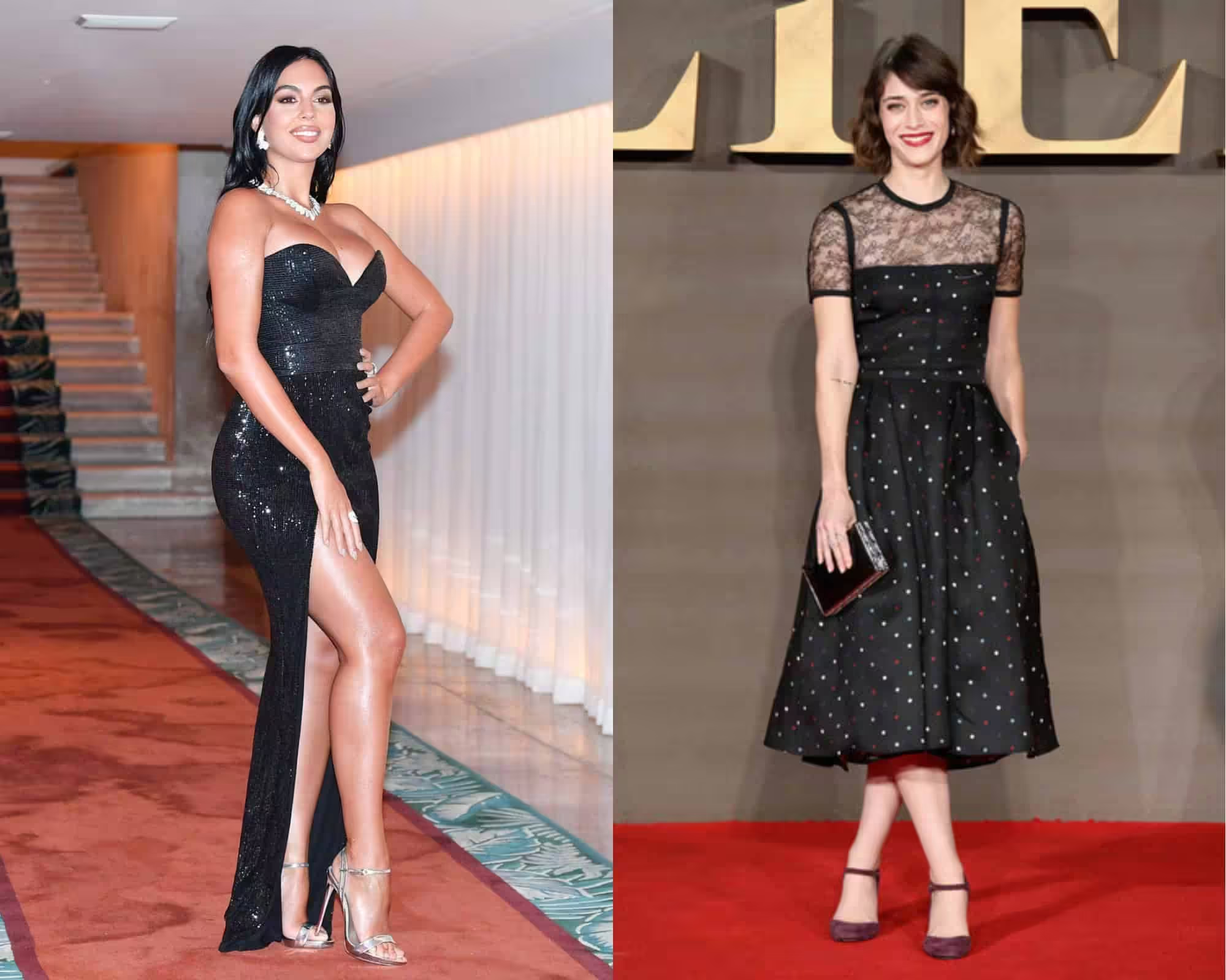
For Lizzy Caplan, it is obvious that such a harsh color as black would look suffocating had it been holistic, but in the case of black, thin lace is very advisable.
It makes her look classy and sophisticated, and this is where she can use the pitch-black color.
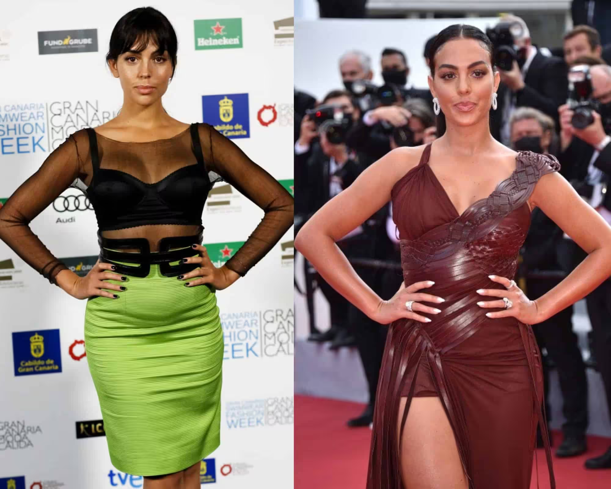
For Georgina, it is a whole different advice – she is a woman of rougher and shinier textures like Bellucci.
She is required to wear leather-like, more “Diva”-like textures appropriate for True Winter, so that you could notice her from the Galaxy.
She will lose her lushness if you try putting her in thin lace or delicate textures like silk or plain cotton. Her appearance will not stand out as much as she would want to.
True Summer Colors
What do we need for natural coloring in cases where there are no special contrasts in a person’s appearance: eyes, skin, hair – nothing stands out sharply?
The photo below is a vivid example of a true summer.
There is nothing too striking about her appearance: her skin is not very fair, her hair is not extremely dark, and her eyes are not very dark or very bright.
When we put winter colors on such a delicate appearance, it creates an undesirable contrasting effect.
Even though both True Summer and True Winter are cold in an undertone, the contrasts they wear should be different.
Otherwise, you can ruin the whole picture. True Summer typically embraces softer, more muted hues that harmonize with their natural undertones, creating a gentle and cohesive look.
In contrast, True Winter can confidently wear bolder, more vibrant colors that enhance their striking features.
For instance, the soft summer seasonal palette features delicate pastels and subtle jewel tones, which can beautifully complement the warmth of their complexion without overpowering it.
True Summer individuals can also draw inspiration from celebrities who embody the soft autumn color palette celebrities, showcasing how these colors can blend seamlessly into their wardrobe without losing their distinctive style.
By incorporating elements from both aesthetics, they can achieve a balanced and refreshing look that remains true to their seasonal identity.
This approach not only enhances their personal style but also allows for greater versatility in their fashion choices.
Can True Summer jump into Bright Summer?
Yes! The key is the contrast – if you change it to a deeper and darker color, you also create an opportunity to jump to more contrasting palettes.
But this is a very subtle choice to make – if you change to a color that doesn’t suit you, you also might ruin the holistic composition of your color palette.
But if you do it right, you preserve the seasonal color but just add a pinch of depth.
Adding More Contrast To True Summer Type
In the appearance of a contrasting color, there is a double contrast. For example, the contrast between skin and eyes, the contrast between skin and hair, etc.
You can have fair skin, contrasting with darker hair and fairly bright eyes, and still be a Summer type.
Winter Type Colors
Winter is perhaps the brightest, most catchy, spectacular, and fatal color type of all.
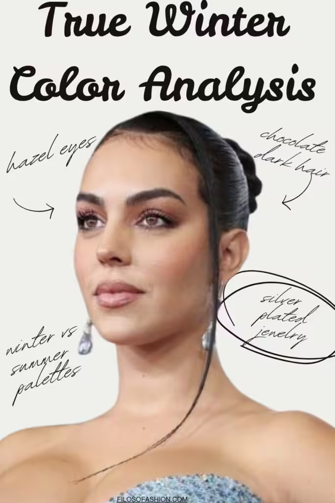
Its typical representative is Monica Bellucci – but I decided to go deeper and chose Georgina Rodriguez.
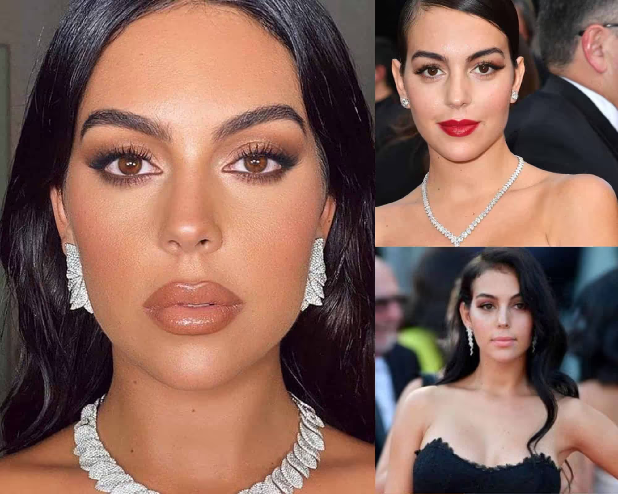
Winter has several differences from summer, which are consistent in color:
- thicker skin;
- more contrasting color;
- often very white, almost bluish, whites of the eyes.
- if we compare these color types, then the winter skin is lighter and the hair is darker. Winter women are more catchy, spectacular “Divas”.
- However, they can also add some natural or artificial tan, but the contrast will not change in that case – they might add to the color palette.
Any color type is determined primarily based on skin tone. In winter, it has a uniform shade with a cold, bluish undertone, as a rule.
There are several types of this skin.
- A very light, noble porcelain shade, like, for example, Monica Bellucci or Georgina. Such skin tans quite well.
The hair of the representatives of the winter color type can be dark brown, brown-black, pure black, or blue-black, as well as ash-blond.
Sometimes you can hear the erroneous opinion that the light brown color cannot be in the winter color type.
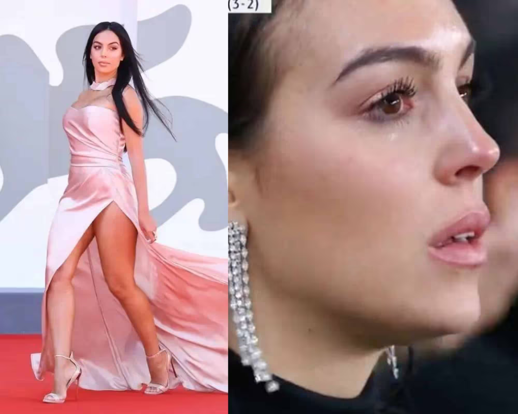
Brunette winters make a very catchy and spectacular impression; they are very bright in appearance.
You can’t fashion anyone out of winter women because their color dictates the image.
This is their advantage, and this is their disadvantage.
Monica Bellucci is catchy and spectacular, and no matter how you dress her or what makeup you use for her, this brightness cannot be hidden by anything.
Contrasting subtype
In the appearance of a contrasting color, there is a double contrast. For example, the contrast between skin and eyes, the contrast between skin and hair, etc.
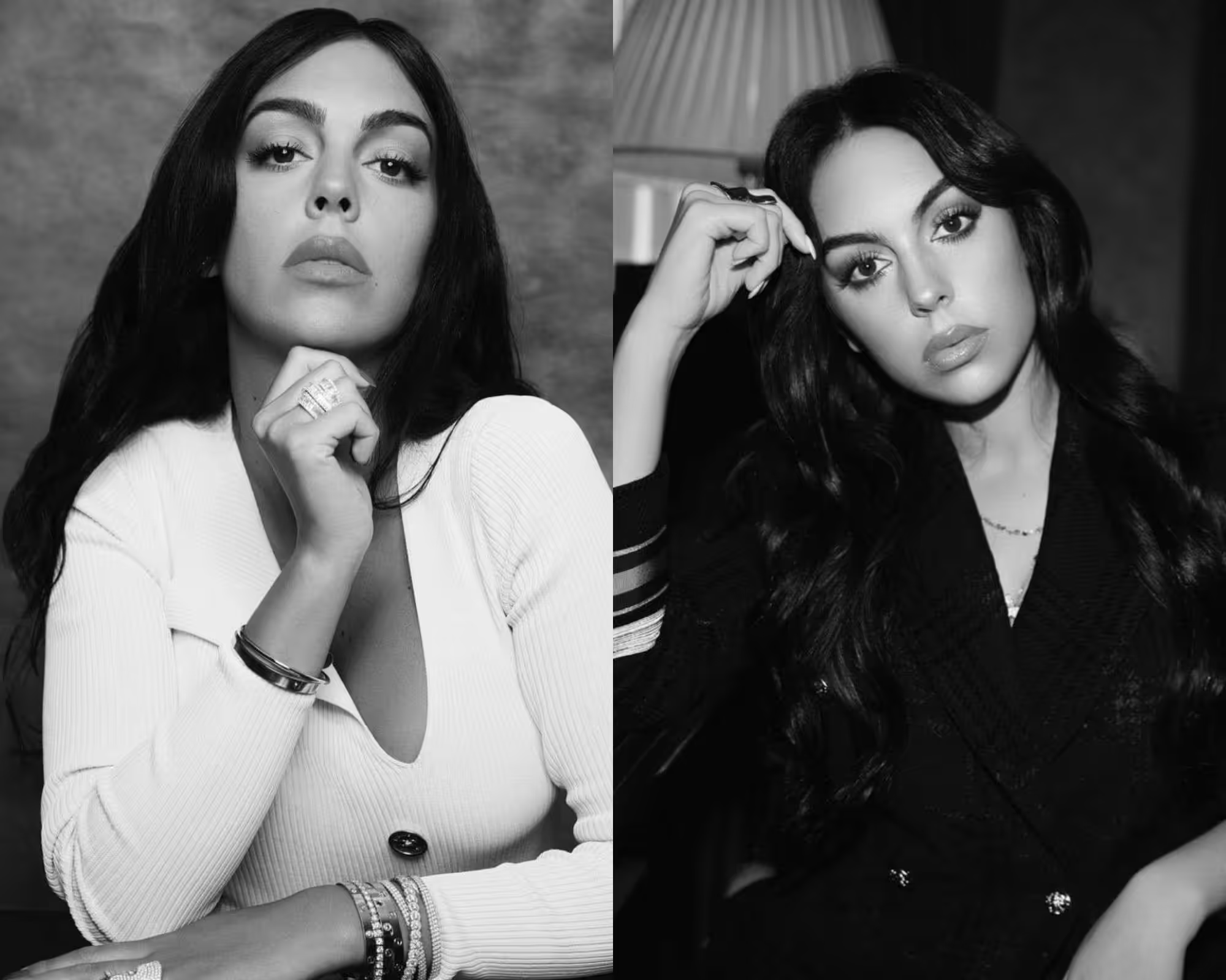
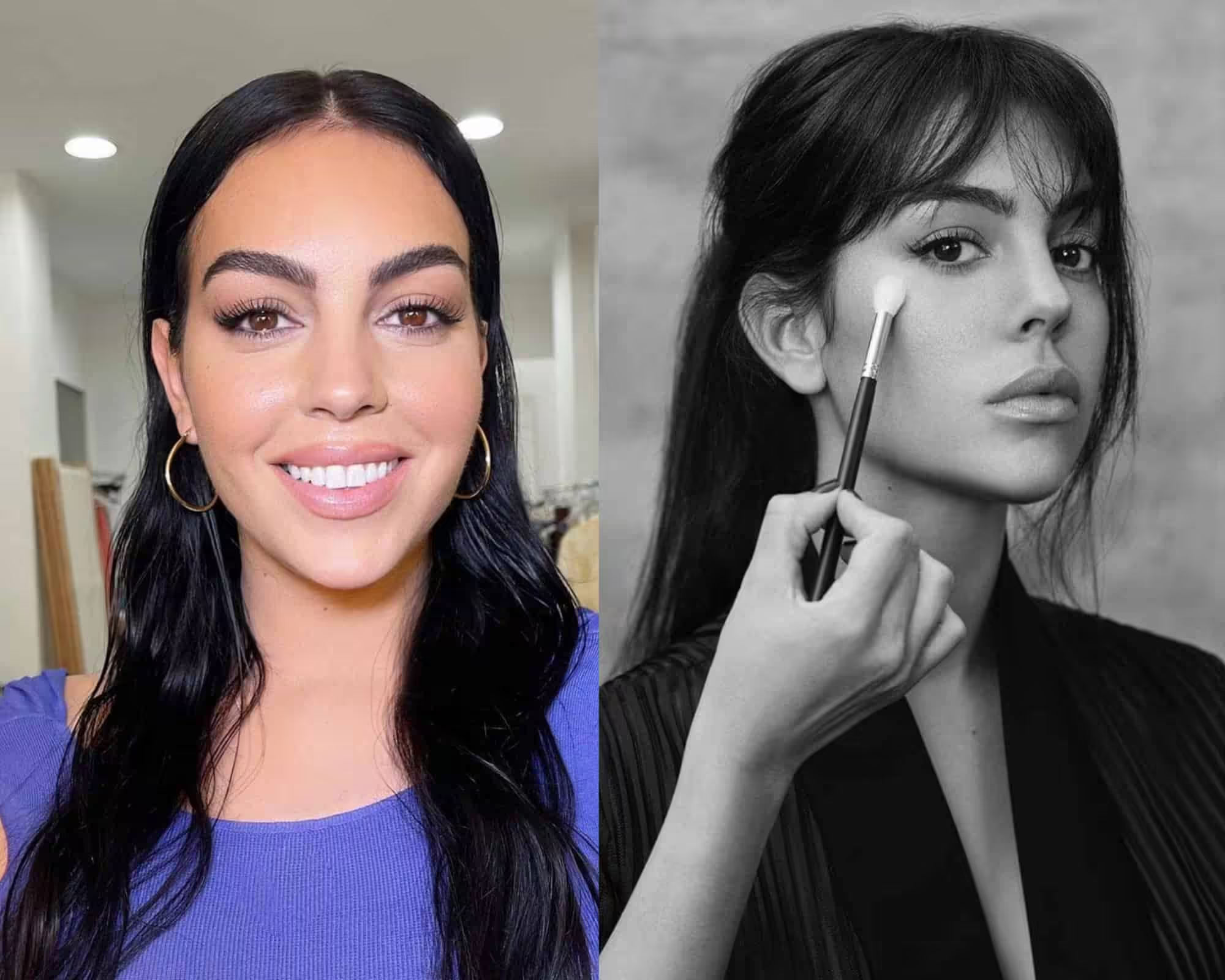
The second contrast is bright eyes and skin. But if her skin is slightly tanned, her coloring will change.
She will move from a contrasting winter into a bright winter, or, as in the case of Georgina, sometimes she might even use a warm color palette like Spring.
This versatility allows her to explore the emotional resonance of different seasons through her artistic expression.
In contrast, the deep autumn color palette explained provides a rich and earthy foundation, drawing inspiration from nature’s most vibrant transformations.
By incorporating these hues, she can evoke a sense of warmth and nostalgia that contrasts beautifully with the cooler tones of winter.
Another contrasting winter is Monica Bellucci/Georgina Rodriguez.
Her appearance contrasts with light skin, dark hair, light skin and dark eyes. Even in the case of a summer tan, she preserves this Winter type.
What You Need To Know About True Winter Colors
There is no such thing as too bright for winter. She fades when she puts on dusty summer colors.
Yes, and the shades themselves in the winter lose their sophistication and look somewhat rustic.
These colors are usually advised against, but even those shades can be included. Down below, I will show you how.

Working with the winter color type is quite simple; it does not require knowledge of special subtleties and nuances.
It is enough just to choose your own color for winter so that it transforms and plays well.
True Winter vs True Summer Colors
- Red color for the winter type
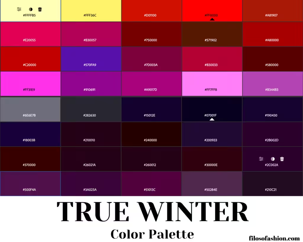
For the naturally bright appearance of a winter woman, pure, saturated, very bright colors, not diluted with grey, are an ideal choice.
Light colors should be very whitened; dark colors should be almost black or pitch-black.
Normally, dusty, neutral, indefinite colors are not for them.

From the red palette for winter, you should choose bright red, pure red, purple, ruby, raspberry, burgundy, and phlox.
The pink winter gamma is represented by the colors of fuchsia, cyclamen, icy pink, and caustic pink shades.
What do we see from this collage?
The bright red-pink blouse is magnificently fitted with her color type – the perfect high contrast is preserved.
In the light pastel pink, the outlook is not as good as the left one.
Why?
Because of her skin color, at the very moment of the picture being taken.
If only she had a higher intensity of the tan – she could definitely use pastel colors.

- Red Color For Summer Color Type
When choosing a summer wardrobe, you should focus on the shades of berries and flowers characteristic of this season with care.
Incorporating these vibrant hues can create a refreshing and lively look that celebrates the essence of summer.
Summer is a cold color, so it is recommended to choose cold colors from its available palette.
For example, adding blue is necessary for red and pink shades.
These are fuchsia, azalea, begonia, ash red, dusty pink, lingonberry, and pink-purple.
These colors can be a little brighter or a little dustier, but they are always colors with a bit of blue added or just pure red.
Perfect options for “summer” will be transparent scarlet (that is, red without the addition of yellow), raspberry, and also the color of red wine.
And here are the colors that Summer is advised against, but then again, it shouldn’t be taken for granted, and later, we will see how to work around it.

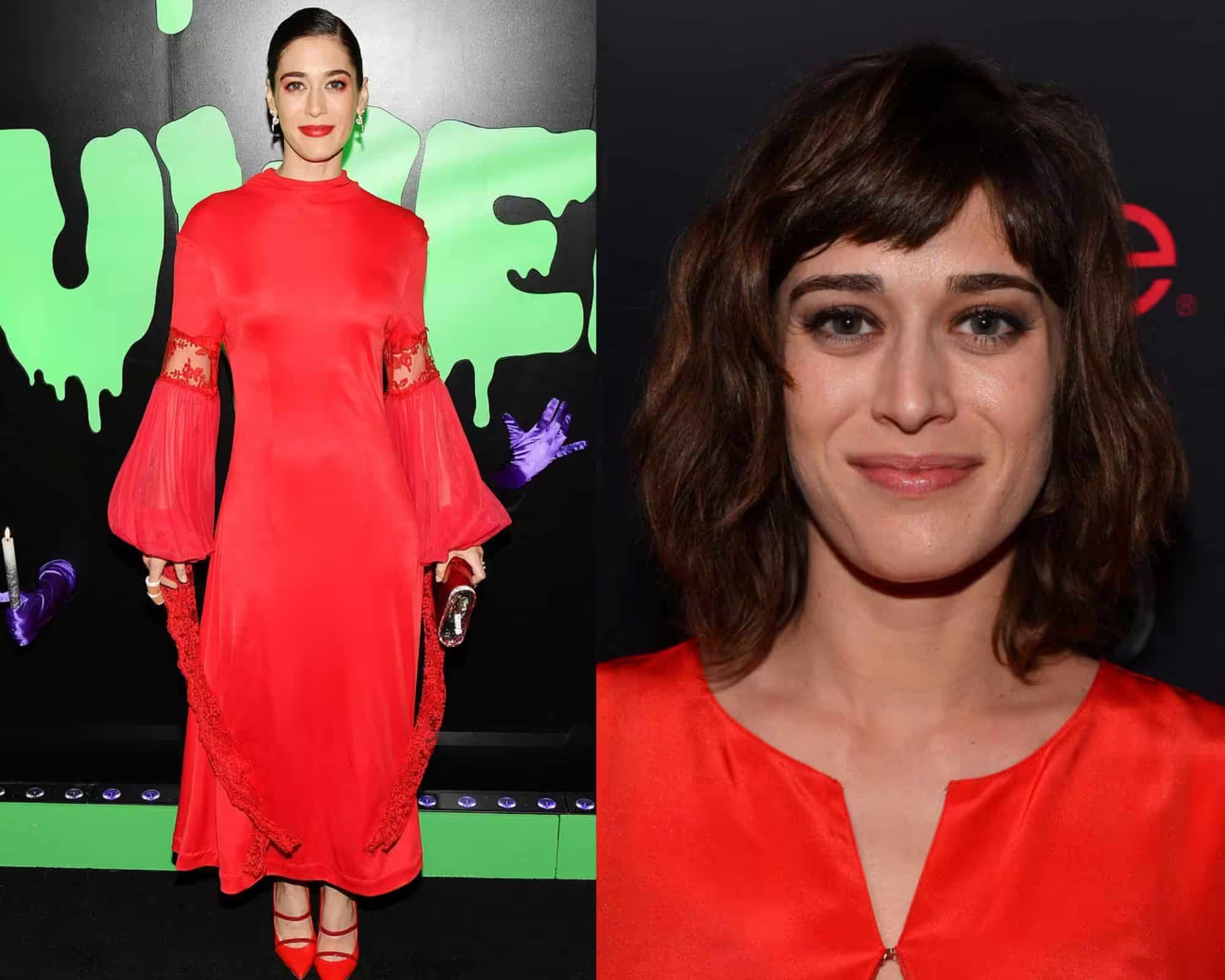
But coral and other shades of red might just be too contrasting for such a delicate appearance as Summer.
Here, we can observe that the bright winter red completely overlaps the beauty of the summer-type actress.
This interplay of colors highlights how the vibrant hues of the true winter color characteristics can truly enhance a person’s natural features.
While the Summer type actress may possess soft pastels that evoke warmth, the striking contrast of winter shades can create a more dynamic and eye-catching aesthetic.
These bold tones allow for a dramatic expression that captivates and commands attention.
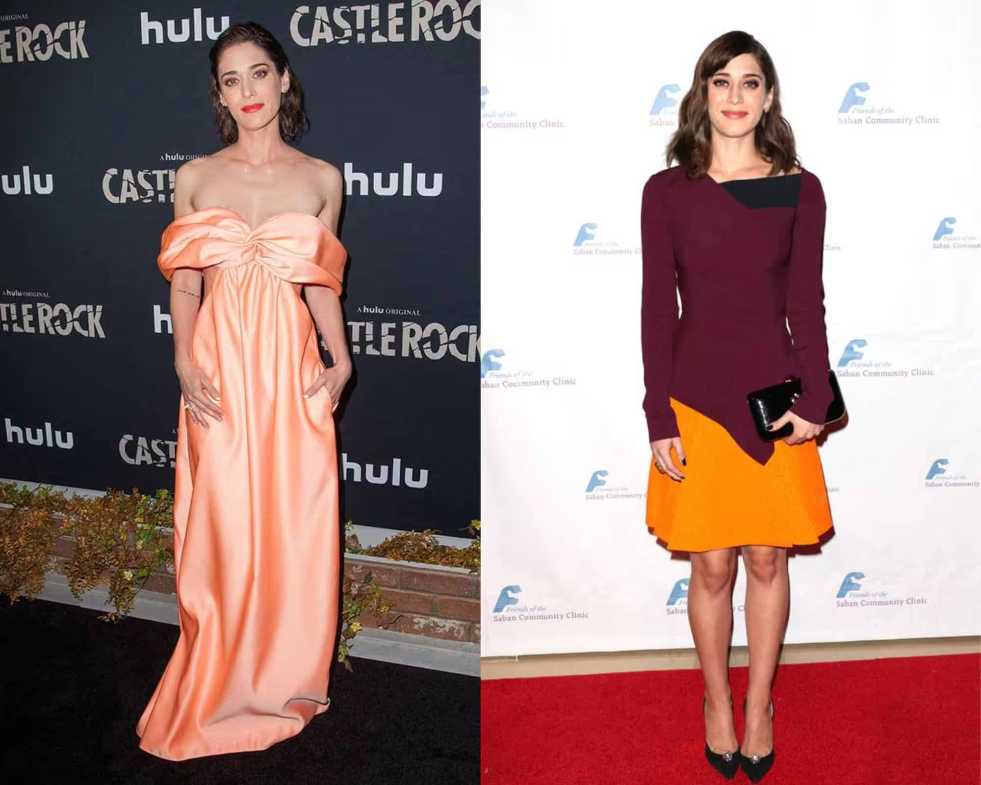
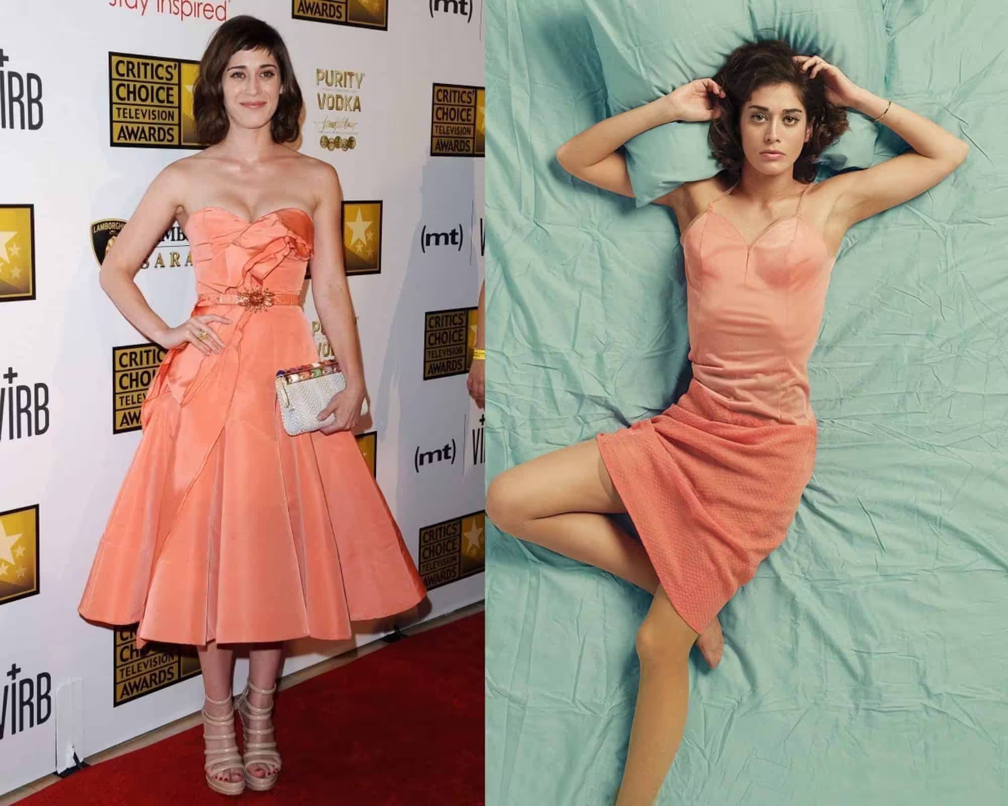
We can also see that light salmon orange and autumn burgundy, both from the warm color palette, don’t fit at all.
If only the actress considered warming up her skin tone, she would automatically widen her color palette horizon.
However, we can see that her initial white skin doesn’t go well with such tones.
- Red for winter type during winter
In the photo, shades of red should be chosen for the summer and winter color types.
Some of the colors of the palette are common to them, some are suitable only for one color type.
In winter, the contrast between light and dark, light and bright, and dark and bright is pronounced.
Winter nature is built on contrasts: white snow – black thawed patches; white snow-bright sky, bright sun; white snow – black tree trunks; white snow-bright berries on its background.
Therefore, in winter, all colors are bright, excessive, and catchy: if dark, then very dark; if bright, then very bright; if light, then very light.
- Blue color for winter color type
The winter palette lacks the neutral colors so sought after in summer wardrobes.
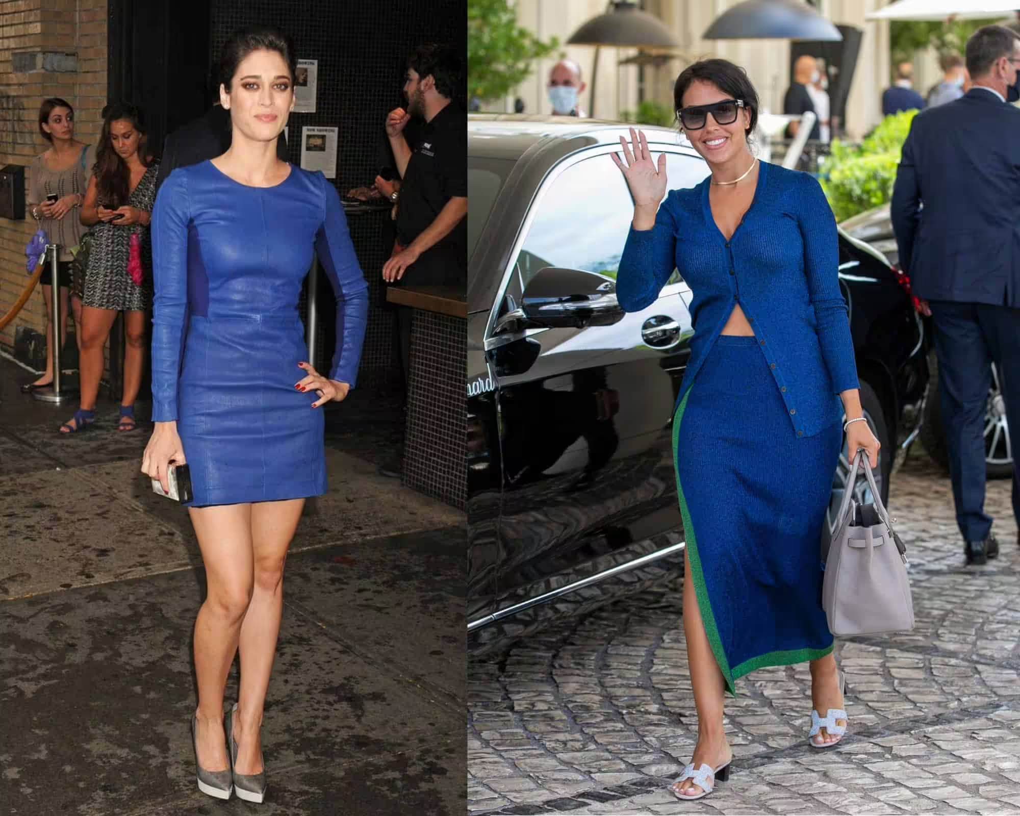
For the summer color type, one of the main colors from the palette is blue or smoky blue.
Therefore, blue is a rather predominant color.
Summer colors are characterized by the addition of grey.
Depending on its quantity, you can get completely different options: this is a summer evening, smoky blue, denim, and gray or greenish blue colored textures.
In the summer palette of blue, both light and bright or dark tones are acceptable.
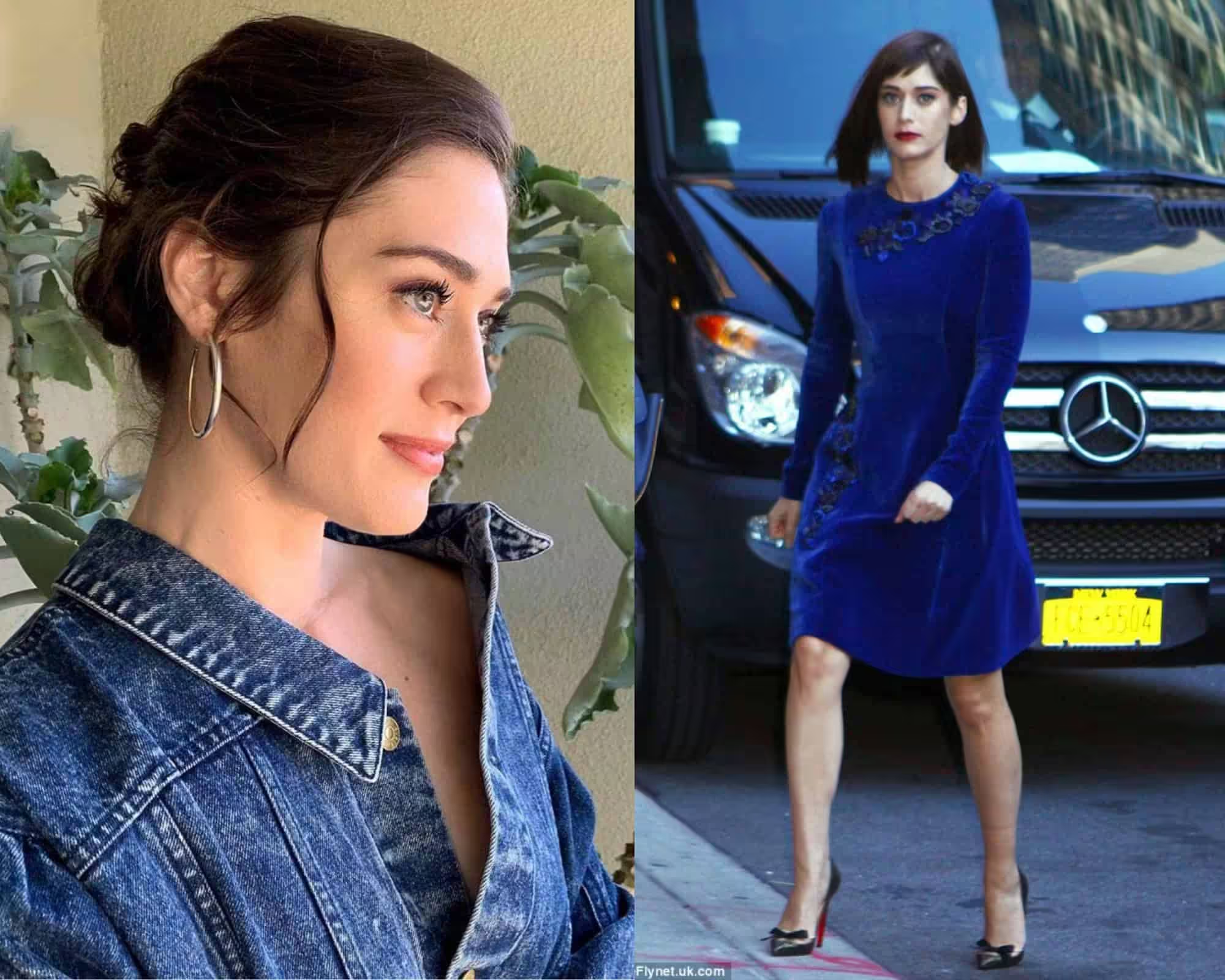
There is an opinion that only pastel colors are suitable for summer. It is erroneous.
Summer shades are simply not pure spectral colors, but their palette is quite wide.
The fact is that summer has a dim, non-contrasting appearance. On the contrary, she is very calm, refined, and elegant.
Therefore, too bright colors can suppress their nature.
At the same time, exquisite shades will only emphasize the natural beauty of the representatives of this color type.
But this does not mean that only faded, inexpressive shades are suitable for them.
It is enough just to add a little grey to the bright spectral color, and it can already be freely used in the summer wardrobe.
- Blue for winter type
Dusty shades for winter are not typical. Her wardrobe should be either bright blue colors (in the image – the fourth, seventh), or very dark.
Clean, untouched winter snow appears slightly bluish on a sunny day.
This is how the light blue palette of the winter color type should look – ice-blue shades heavily diluted with white, without adding gray.
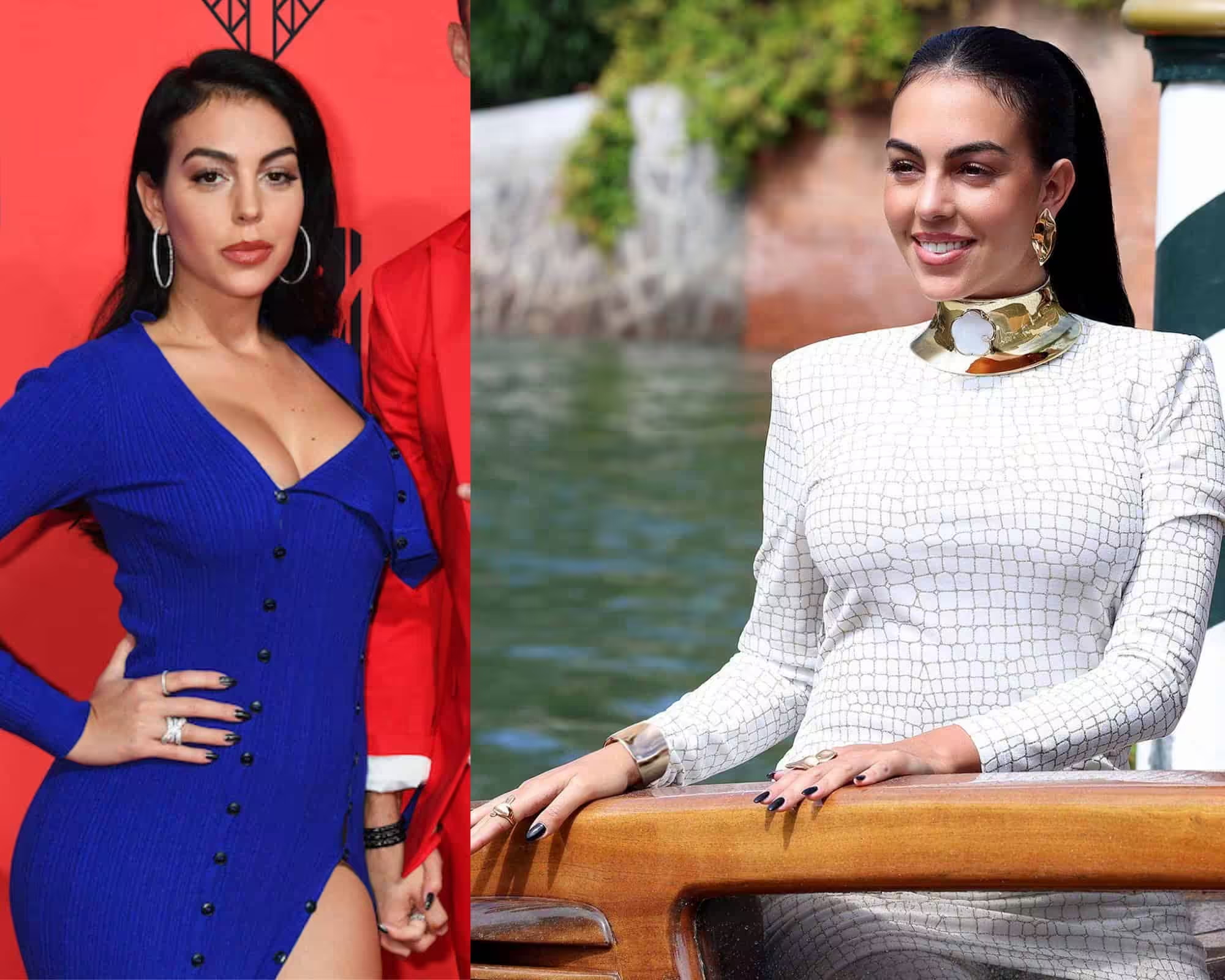
Among the blue shades for the winter color type, you can name options such as night blue, sea blue, azure, ice blue, cobalt, and indigo.
It can be either very light, bleached, very bright, or very dark colors – colors that create enough contrast (especially when the skin color is white).
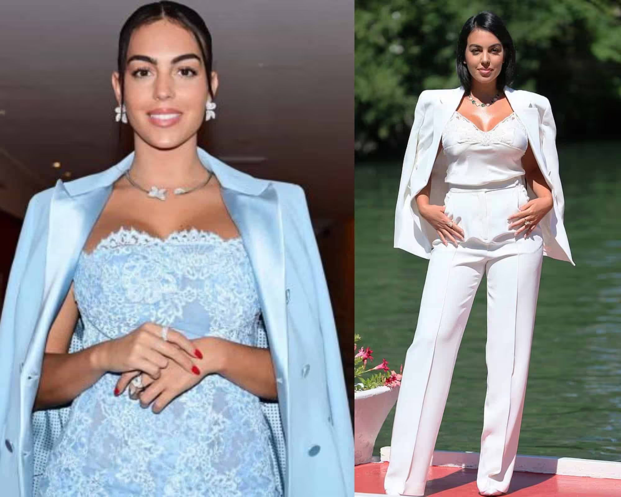
In winter, the appearance is extremely contrasting, which is unique.
Many bright winter colors can overwhelm other colors, making them soft, faded, and inexpressive.
- Green for summer type
In the photo, green shades are most suitable for the summer color type. The dusty turquoise fits like a glove here.
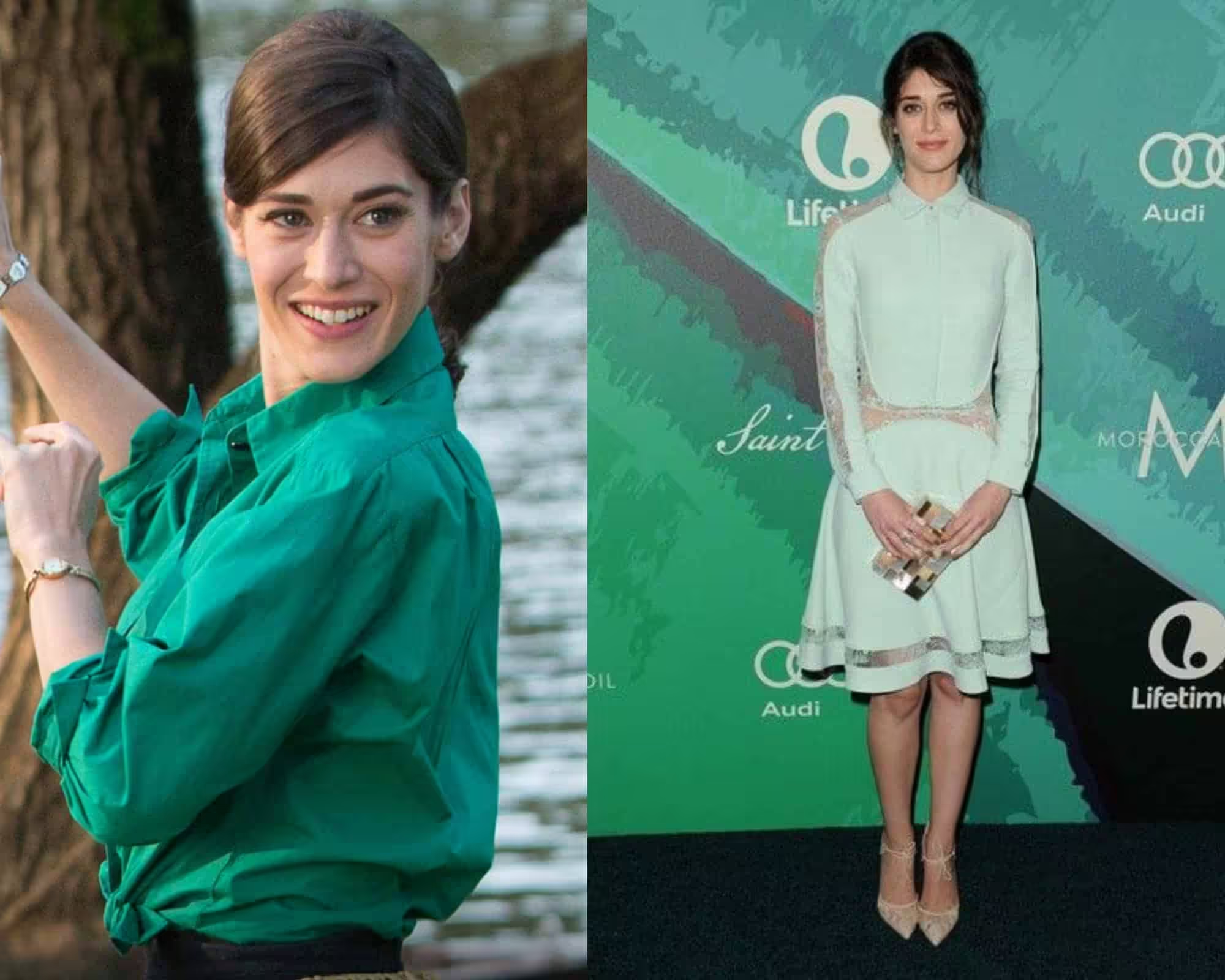
If you look at a garden or forest in the summer, you will notice that its greenery is no longer as bright as it is in the spring.
This greenery seems to be a little dusty.
Summer green is smoky grey-green, mint green, apple green, blue pine, emerald green, jade green, and blue-green.
In the summer range, there are no such dark colors as, for example, those found in the winter color type. They can be light or bright, but not dark.
- Green color for the winter color type
For winter, you should choose either dark, deep, intense green or very bright ones.
There are no nuances in the winter palette; everything is clear, vivid, and definite in it.
As stated previously, skin tone will dictate the potential shift to other color palettes.
Here we can spot a dusty turquoise – a summer color. It is advised against winter types.
However, let’s also consider the warmth of the skin.
This is the answer if you were looking into other palettes that are not “supposed” to fit you.
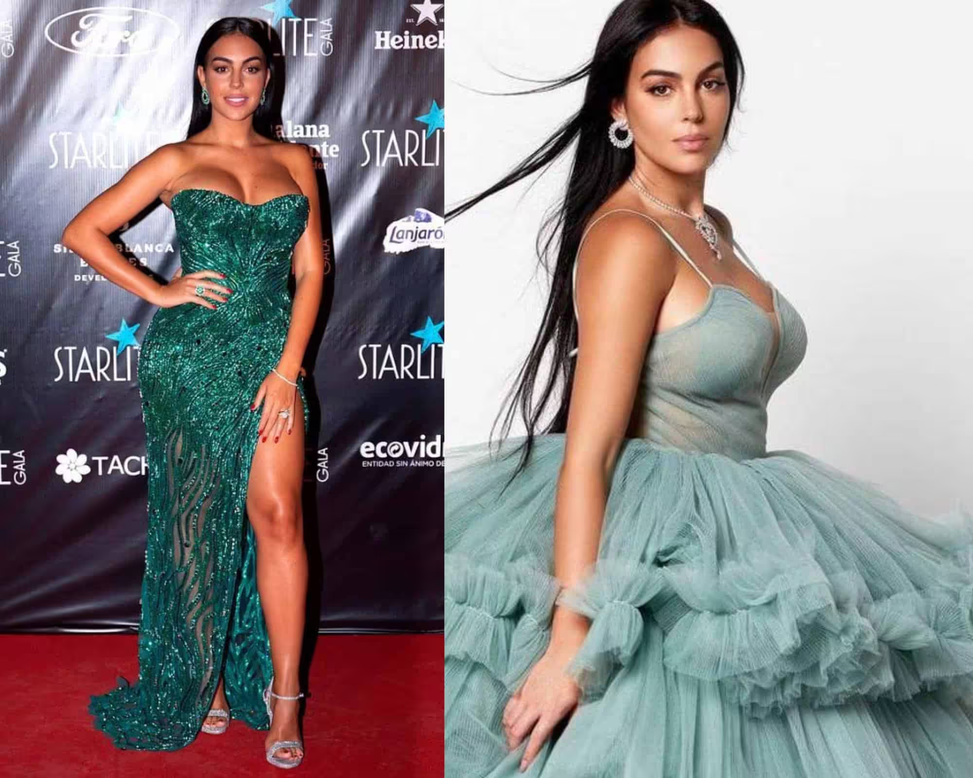
Winter greens include juicy greens, azure greens, turquoise greens, emerald greens, bottle greens, and coniferous greens.
As we can also spot, the Spring green fits well with the changed skin tonality (which is also a completely different palette type). This harmony creates a refreshing contrast that enhances the overall appearance.
Elements from a soft summer color palette overview can further enrich the style, bringing in gentle shades that complement the vibrancy of spring.
By blending these two palettes, individuals can create a unique and balanced look that transitions beautifully through the seasons.
In addition to this blend, exploring a soft autumn color palette overview can introduce warm, earthy tones that provide depth and warmth to the overall style.
This combination not only facilitates a smoother transition between seasons but also offers versatile options for layering outfits.
By thoughtfully integrating these palettes, individuals can curate a wardrobe that is both harmonious and dynamic.
- Green-yellow for summer color type
Since yellow originally refers to warm colors, there are not so many cold shades in it.
But it is they, and in their lighter variations, that is summer.
These are, for example, chrysanthemum yellow or the color of yellow daffodils – cold nuances of yellow diluted with white.
Roughly speaking, this is a lemon color diluted with white.
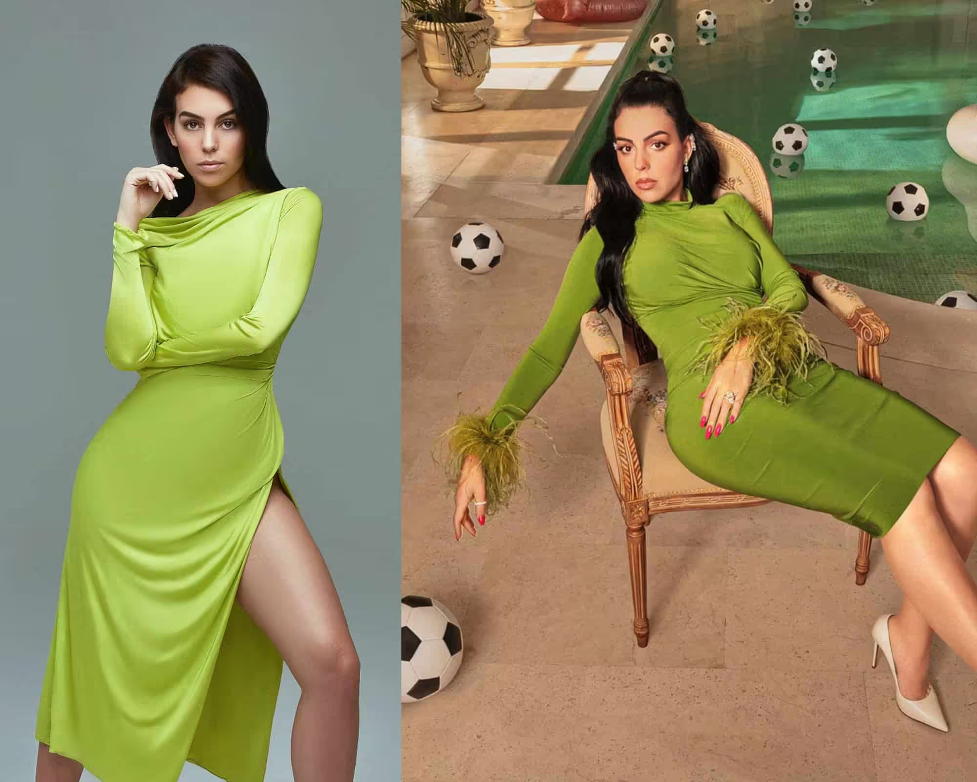
And the green-yellow spring color is a definite failure because that will also require her to change her skin color.
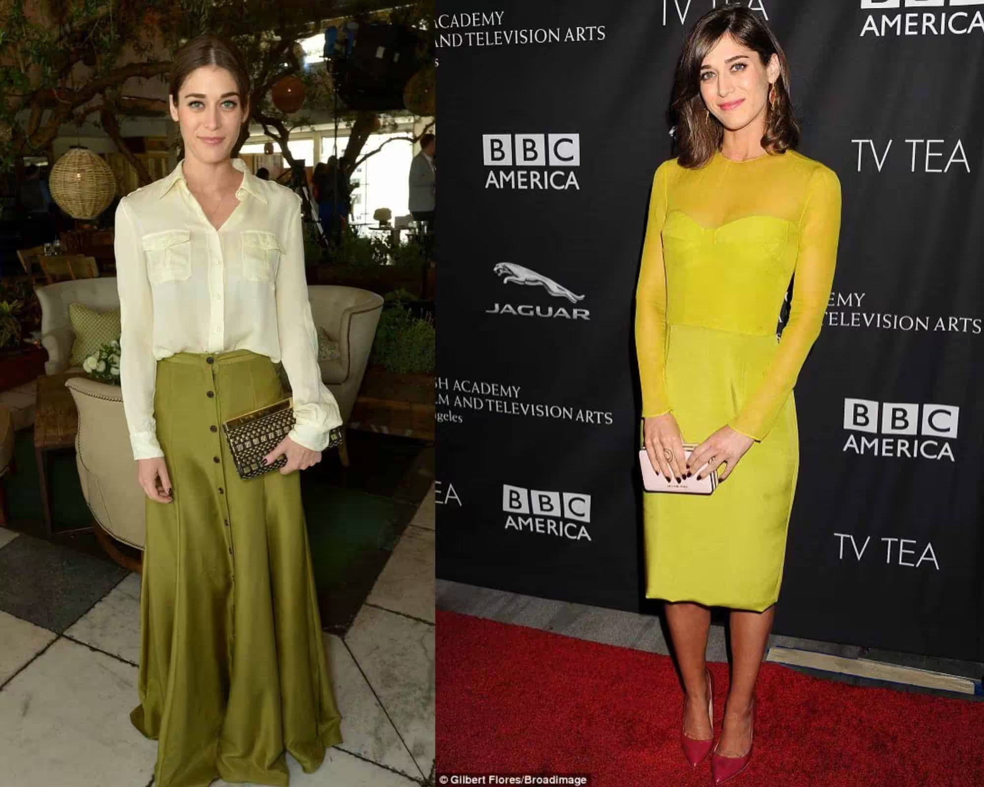
The yellow-green color looks good only on a tan.
In summer, when the skin is slightly tanned, yellow is very refreshing, and in the autumn-winter season, on the contrary, it can age.
The main feature of the yellow color is that it looks better, if not on very tanned skin, but at least on weathered skin.
The yellow color has another feature – it is chic in shoes and accessories.
Adding it to a set in the form of shoes or an element of an accessory group, for example, a bag, allows you to make a look more juicy, stylish, and interesting based on neutral colors.
For example, if you add it to gray or deep blue, it looks very impressive.
In general, yellow has the widest possibilities for combination with other colors; it is equally good with blue, green, and orange (if you are interested, here is an article on which color goes well with orange), and with lilac.
- Yellow color for the winter color type
When choosing yellow for winter, you should focus on metallic yellow or lemon.
With the variants of these shades, it is recommended to replenish the yellow range for women of the winter type.
Among them, there are no warm shades; These are bright, expressive, cold colors.
Do not forget that yellow requires a tan.
- Neutral colors for summer type
If neutral colors in the wardrobe spring should be represented by shades with the addition of yellow, then pink or blue should be present in neutral summer colors.
These shades include coffee with milk, cappuccino, mochaccino, rosewood (brown with pink added), milk chocolate, and beige-grey shade.
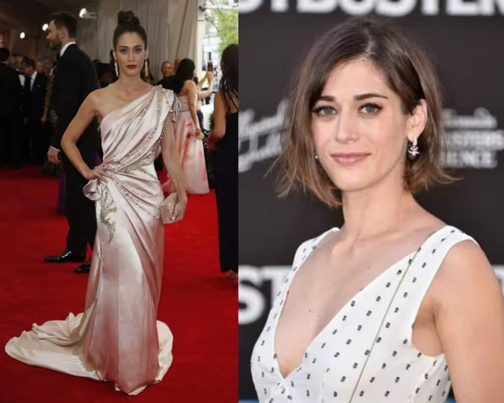
In the photo: a neutral white range for the summer color type.
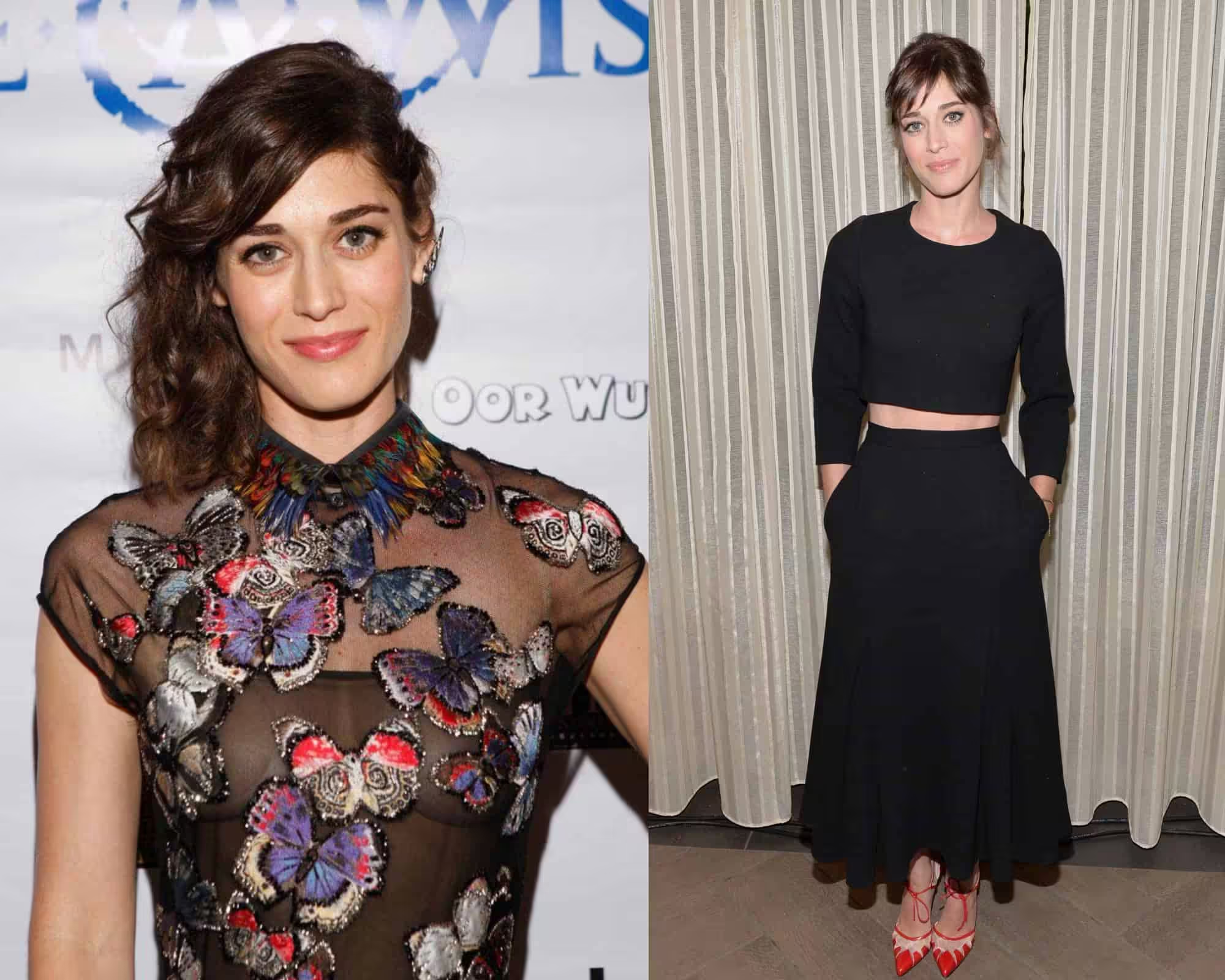
We come back to the black color here. It is obvious that harsh black “eats” her up, and for this reason, she would be advised to wear it only with very light, almost transparent fabrics like lace.
Chocolate looks great when there is a consistent shade in the color of the exterior.
Then it is allowed to be used in large quantities.
A woman with chocolate hair and brown eyes can wear a chocolate dress without feeling overdone.
But a chocolate dress will look gloomy on a blue-eyed blonde or someone with a very delicate beauty.
She can use chocolate in shoes, purses, and accessories after all.
Black is a color that suits the winter color type. In summer, it is replaced by graphite, a very dark grey.
Neither spring nor autumn has black in its palette. It will crush them.
You should not choose colors that do not look perfect on you, no matter how much you like them.
No need to try to change your appearance. You need to use what suits you, and this is your big secret.
If you are summer, do not try to be fatal in winter, be refined, elegant, and feminine.
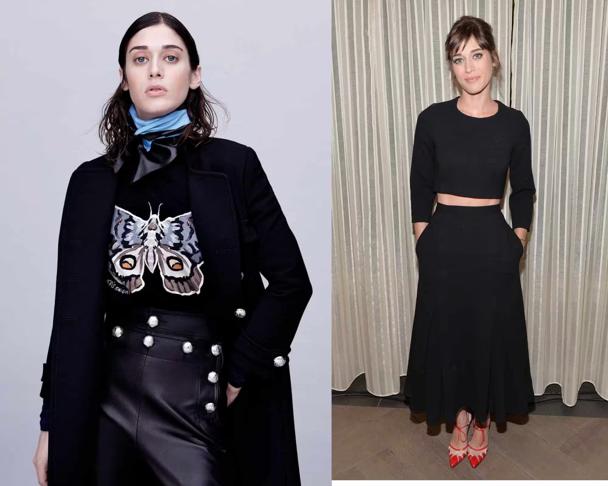
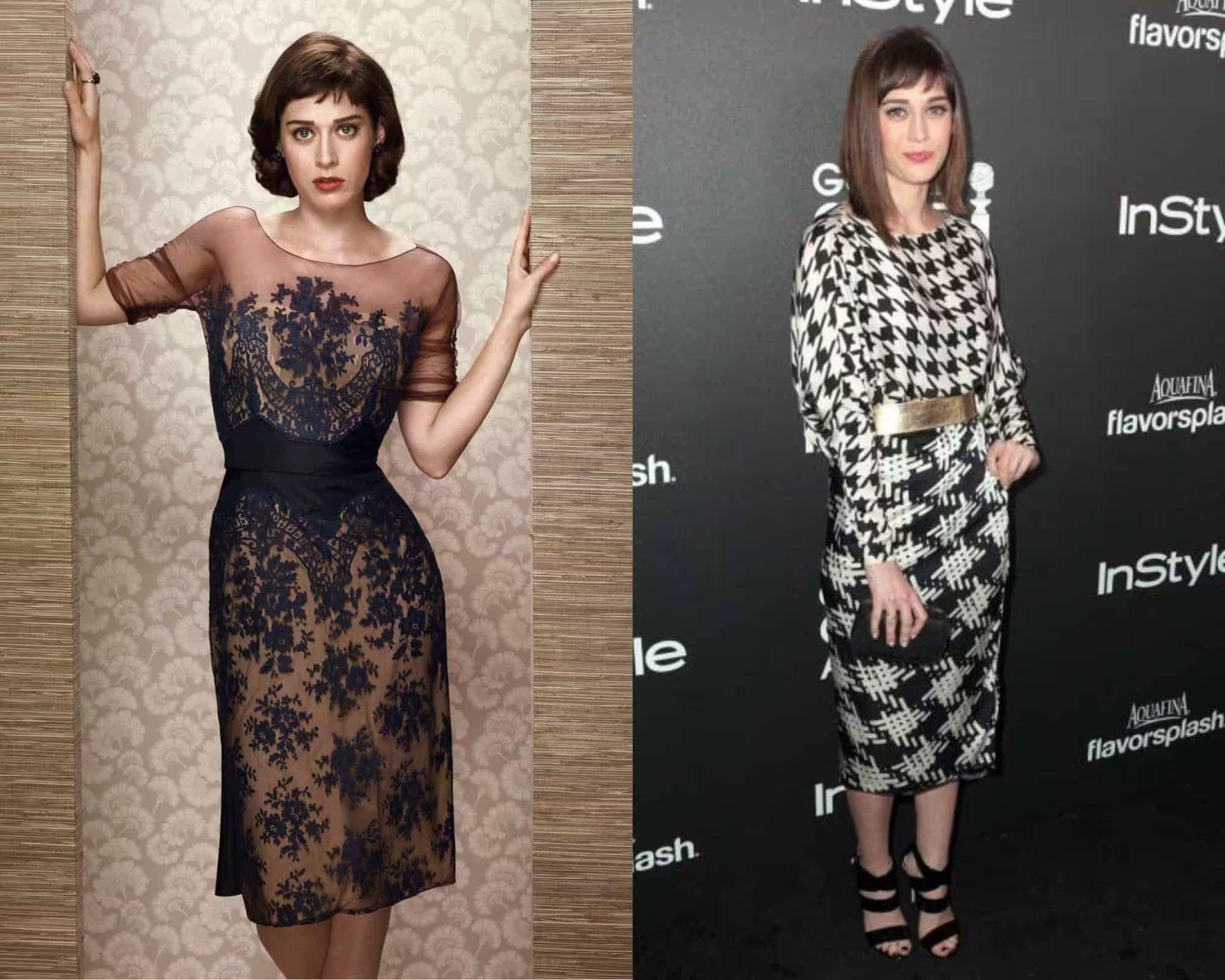
Black is also accepted if it has a print or a disseminated pattern, where it visually creates a grey effect.
There are a lot of gray shades that match the color of summer.
These are silver-grey, grey-blue, ashy, smoky, and graphite.
That is, the grayscale for summer is expressed by the whole spectrum, from pearl grey to graphite.
Everyone knows that there is a classification of appearance by color type and that each has its own palette of colors.
However, there are cases when it is necessary to use a shade of a different color. In particular, this may be necessary for the manipulation of impressions.
For example, blue is the color of power, and sometimes there are exceptional situations when a woman should ignore the rules. By choosing a stronger winter color, she can make some desired impressions.
It can create an emotion and create an association because this color will look stronger because it is deeper, more intense, and richer than summer.
- Neutral shades for the winter color type
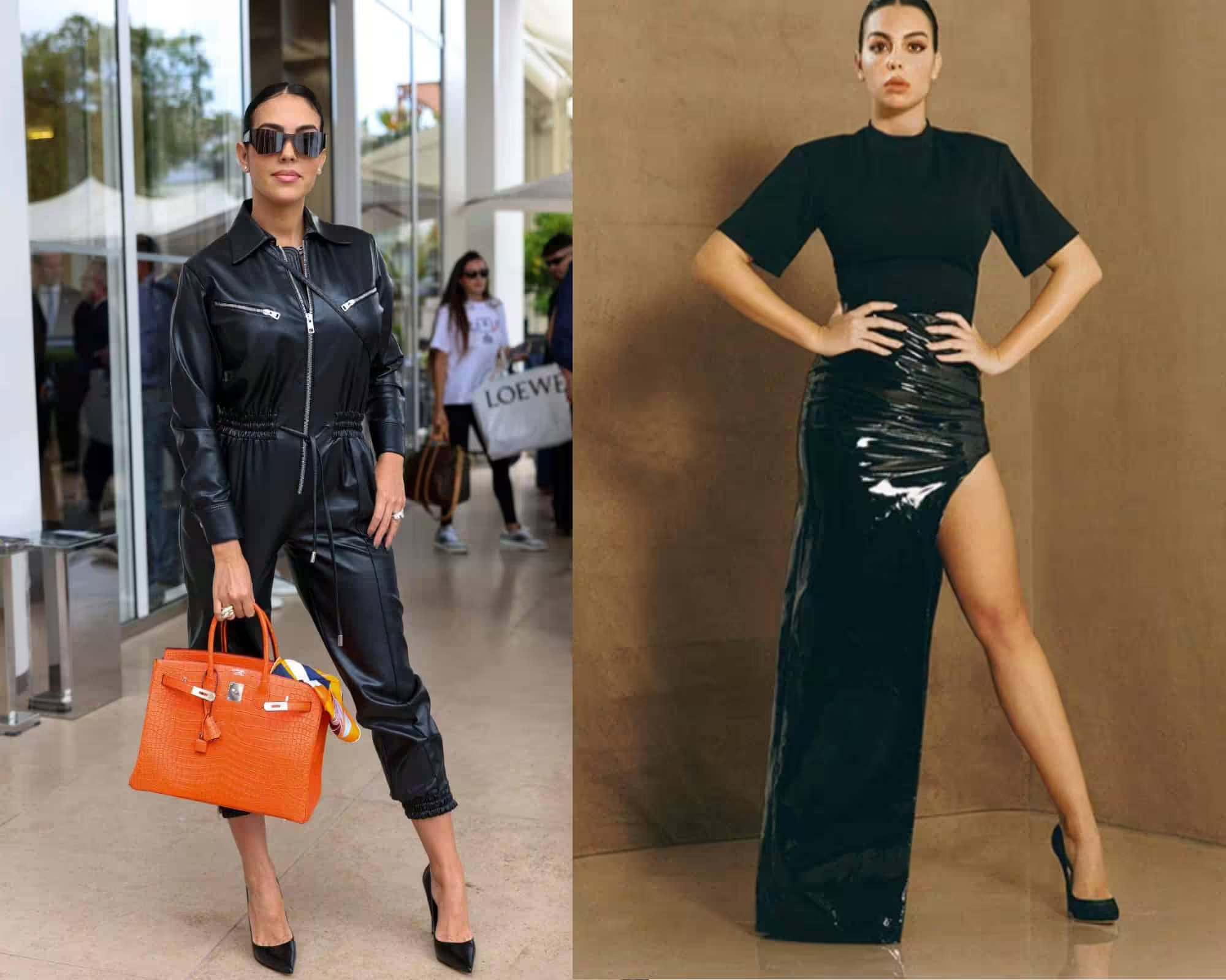
When choosing neutral shades for a winter woman, you should focus primarily on cold shades of black and deep grey.
For example, anthracite, black grey, steel grey, silver grey, ice color, and bluish grey.
Variations on the theme of brown are also expressed in cold shades. The shades of “chocolate” and “bitter chocolate” are very suitable for the winter color type.
The photo below shows the grey options that are most suitable for winter.
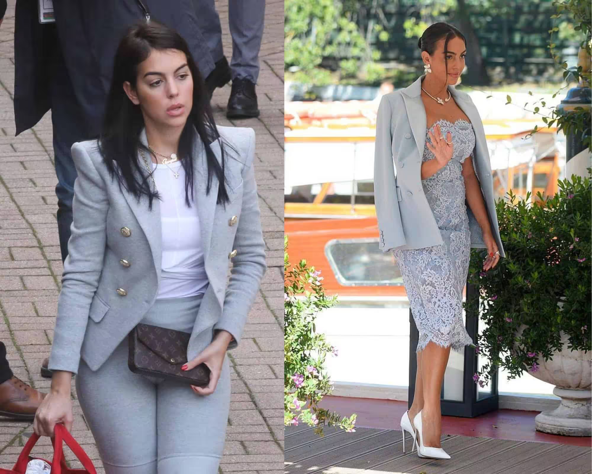
A deep grey – is a great solution because of its high contrast, and a summer light grey – is a bad solution (no contrast and immediately eases the whole appearance down).
A light grey with tan – a beautiful solution (then again, because the skin color is charged).
In the winter wardrobe should be only the purest grey shades.
True winter is almost the only color type that fits with pitch-black and squeaky white.
Prints for Georgina should be of a smaller size.
Otherwise, they will emphasize all the voluptuous sides of her body and make it even bigger.
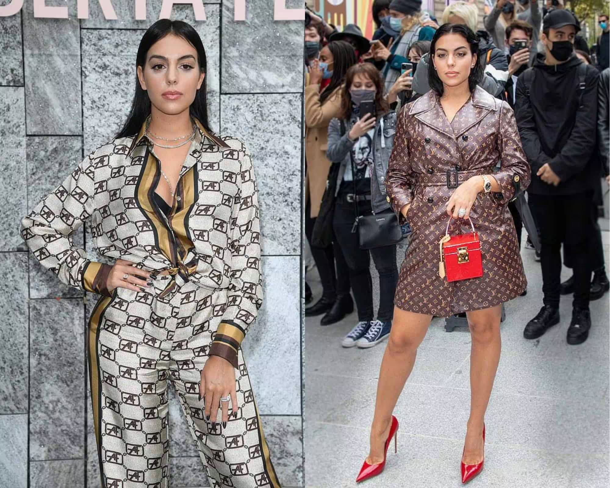

Textures for winter type

Needless to say, but it is obvious that the textures of fabrics need to reflect the essence of the personality.