Dark Autumn vs Soft Autumn Myths And Aura Colors

Are you not sure how to determine Dark Autumn vs Soft Autumn?
This article will show you!
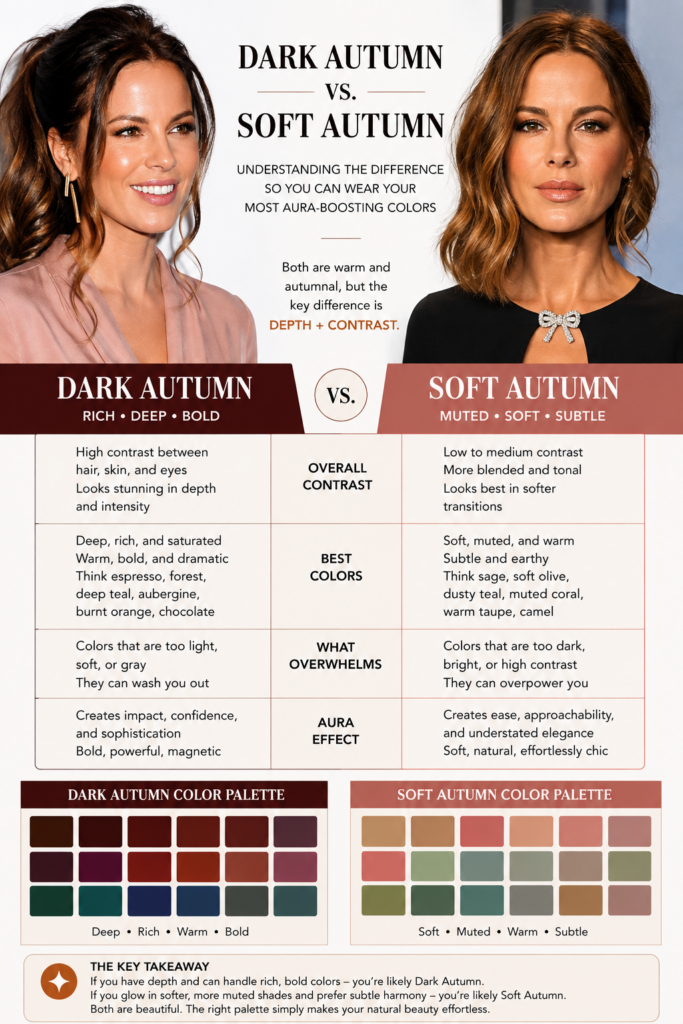
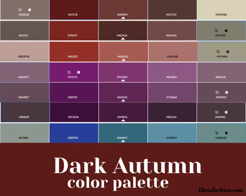
The Dark Autumn color palette, a sophisticated spectrum of deep, rich hues, draws its inspiration from the natural world as it transitions into cooler months.
This palette is characterized by its depth and warmth, evoking the feeling of a forest floor in late autumn, bathed in the soft light of a setting sun, or the plush velvet of a king’s cloak.
It’s a palette that speaks of quiet confidence and an understated elegance.
Understanding and utilizing these colors can significantly enhance personal style.
Defining the Dark Autumn Color Palette
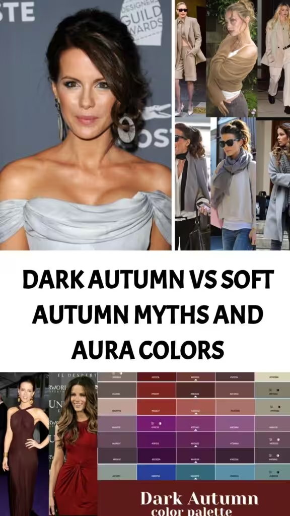
The Dark Autumn palette is distinguished by its deep saturation and warm undertones, leaning towards the richer and more muted side of the spectrum compared to other Autumn classifications.
Think of the colors found in dark, fertile soil, the leathery leaves of oak trees, or the glint of dark, polished wood.
Defining Soft Autumn Color Palette
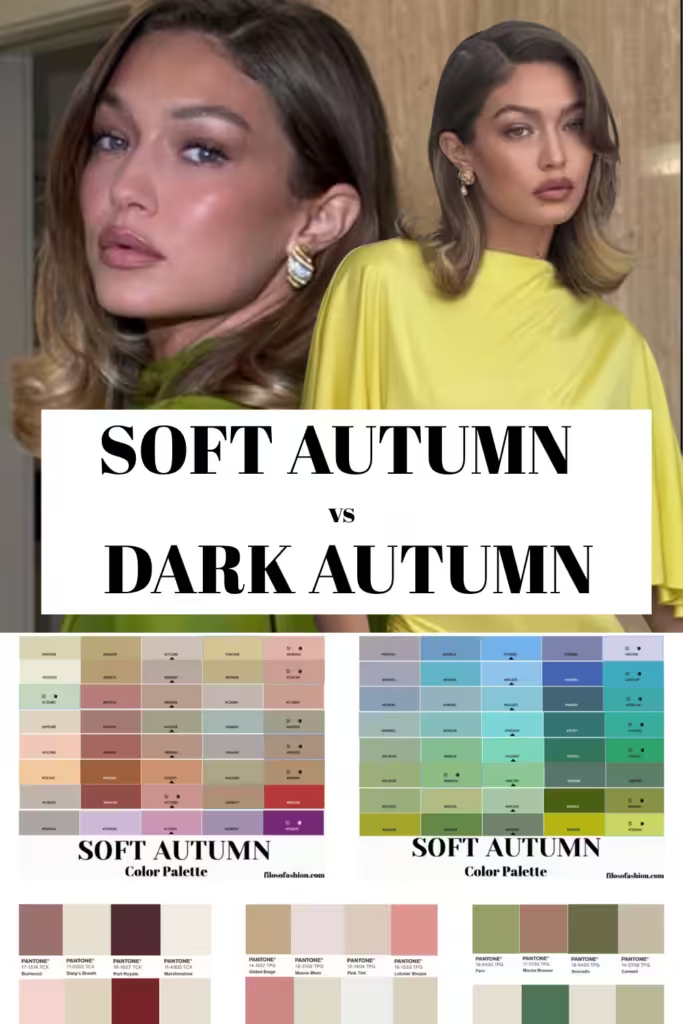
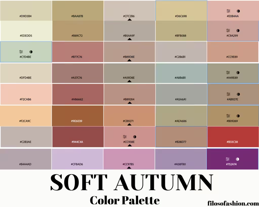
The Soft Autumn color palette is a descriptive term used in color analysis to categorize individuals who tend to harmonize with muted, warm, and earthy tones.
The core principle of Soft Autumn is the presence of both warmth and softness in a person’s natural features.
This means that while their underlying skin tone leans warm, the overall impression is not of high contrast or intense saturation.
Instead, the colors that complement them are as if seen through a gentle mist or filtered sunlight.
These are not the vibrant, highly saturated colors of a “True Autumn,” nor the cool, muted tones of a “Soft Summer.”
Soft Autumn sits at a unique intersection, drawing on the warmth of autumn while softening its influence.
The colors are generally low to medium in value and saturation, with a clear leaning towards warmth.
A specific range of hues characterizes the Soft Autumn palette.
These colors exhibit a moderate temperature, leaning warm but not overwhelmingly so.
They possess a muted quality, meaning they have been desaturated to some degree, akin to colors found in nature that have been softened by atmospheric conditions or age.
This muted nature means they do not shout for attention but rather create a harmonious and subtle glow when worn by those they suit.
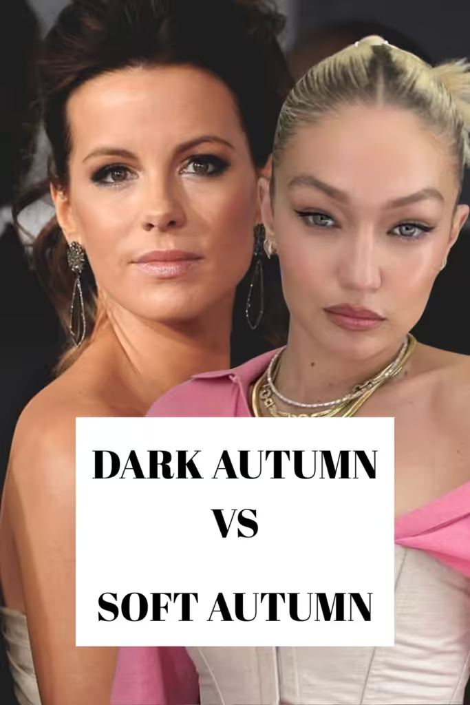
Today, I will discuss Kate Beckinsale, who was previously typed as Dark Autumn, and see why it’s not the right color type for her, and Gigi Hadid, who was typed as Soft Autumn, and what she actually is.
Plus, to make it more interesting, I will “channel” their auric field (P.S.: I am an Akashic Records reader, and I work with Oracle at this website) to get their Aura colors, chakra colors, and see what colors would be actually helpful to them. This is for entertainment purposes only.
So, I’d start with Kate Beckinsale and her color analysis.
And for those of you who think that we cannot type celebrities because we don’t have their real, no-makeup pictures is wrong.
With celebrities, it is even easier because they already have numerous pictures out there in different colors and different lighting throughout their lifetime.
So we can actually access their colors very well.
Now, bear in mind that she was “typed” (P.S. by others, not by me) as a Dark Autumn color type.
If you are a Dark Autumn is very earthy, deep, dark, mysterious, but warm as if you are starring in a Sweet November kind of type.
Here, you can also read a previous post on Deep Autumn vs Soft Autumn featuring Heiley Biber and others.
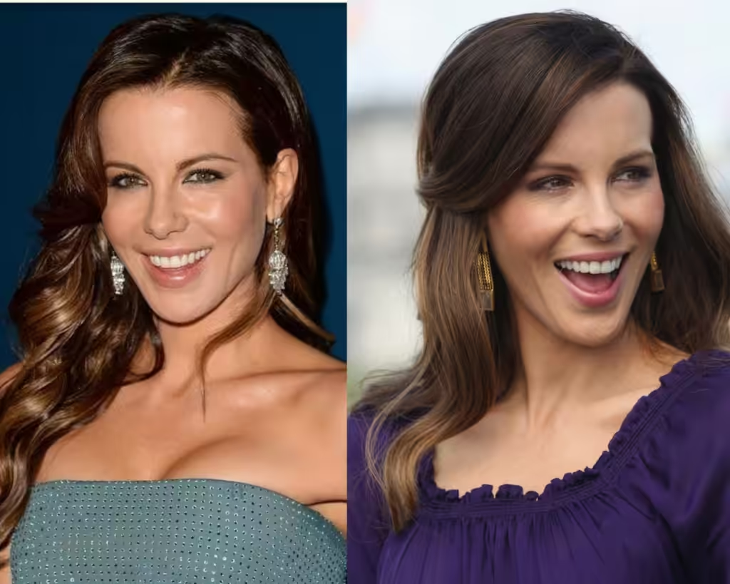
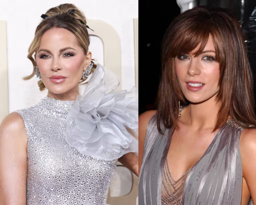
Kate has brown hair and hazel eyes, and we will see that she is actively trying to resemble a Latin American appearance, which she does not.
She will bring on some more contrast by darkening her hair, and her tan will be visible more and more.
When we look at this picture, it is not clear what could fundamentally go wrong, since all the attributes seem to be there, yet something is off.
It’s going to be her skin type that cannot handle the depth of the color, especially with age.
It’s obvious right away that the deep purple, which is the amalgam of the Dark Autumn palette, is way too intense for her. I like how teal blue works with her way much better.
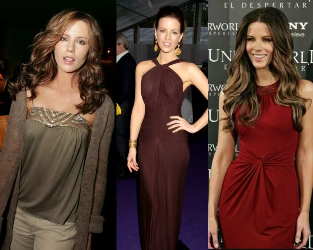
Here I gathered all the earthy tones that belong to Autumn – if you are one who sets, it would work wonders for you.
As you see, even having brown, earthy hair color and hazel green eyes doesn’t mix well with the brown shades of her outfit. And the problem is the skin + undertone.
The red earthy tones with golden jewellery dim her appearance, making her more “invisible”.
Her eyes don’t stand out, her hair is not lustrous, and it’s not creating a good, flattering contrast.
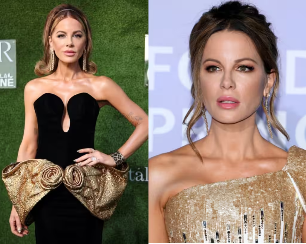
Now, gold is supposed to fit like a glow if you are an Autumn type – here is see that it rather weighs her down.
She looks sort of “heavy,” which adds more “age” to her appearance.
And these two pictures are clearly taken at different times, and still it looks extremely heavy on her, like when a teenager would wear a Chanel tweed suit – completely off.
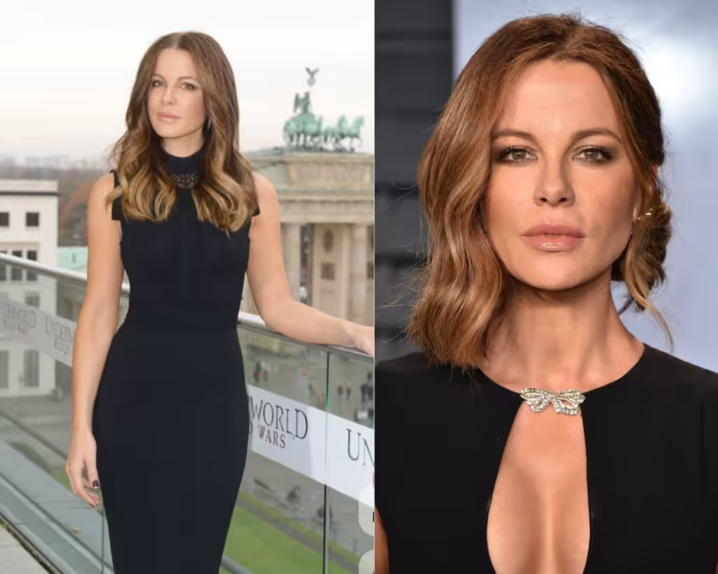
When it comes to black, it’s also one of Deep Autumn’s hidden secrets – very often, they can wear it because it contrasts well.
However, here, we see that the color actually outshines her appearance – it’s too strong.
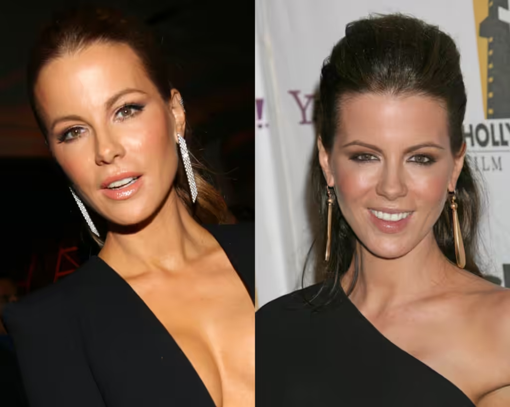
It’s also how the silver and golden jewellery work right near the face. Which variant do you actually like better?
I see silver that is actually brightening her appearance – it’s actually becoming brighter, while golden earrings actually weigh her down, and it feels like these long earrings are actually heavy.
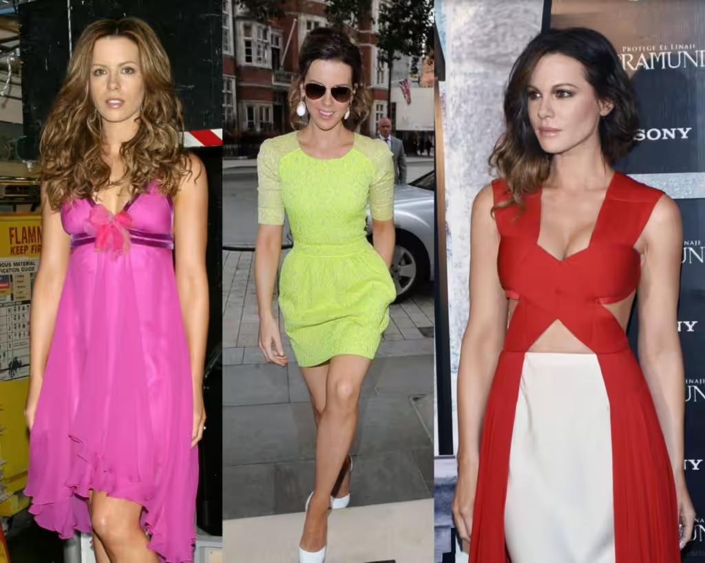
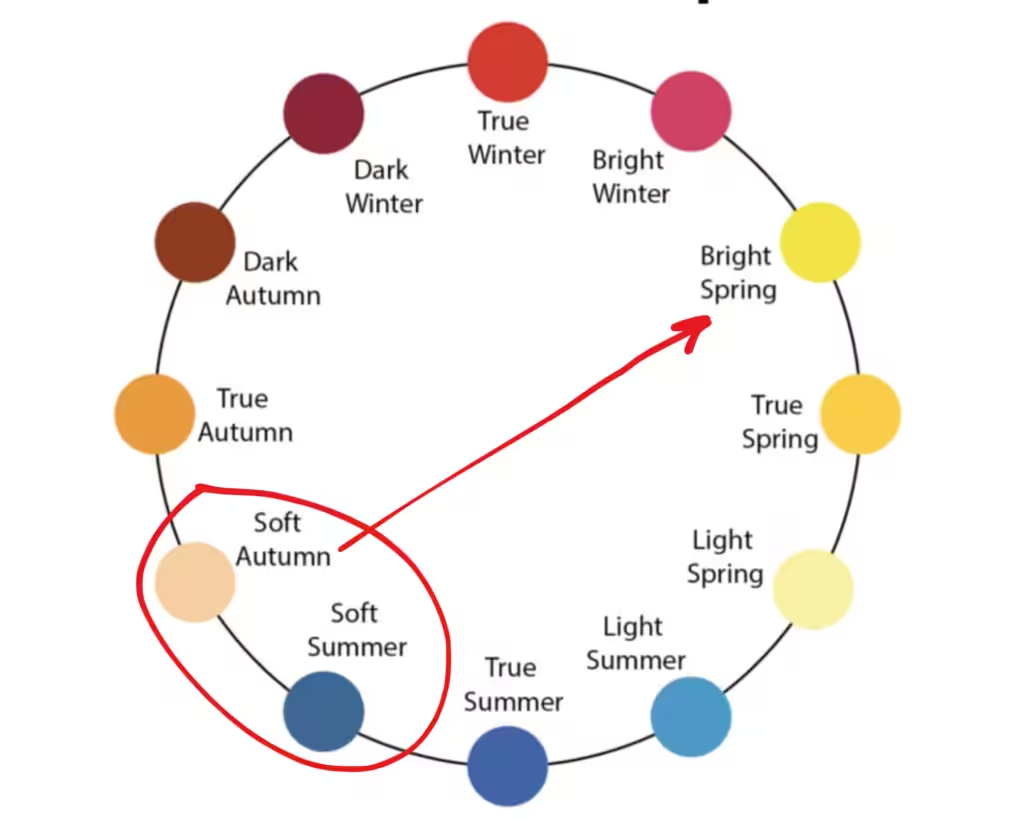
Autumn type is the most versatile color type, as it can easily shift to Bright Spring, for example, where bright pink, neon green, and bright red would suit its warm, tanned appearance very well (even Soft Autums).
But I see otherwise, all these Bright Spring colors outshine her; they go completely off with the skin tone, which shows on her face right away.
She lacks the natural contrast.
Her actual contrast is very low.
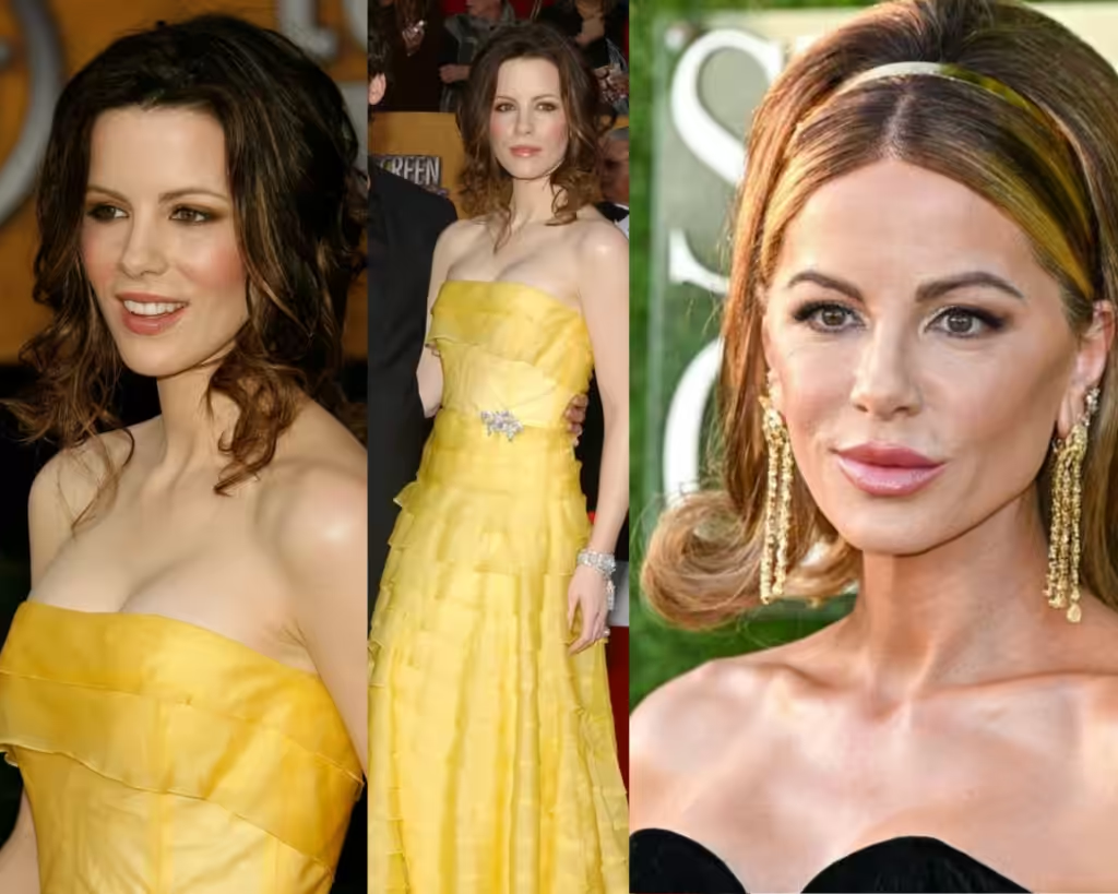
Now and then, pictures show that the coloring she chose is wrong for her type.
The yellow does not complement her.
Take a closer look at her snow-white, delicate skin, her low-contrast hair color, and her muted eye color.
Even now, if you look at the “fake tan” and golden jewellery, it creates an undesirable aging effect, as if she shouldn’t try to make herself look warmer.
As if she is trying to be like Eva Longoria or Victoria Beckham. Kate is way more delicate for all this high-contrast “posh” effect.
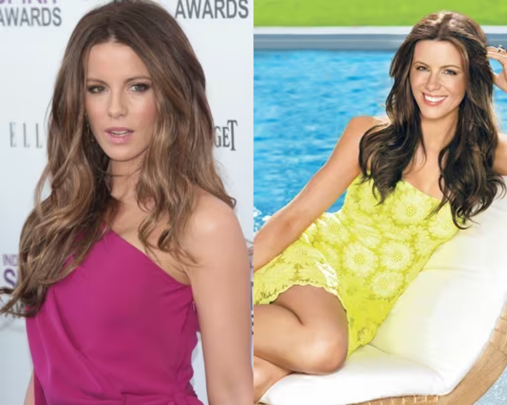
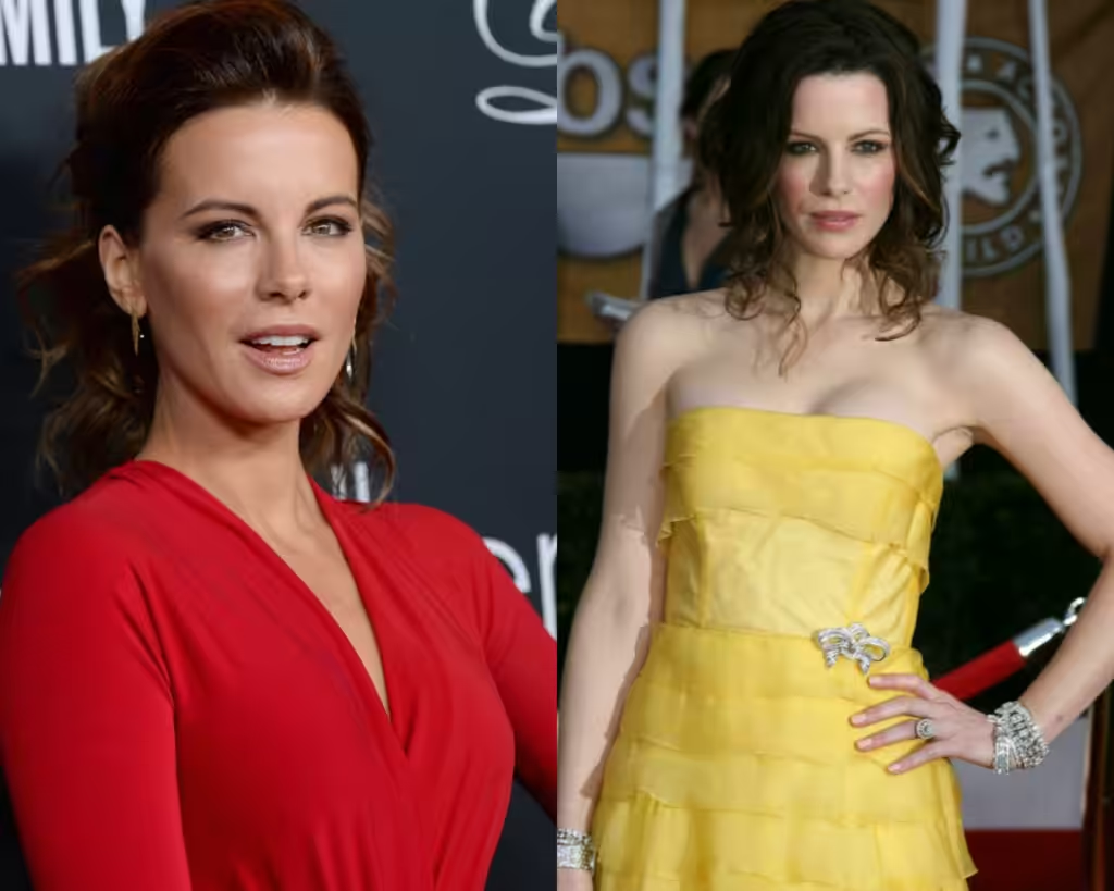
As you see, none of those bright colors fits well for her. So, what does look good on her?
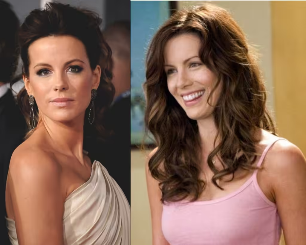
Soft pastel colors soften her, making her look like herself.
She looks calm, peaceful; these colors look like her cup of tea.
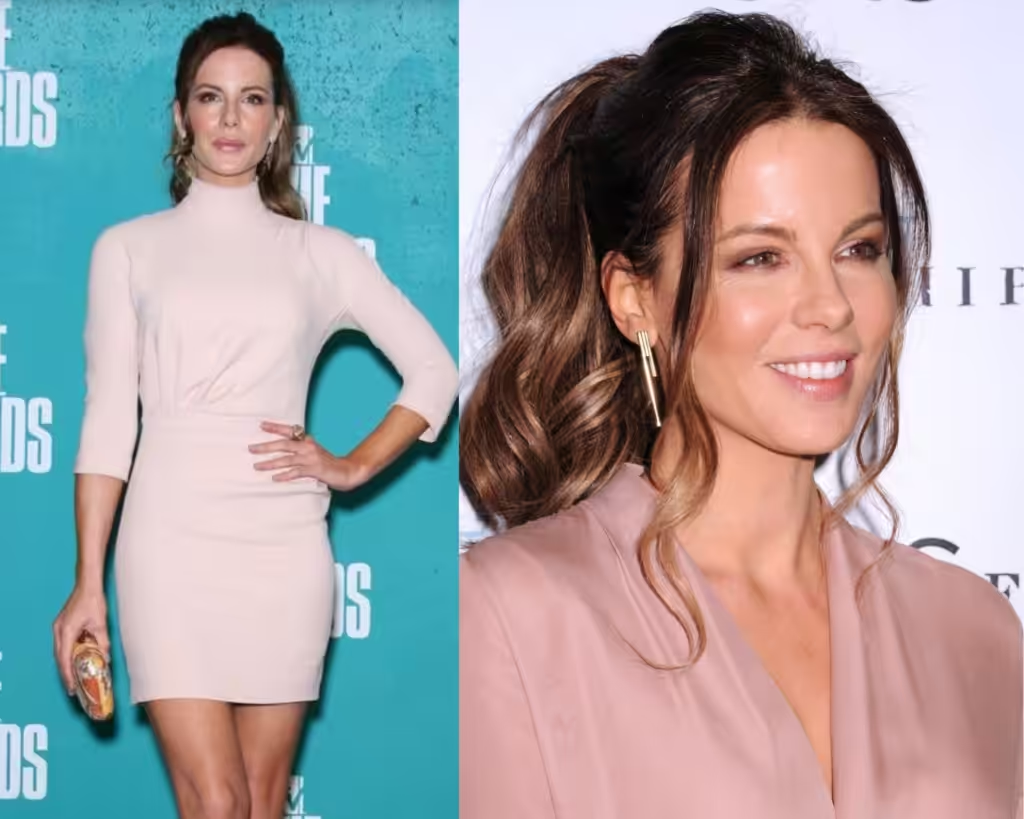
Beautiful elegance is where she needs to be directed at, not exotic, golden, bright Latin American style and colors, but super elegance, sort of the way Kate Middleton dresses.
Look at the way her face changed with the heavy gold, black, or deep colors – it’s magnificent what a color and simple elegance could do.
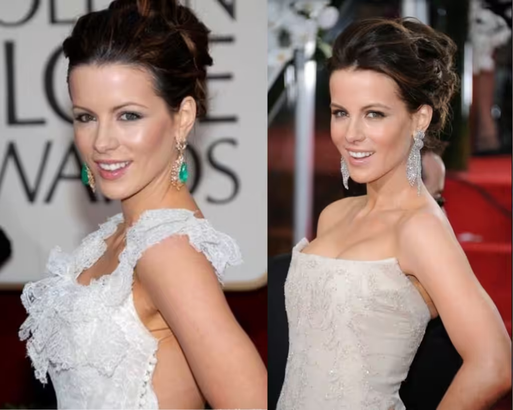
Light, delicate tones – a top-notch choice for her. Silver earrings look much better right near the face, emphasizing beautiful skin tone.
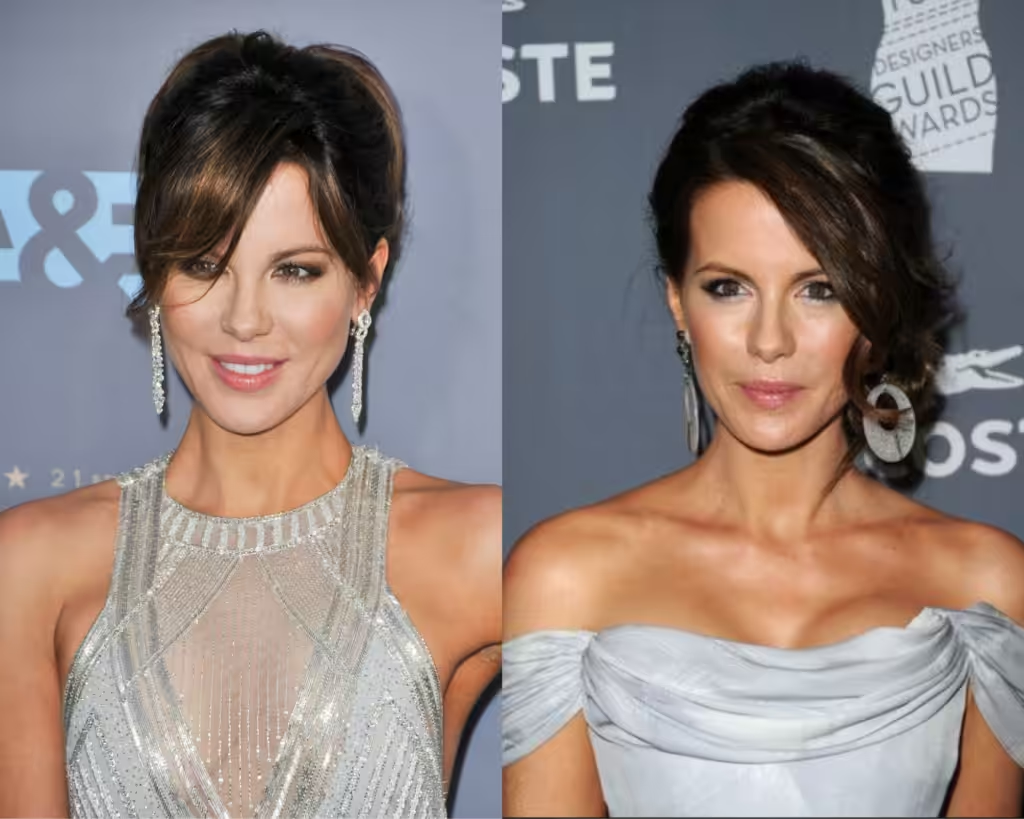
Here we see two variations of silver – this is the best choice as silver and grey can be peaceful and monotonous, and it can be shiny.
Both variations work very well.
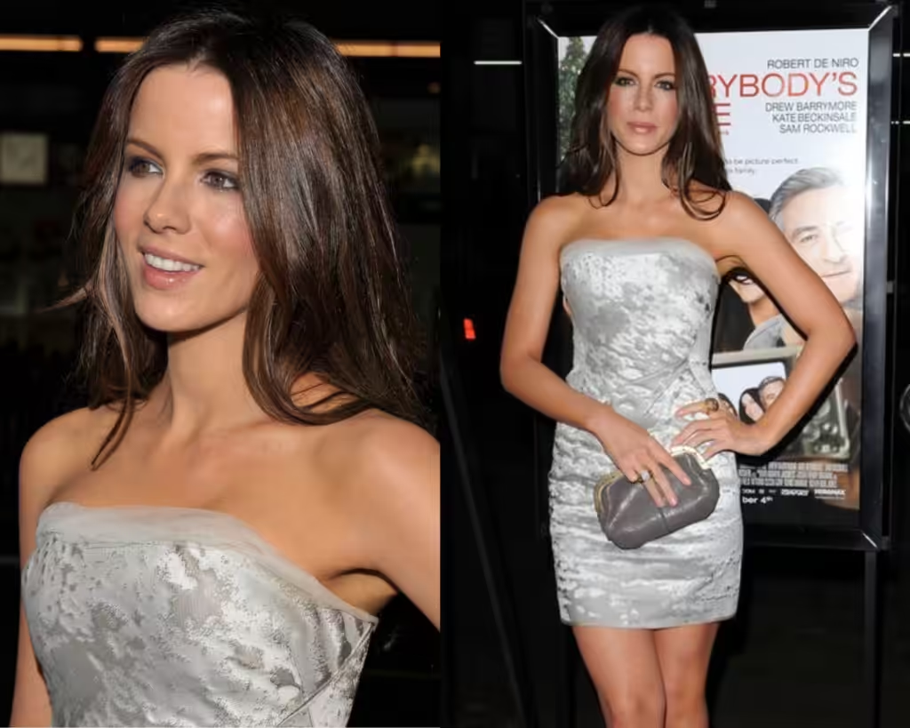
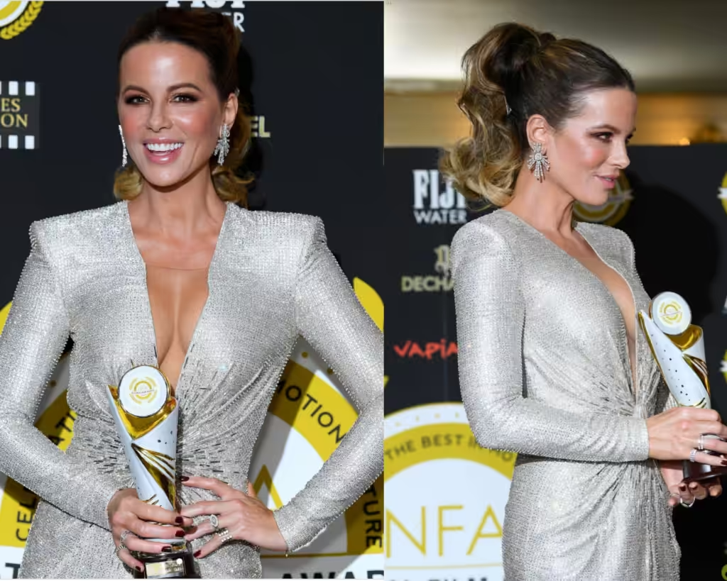
Now and then – it is and always was her best choice, silver, light, pastel shades, regardless of the tan and warm appearance attributes.
The key to your own analysis will always be the skin.
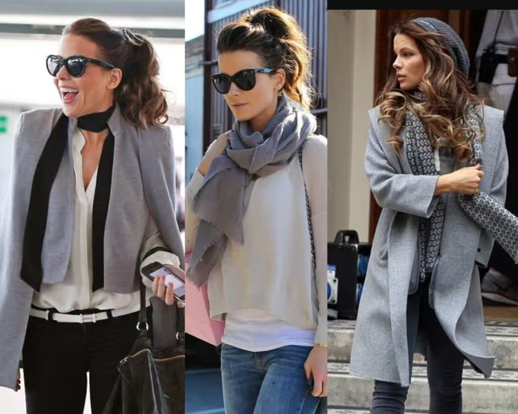
It doesn’t need to be a parade all the time with nightgowns, even everyday casual things all fit her appearance very well as long as it’s light grey, a pastel shade.
And by concluding this analysis, if Kate were typed by me, I’d put her in the category of Soft Summer color type.
Gigi Hadid Color Analysis
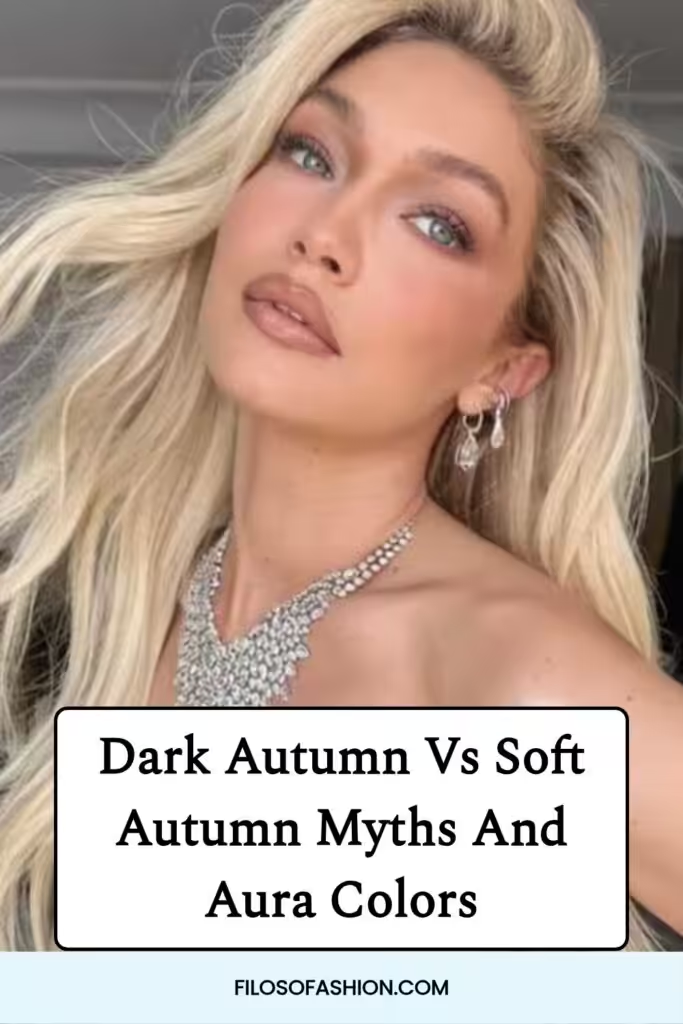
And how I’d like to see Gigi Hadid, who was typed as a Soft Autumn type.
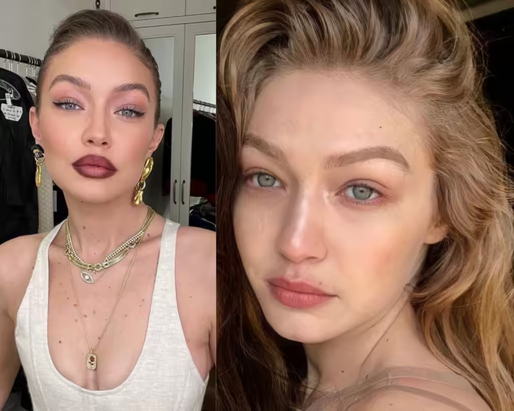
I think Gigi is a very good candidate to be a Soft Autumn, but we shall see if that is all she actually is.
She has quite interesting features; her eyes are light, and her skin tone is rather delicate. It’s quite rare that Autumn types would have such delicate attributes.
Usually, this skin type is an attribute of Light Summer or Light Spring.
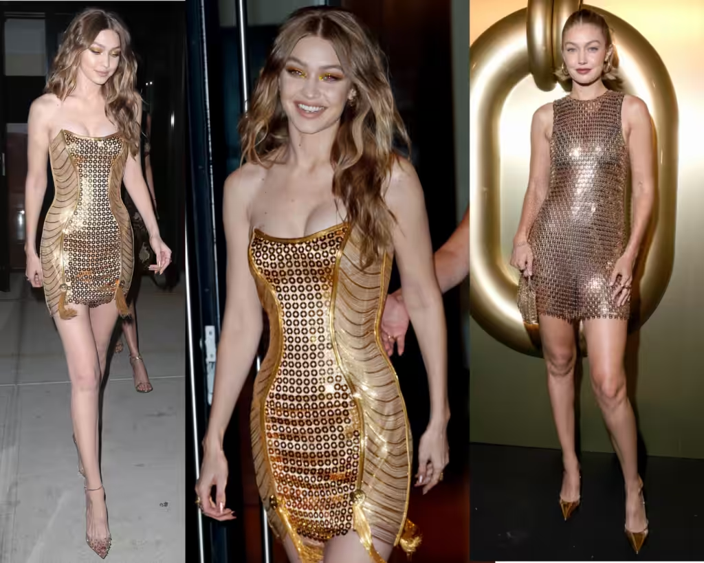
I must say that gold looks very well for her – it matches her hair color, and it’s not strikingly off.
There is no contrast conflict.
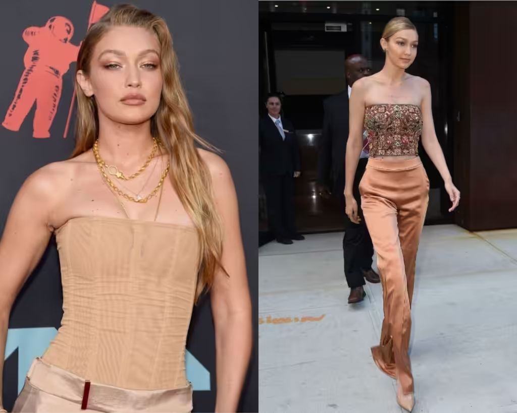
Warm beige, copper shades all fit very well for her – golden jewellery, golden copper eyeshadow outlines her eyes and makes her appearance brighter and better.
It tunes in with her.
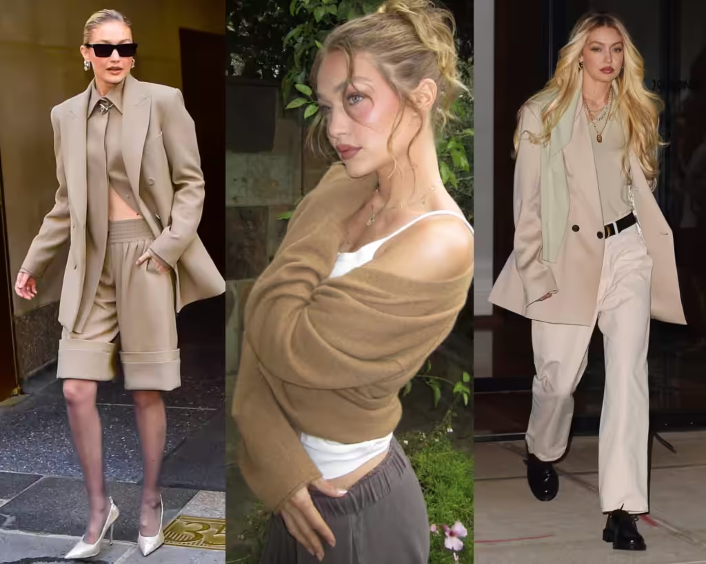
Unlike Kate, Gigi actually looks very good in Soft Autumn colors – it looks like she looks very well without trying too hard.
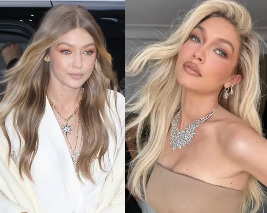
Her tan could be different, her hair color can be really different, and light and pastel colors work wonders for her.
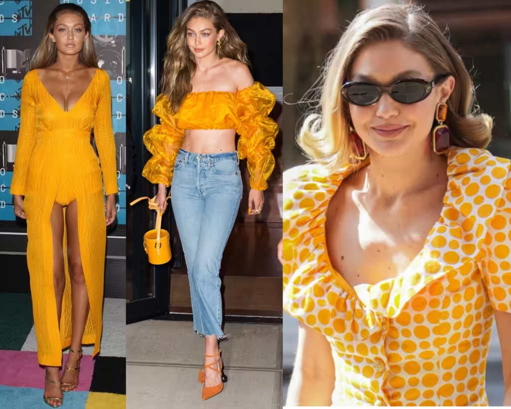
Mustard yellow – not everyone can pull off this color, which is predominantly for the Autumn type.
It fits like a glove with very tanned skin and very white, non-contrasting skin color.
That’s a tricky one, for example, Kate would not fit well with this color, and it doesn’t matter how hard she tries to tan.
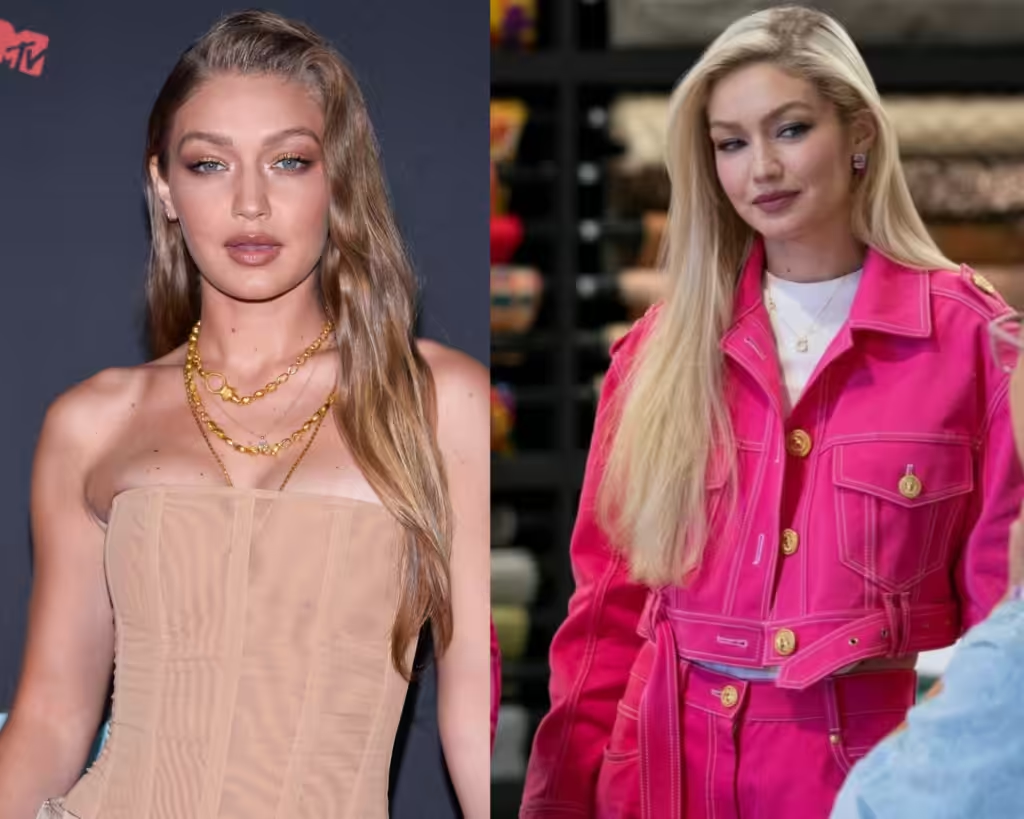
I like how pastel beige-type shades work for her, but she also looks good in Bright Spring colors like pinks, greens, yellows, etc.
They actually work well for her.
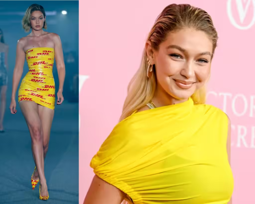
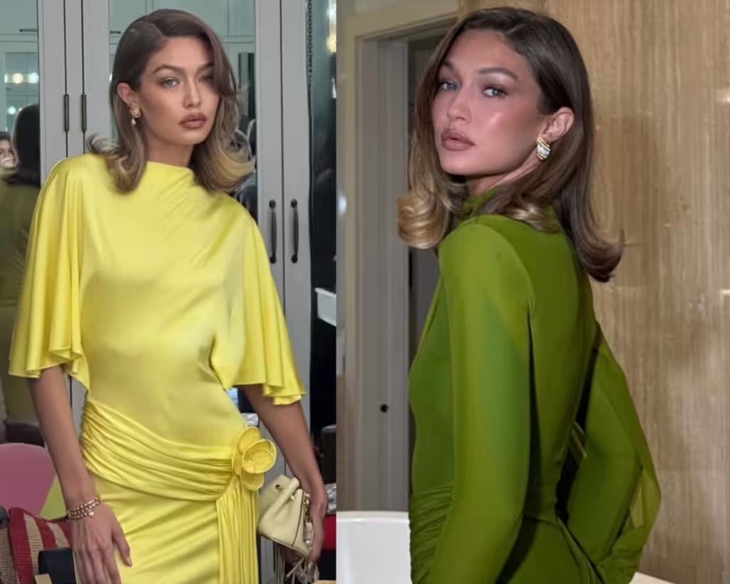
All these colors work well for her. Not a lot of people can afford to wear such bright colors. bright yellow.
Usually, that is a case when you are an Autumn type. And you would know that if you follow my Color Palette Constellation analysis.
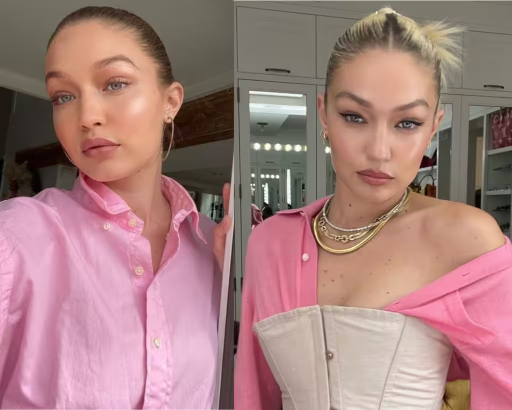
Light pinks are magnificent for her it actually emphasize the delicacy of her skin type.
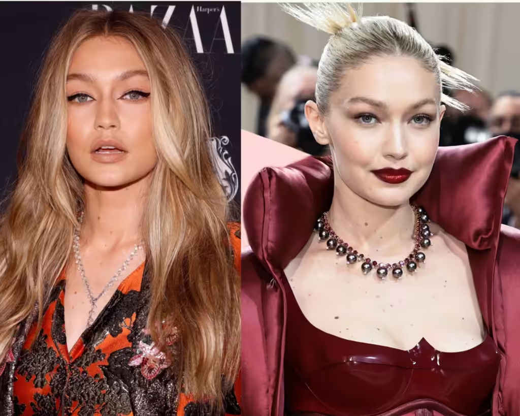
Very high contrast is also for her – yes, it’s deep burgundy and orange, but she definitely can wear it, bringing more contrast with the makeup.
But how does she look in colder tones like silver?
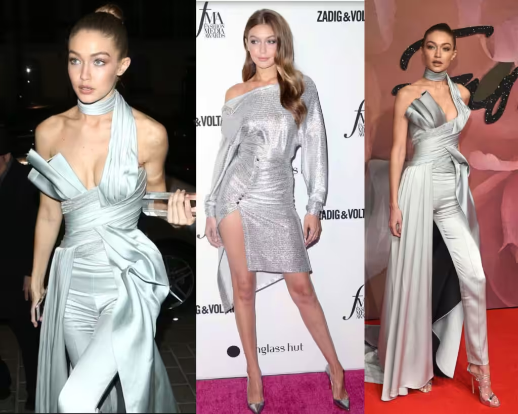
And that is avery intersting case that one person can wear all colors warm and cold.
For those of you who follow me, you already know where this is going.
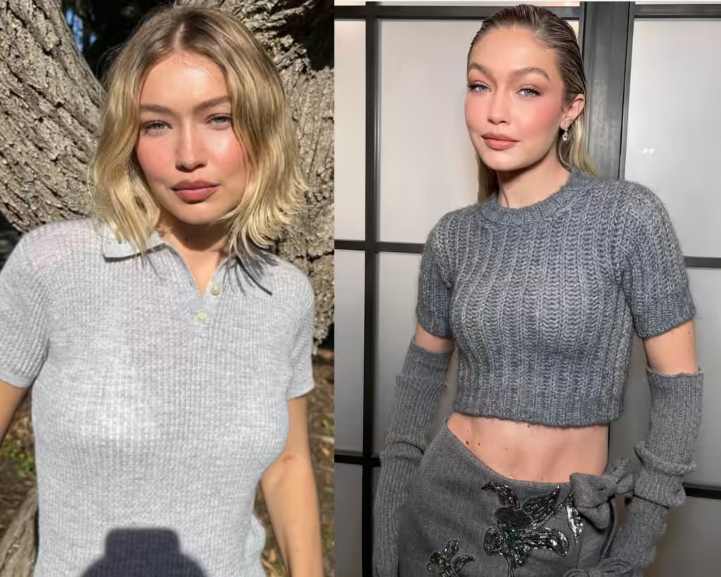
Grey works very well for her as well.
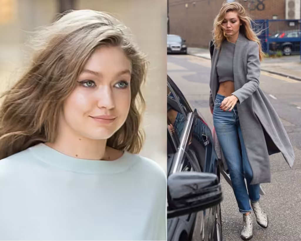
And it’s not just nice-looking nightgowns with rhinestones, etc, it’s casual grey outfits that are supposedly dimming her down like a woolen sweater or a viscose coat.
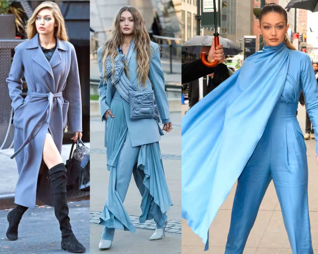
Blue, grey blue, grey purple, and grey are all good for her as well.
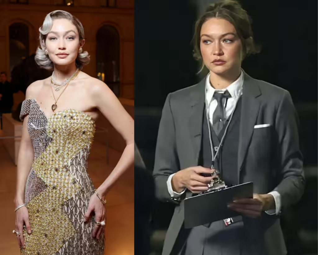
However, I’d say that I like warmer shades on her better, but she can definitely work with just any color.
And if Gigi Hadid were my client, I’d tell her that she is an in-transition type – the type that is right in between Soft Autumn and Soft Summer, having a possibility to wear all Autumn transit colors, some of the Summer, and even Spring.
Aura Colors: Kate Beckinsale and Gigi Hadid
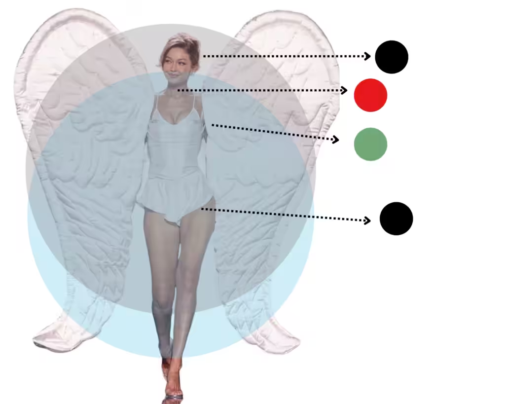
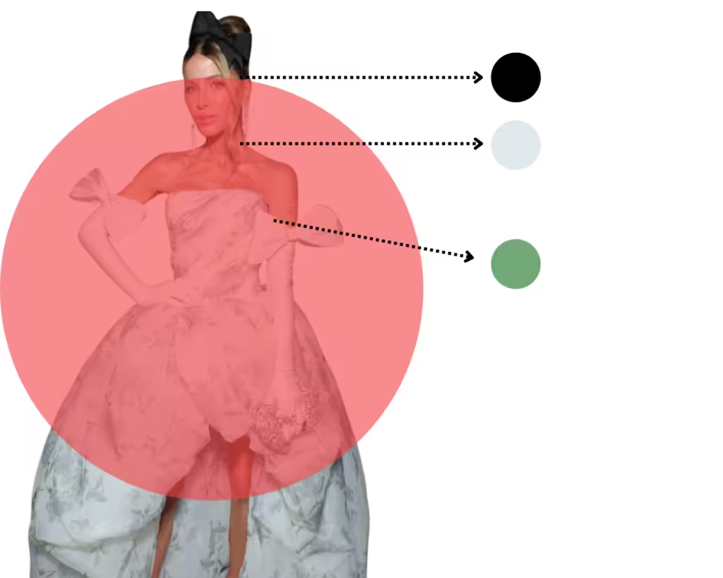
I took the most recent pictures of their bodies, and this is what I saw for them.
Gigi’s natural aura has a crystal blue light, but as of right now, it has been cocooned by a dark grey one. That is usually a sign of a negative influence on her from someone else.
She was born with a light energy, and as of right now, there are inferences with it as if someone or something is trying to take control of her, and that also shows on her Ajna and Muladhara chakras, which correspond to the third-eye and root center.
Ajna should be purple, and the Root chakra must be red, colors that appear as black for her.
There is also a problem with the Throut chakra – Vishuddha, it must be blue, which appears to be red (which also means that she does not feel safe in her own body).
The only chakra that is green – the heart chakra is what is keeping up with her.
What was recommended for her is to wear more pink clothing and crystals like Rose Quartz in order to intensify the feeling of love for her own body.
Amethyst, the purple crystal, in order to intensify the intuition and open up her blocked centers.
Kate Beckinsale Aura Color
Her case is more complicated than easy, as she appears to have a completely red aura that is rather dark red.
Most of her chakra systems are switched off, and that is a sign that she is not fully connected to her own self, as if she is existing. She was recommended to wear white linen as it’s a high vibrational fabric and, in general, light and white colors.