
True Autumn Color Palette: Colors For Wardrobe And Makeup

Are You Wondering If You Are A True Autumn Color Palette?
I got you covered with these answers from a stylist and artist
True Autumn is the perfect colorful description of yellow leaves, orange pumpkins, grey rainy roads infused with milky morning fog, and, of course, the richness of tasteful harvest.
As nature transitions, the vibrant spectrum of hues captivates the senses, inviting people to indulge in the warmth of sweaters and the aroma of spiced cider.
The true autumn color analysis differences reveal how each shade interacts with the changing light, creating a mesmerizing tapestry that inspires cozy gatherings and reflective moments.
This season not only showcases nature’s beauty but also encourages a deeper appreciation for the fleeting moments of warmth before winter’s chill sets in.
This is the fruition of the autumn galore, which corresponds to the deepness of the color in a slow transition to the darkness of colder times.
True Autumn is the “richest” season in terms of the depth of the color and warmth of the palette.
As leaves transform into vibrant shades of red, orange, and gold, they create a stunning backdrop that evokes feelings of warmth and nostalgia.
To fully understand the beauty of this season, consider incorporating true autumn color palette tips into your wardrobe and home decor.
Rich jewel tones paired with earthy neutrals can beautifully reflect the essence of autumn, bringing a cozy atmosphere that celebrates nature’s changing hues.
This is the set of colors that will definitely intensify your assets.
For example, if your eyes are green-blue, this palette will make them deeper and more color-rich.
There are four seasons of the year and four seasonal color palettes.
Here you can also read more about the seasonal color analysis here.
True Autumn is right between Soft Autumn and Dark Autumn on the chart.
It is influenced by Soft Autumn with grey pastel colors and Dark Autumn with its darkness and deepness.
However, let’s not forget that a True Autumn is a truly warm type that suits warm-type ladies.
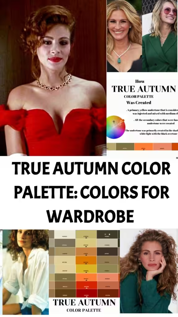
How True Autumn Color Palette Was Actually Created
How to know if you are True Autumn?
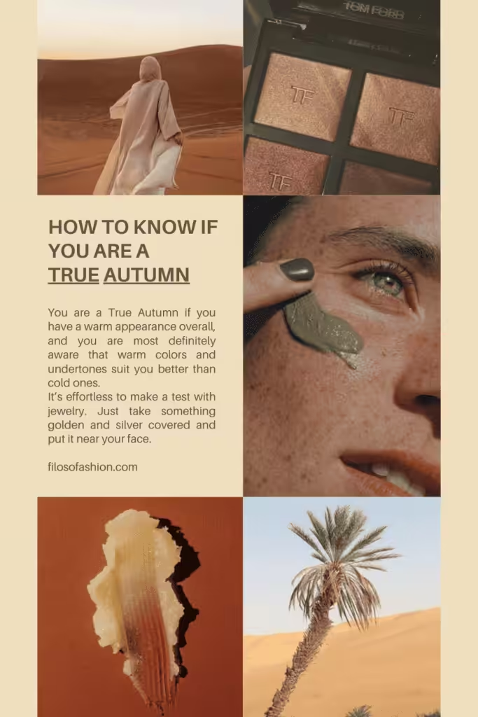
You are a True Autumn if you have a warm appearance overall, and you are most definitely aware that warm colors and undertones suit you better than cold ones.
True Autumns often find that rich, earthy tones like rust, olive green, and deep gold enhance their natural beauty, contrasting sharply with cooler shades.
Understanding the dark autumn vs true autumn differences can further help in curating a wardrobe that complements their unique palette.
The warmth and depth of colors can make a significant impact on how vibrant and radiant they appear.
It’s effortless to make a test with jewelry. Just take something golden and silver-covered and put it near your face.
I, for example, put one gold earring on the left ear and one silver on the right ear.
I will definitely say that golden earrings suit my skin much better than silver ones.
Because gold has a yellow (warmer) undertone, and silver is cold.
My skin naturally has a yellow undertone, so a warm palette will suit me better.
How to find out if your skin type is warm or cold?
That is really easy to do! The fastest way to understand your main type is to face yourself in the mirror and play around with gold and silver jewelry.
For example, if you see that you have a slightly pinkish skin undertone, silver earrings suit you better; you are a cold type.
If you have olive-shaded (warmly tanned) skin and gold jewels suit you better, you are a warm type.
You do have a soft appearance colorwise, but it’s not completely true when technical resources say that your “features appear somewhat ‘greyed’ out or toned down”.
There are people with a greyish appearance, but their blue eyes definitely stand out.
They are “somewhat muted”, but in general, you can clearly see that the color of the eyes does stand out from the whole picture of your colors.
Your true colors are warm and calm, somewhat “cozy,” but if you add perfect true autumn color to your features (or at least one of them), those will definitely stand out.
With the right palette, your features will be enhanced!
It might be true that the contrast between your skin, eyes, and hair is medium.
But the important thing is that a person who reads these statements will not be able to identify that contrast.
It’s difficult to figure out which chroma, hue, and contrast your own appearance has.
My advice to you is not to pay so much attention to these “technicalities” and just go along with a simpler explanation of what your palette is.
How Does True Autumn Look Like?
The dominant palette for you would be warm tones and deep undertones.
I wouldn’t call them “muted” but rather rich and mild.
Muted colors are those that have a cold grey or black undertone, and this is definitely not the case for True Autumn.
Imagine a warm day in September when the sun is still caressing your golden hair, and you can even see the freckles blending in with your autumn-like eyes.
The skin is slightly bronzed, but not a single feature would stand out harshly, ruining the beautiful composition.
It’s mild and warm with no strong contrast but still bright in its own palette, where green is rich emerald and red is cherry gloss, etc.
There is no space for neon shades like bright yellow; there is calmness and peace, there is confidence, and the golden hour.
Deep colors mixed with softness push the brightness of the August sun down into the hollow of the deep blue sea and the deep green forest.
True Autumn Features
Eyes
True Autumn eyes are medium or golden/ amber brown, aka honey brown, deep green, blue-green, or olive-green (when green is mixed with brown pigment, which might look yellowish in the sun).
Skin
Needless to say why, but warm skin undertone is your main feature to consider when choosing the right color palette.
Colors that complement warm undertones typically include earthy shades, warm yellows, and rich reds that enhance your natural glow.
For those looking to delve deeper, the true summer color palette explained focuses on softer, muted tones that harmonize beautifully with warm skin, allowing you to radiate confidence in every season.
In contrast, the true spring color palette brings vibrant, lively hues that illuminate the complexion of those with warm undertones.
By incorporating shades like sunny yellows, cheerful corals, and soft greens into your wardrobe, you can create a fresh and energizing aesthetic.
Pastel hues, soft blues, and gentle greens that not only blend seamlessly with warm undertones but also provide a refreshing contrast.
Hair
True Autumn hair is like golden blond, true dark blond, light brown, golden ginger or red, and all shades of ripe golden wheat.
True Color Dimensions Of True Autumn Color Palette
In technical fashion resources, all “experts” usually say that True Autumn is greyed out and muted, plus there is no visible or strong contrast.
However, I, as a painter, will tell you that it’s right on the contrary. It’s not muted and not greyed out! True Summer is, but not True Autumn.
As discussed before, True Autumn is deep and calmly soft, it’s rich (the richest from all seasonal chart flow) and warm.
Forget about that book where it says it has a pinch of grey!
Am I True Autumn or True Spring?
True Autumn and True Spring are predominantly warm in type, and this is the only thing they share.
True Autumn is like walking into a cozy, warm house after a hot day, and true Spring is clear and fresh and can only be experienced in the early morning.
The air is filled with a crispness that invigorates the senses, while the world transforms into a palette of rich golds, deep oranges, and vibrant reds.
These hues epitomize true autumn color characteristics, reminding us of the fleeting beauty of nature as it prepares for the winter ahead.
In contrast, the brightness of spring brings a sense of hope and renewal, with blossoms bursting forth, painting the landscape in soft pastels that herald warmer days.
True Spring is warm but muted with the greyish tones of the sunset, and True Autumn is the warm, deep sunset.
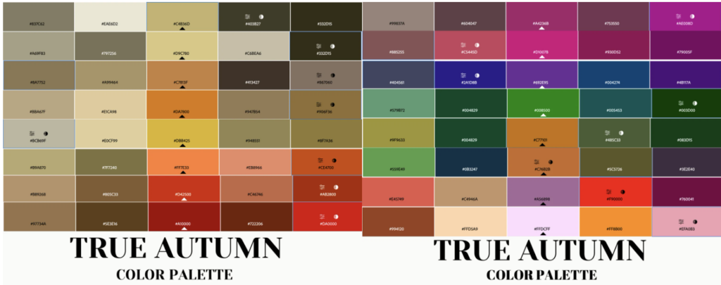
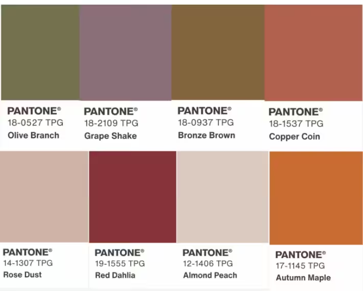
True Autumn Color Palette
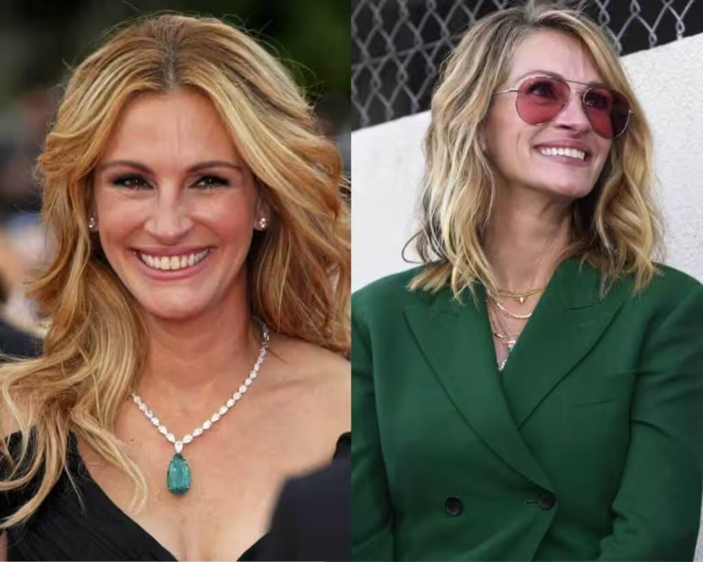
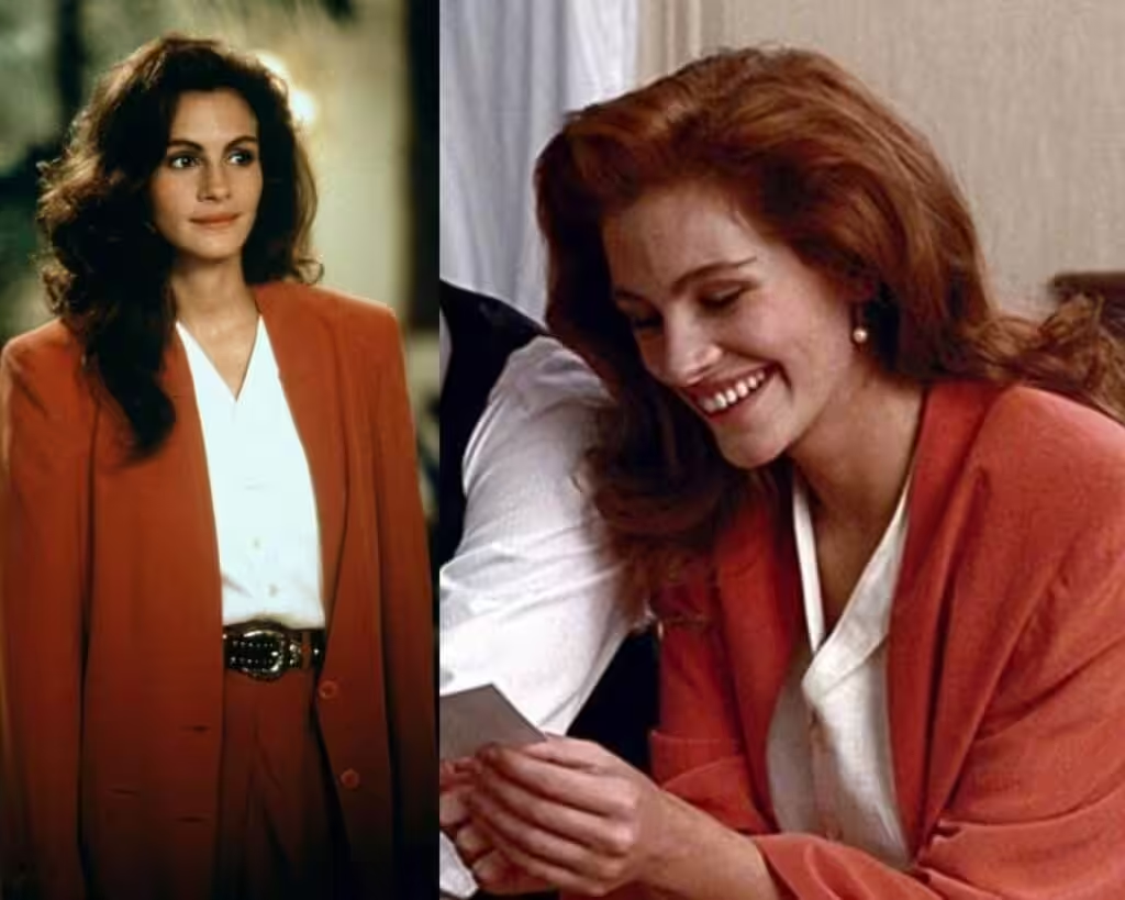
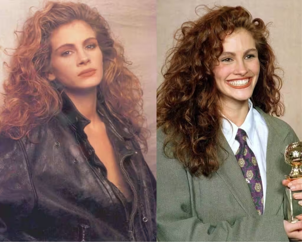
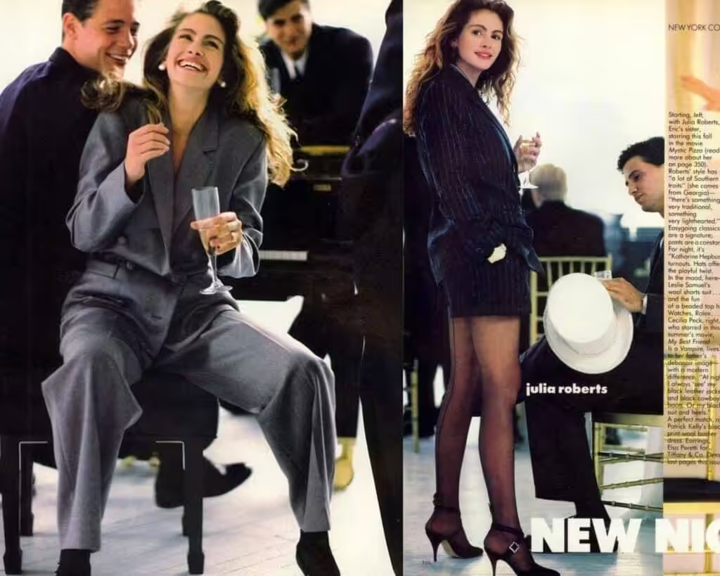
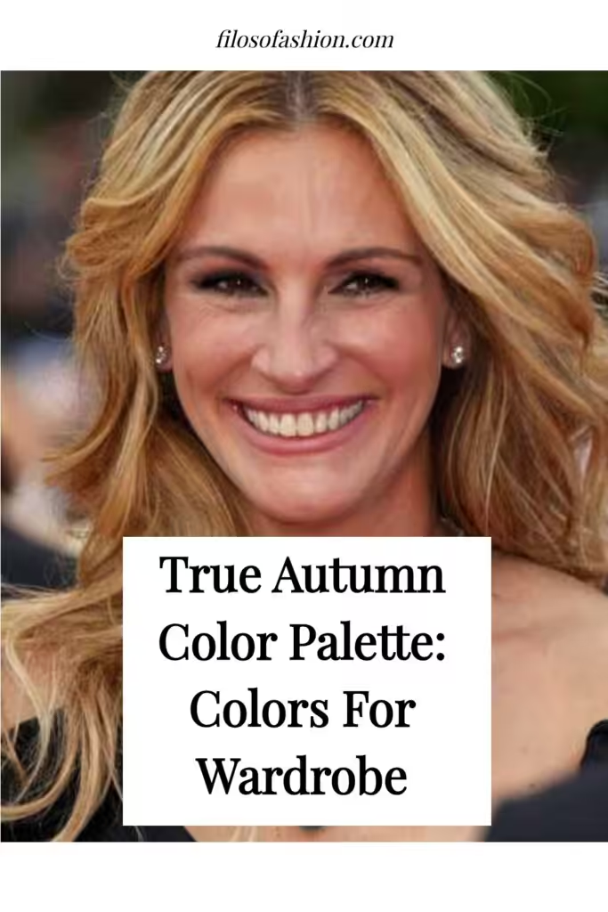
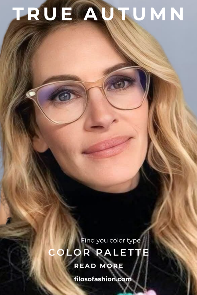
In terms of colors, the following images with Julia Roberts are representative of the warm, rich shades of the True Autumn color palette: These hues beautifully highlight her complexion, embodying the essence of an autumnal glow.
In contrast, the soft autumn palette explained emphasizes gentle, muted tones that harmonize with the warmth found in nature during this season.
This approach to color not only complements Julia’s features but also evokes a sense of coziness and richness.
The Palette
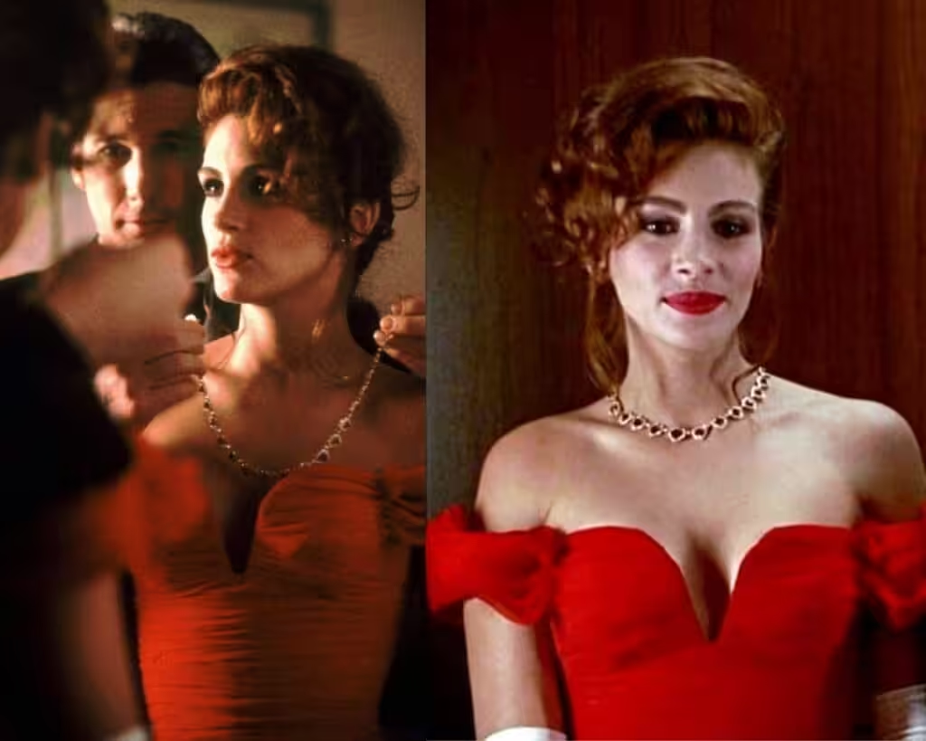
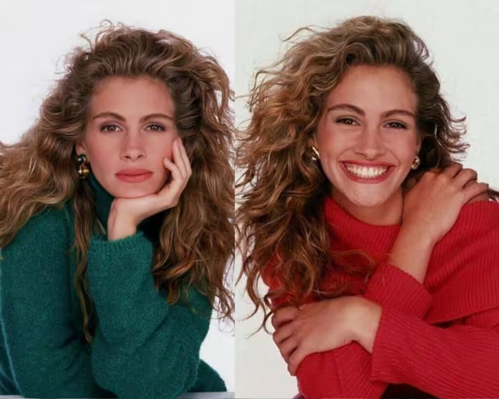
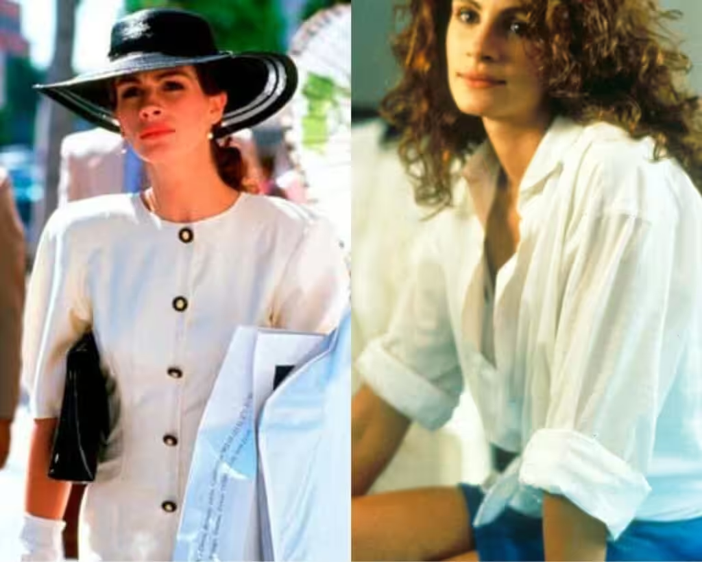
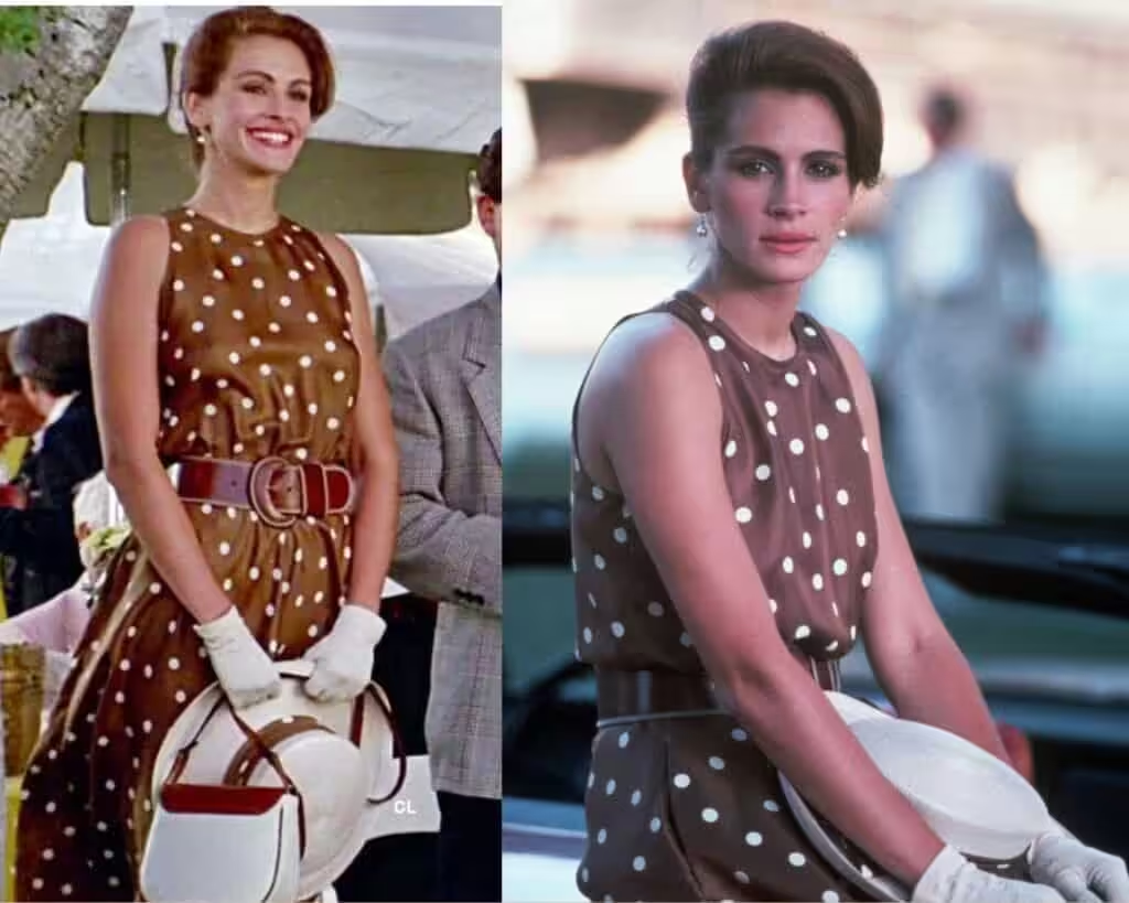
True Autumn is the central Autumn season in the four seasons color analysis, and is the most original Autumn palette. Its colors are deep, color-rich, warm, and cozy.
The hues found in this palette evoke a sense of warmth and comfort, reminiscent of fall foliage and harvests.
In contrast, the soft autumn color characteristics offer a gentle, muted counterpart, featuring softer tones that still embody the essence of the season.
Together, these palettes create a harmonious blend that celebrates the beauty of autumn. While True Autumn shines with its rich and vibrant hues, the contrast with true summer color characteristics brings a refreshing balance to the overall seasonal palette.
This interplay not only enhances the visual appeal but also emphasizes the serene elegance found within soft autumn celebrities and colors.
These tones, characterized by their muted warmth and gentle undertones, evoke a sense of comfort that resonates with the essence of the season. This effective combination invites a celebration of nature’s bounty, inspiring fashion choices and home decor that reflect the rich tapestry of autumn.
True summer introduces cooler undertones and softer shades, enhancing the warmth of autumn without overshadowing it.
This interplay between the warmth of autumn and the coolness of summer creates a dynamic range that beautifully reflects the changing season.
This palette, characterized by its icy tones and bold contrasts, serves to elevate the richness of autumn colors while providing a striking visual interest.
The combination of warm autumn shades, gentle, soft autumn tones, and the crisp clarity of true winter establishes a vibrant tapestry that celebrates the transition from warm to cool.
This vibrant tapestry is further enriched by the soft summer seasonal traits, which offer subtle hints of coolness and delicacy.
These traits allow for a seamless integration between the warm and cool palettes, enabling a versatile expression of style that adapts to the changing landscape.
The result is a captivating interplay that not only reflects the essence of autumn but also embraces the refreshing nuances of the seasonal transitions.
Red is not bright red; it’s toned down to cherry red.
Green is not bright spring green, but has eased down to green emerald. White is not squeaky white, but off-white and cream white.
Brown is definitely muted and dissolved with an off-white polka dot pattern, which makes it even more classy.
Grey is toned down to soft grey as well and black is more muted with soft greyish shades.
Styling For True Autumn Color Palette
How to mix and match a true autumn color palette in your wardrobe?
In technical fashion materials, it is stated that you should only combine colors from one color palette that belongs to your skin tone.
So, colors that work for a true autumn palette should only be chosen from the palette given to you. Incorporating these shades will help create a cohesive and harmonious look that reflects the warmth of the season.
For those who also enjoy experimenting with styles from different climates, consider exploring dark winter color palette ideas to complement your autumn wardrobe.
This approach allows for a versatile collection of colors that can transition smoothly between seasons.
Additionally, understanding the deep autumn color palette explained can provide further insights into how to enhance your existing wardrobe.
By focusing on richer, earthy tones, you can create outfits that truly embody the essence of autumn.
Mixing in pops of contrasting colors from other palettes can also add depth and interest to your overall look.
Harsh and way too bright/warm colors can create an undesirable effect on the skin, especially if you have a delicate/muted appearance.
However, it is not entirely like that. I have already mentioned that dark/warmer colors can still be used for the lower body.
The main center is always your facial zone, which attracts the most attention.
So, you mainly need to concentrate on the face and decolletage zone with your true autumn palette.
You have to understand that even if you use all blue combinations or all dusty pink or creamy combinations in your upper and lower body.
It will be color-correct for your skin, but still unflattering if your body shape is not a perfect hourglass shape.
This especially concerns those who have an ampler bottom-like pear body shape.
So that would mean that light pink pants will not be the best choice for your bottom line because they can make you look bigger than you actually are.
And this is what we are trying to avoid when constructing the perfect wardrobe.
- Inverted Triangle Body Shape: Capsule Wardrobe
- Pear Shaped Body: Capsule Wardrobe
- Apple Body Shape Shape: Capsule Wardrobe
- Hourglass Body Shape: Capsule Wardrobe
- Rectangle Body Shape: Capsule Wardrobe
Colors to Avoid For True Autumn Color Palette
Those colors down below will make your beauty washed out, and your face can “disappear,” becoming a white “canvas” with no identity.
Just take a look down below. Probably, if you still want to use those colors, you would need to break them down with a necklace or something that can create a line between your face and upper body.

Patterns & Prints For True Autumn Palette
Patterns are usually used for upper body garments like blouses and sweaters etc., or summer dresses.
People rarely wear trousers with patterns; most likely, blatant colors are used.
As a True Autumn type, you can wear prints, but those would need to be in the right color palette for you.
If you see a patterned fabric, you need to concentrate on the primary color of the whole garment.
There might be blue flowers on white, but you need to figure out which color is primary here.
It’s primarily white, which is basic here, so you need to see if that primary color is from your True Autumn palette.
It’s believed that True Autumn needs to use low to medium contrasts because of the delicacy of natural beauty.
You might still go for low-level contrast, which would be right for you.
However, there is always a solution for you if you don’t find anything from this guide.
Jewelry For True Autumn Color Palette
How you could fix your non-perfect colored look with just one thing.
It’s a necklace, and for me, it’s pearls. Be mindful that pearls need to fit your skin color perfectly.
When you put something like a pearl necklace on your neck, you create a rough separation between the “wrong” color of your skin and the necklace.
So, the chain is going to be the primary color reflector for your skin color.
For example, I have a purple dress that does not really fit my skin color, and my face tends to look a bit tired with it.
You know it, especially if you have blue eye bags in the morning. It doesn’t make me look my best.
So I create a cut between the color and my face with a pearl necklace that perfectly fits my skin.
So, the jewelry is the first color reflector near my face.
Check out my article: “How to wear pearl necklace and where to buy it. “
As stated, between gold and silver, I’d recommend gold as it’s warm enough for your skin tone.
Silver is appropriate if it is mixed with gold and looks primarily warm-toned.
Pearls need to be cream-white in color as they match your complexion perfectly.
Avoid huge plastic earrings of vibrant shades like Samantha from Sex and the City used to wear.
READ MORE ABOUT COLOR PALETTE:


