
Which colors go with pink in the wardrobe

Are you wondering which colors go with pink for your wardrobe?
This article will answer all your questions!
Which colors go with pink and what it means? Pink means tenderness, love and care. Combinations of pink are refined, expressive, and soft.
The color of the sunset, rose petals – a truly feminine tone. It is characterized as tenderness, striving for stability, a shade of motherhood, weakness, naivety, not objectivity in the perception of the world. This is the color of all-consuming, faithful love, affection.
It is believed that pink is the closest to the color of the body, and women are much more sensitive to their bodies than men. The gazes of men are also riveted to him, who attach sexual meanings to flushed cheeks. It affects them no less than red. (Alfred Hotges believes that only in a pink dress will a girl be invited to all slow dances)
Along with this, one can notice the “vulgarity” of the “blonde in pink”, which symbolizes the female extreme, intellectual weakness, complete detachment from objectivity. The expression “rose-colored glasses” speaks of belief in a fictional idea of the world. For which this tone is often attributed to young people.
Pink as a mixture of purple (female superconsciousness) with white (motherly love) adds up to birth (or rebirth). This property is used for therapeutic purposes: it stimulates the renewal of the body, self-healing. It is not for nothing that the average life expectancy of a woman is longer than that of a man.
Pink color palette for wardrobe
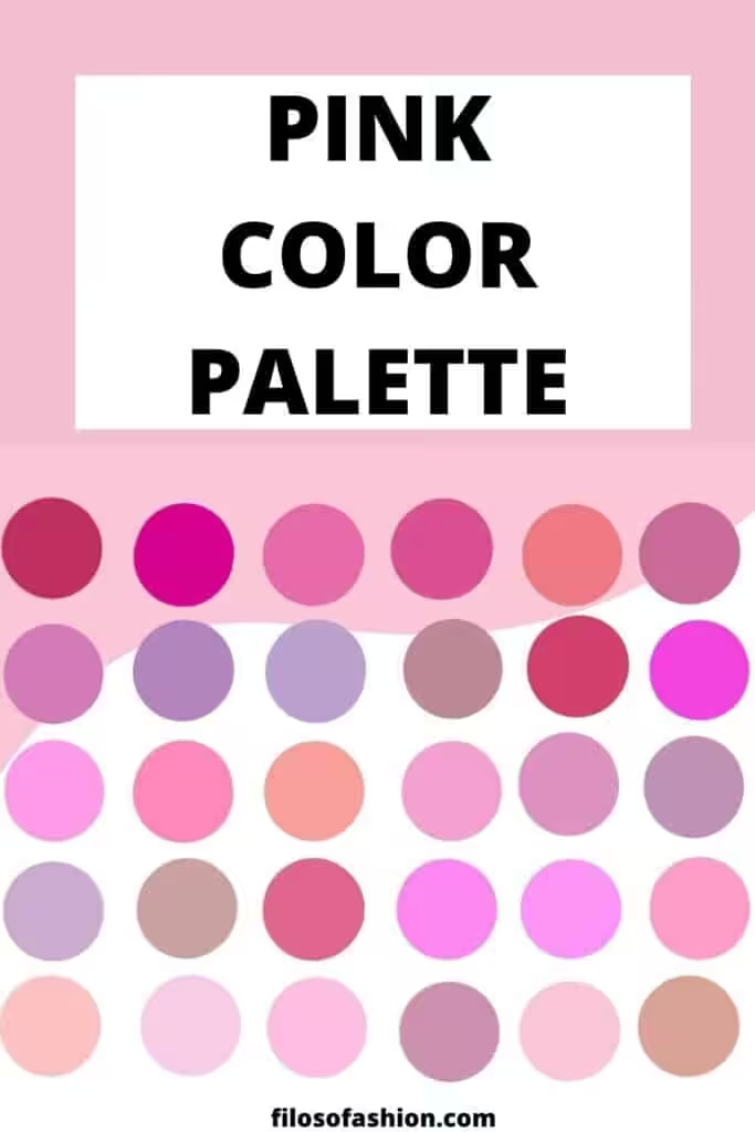
shades of pink can be divided into subgroups:
light and warm, delicate pastel pinks: royal pink, cloudy, shrimp;
light and cold pastel colors: pale pink, white-purple, cotton candy;
medium cold with a gray undertone: lavender, lilac, orchid;
rich warm, medium: sunset pink, coral pink, flamingos;
pale (with a gray undertone) light shades: rose ash, beige pink, strawberry;
bright: barbie pink, hot pink;
deep pinks with purple undertones: magenta, fuchsia, purplish-pink;
red-pink: red-pink, amaranth, raspberry;
dark cold: dark pink, purple potion, lingonberry;
The combinations of pink color palette
The combination of pink is usually juicy and attractive. Most often they are based on thermal and light contrast. However, it is very important to select shades of the same saturation with the main tone, this will give harmony, except for the option when you want to create a bright contrast: to emphasize the richness of the color against the background of a pale tone. For you, the tables are a combination of medium pink with all other colors.
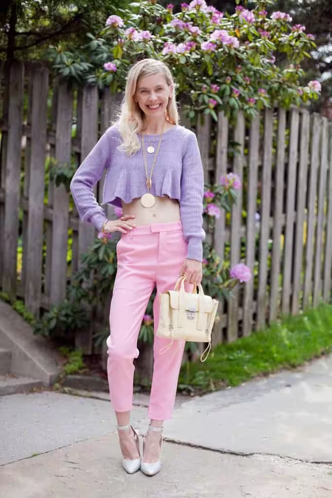
A combination of pink with other shades in this range. The combination of shades of this color deepens the palette, making it more saturated and voluminous. The shade of the pair should be either lighter or brighter than the main one, so the contrast will be observed, but it is better than the purity of the tone remains at the same level in the palette. For a vibrant composition, combine a medium pink tone with white and purple, Barbie, magenta, fuchsia, lingonberry.
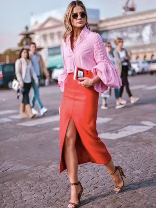
Color combination: pink and red. A bright, in some places scandalous composition, which is difficult to perceive, therefore it is rarely used in everyday life. The palette is built on the contrast of warm and cold. To implement it, choose the following tones: scarlet, medium red, dark red, maroon.
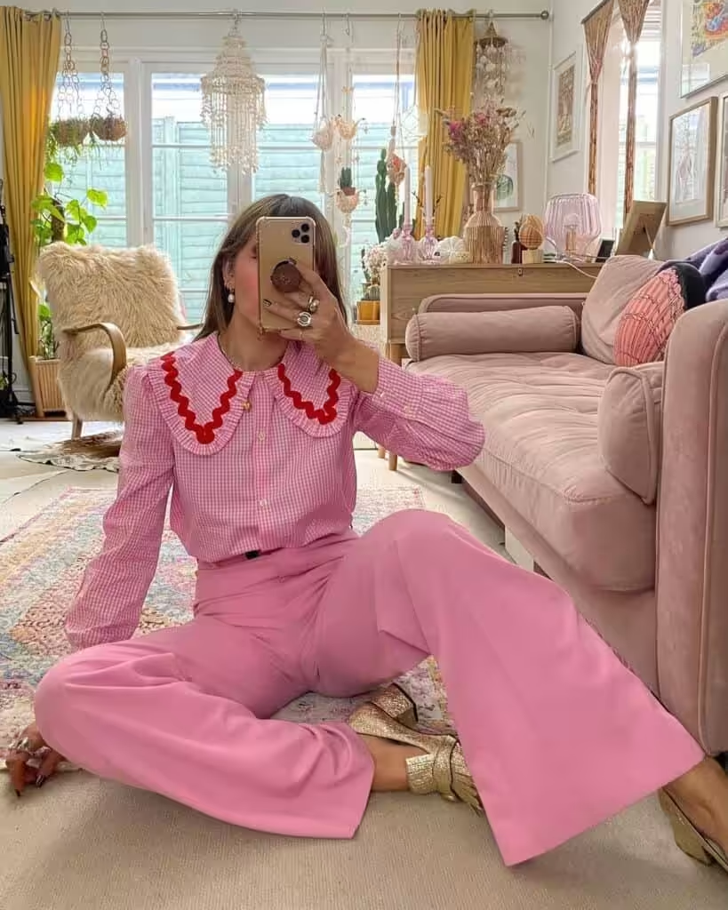
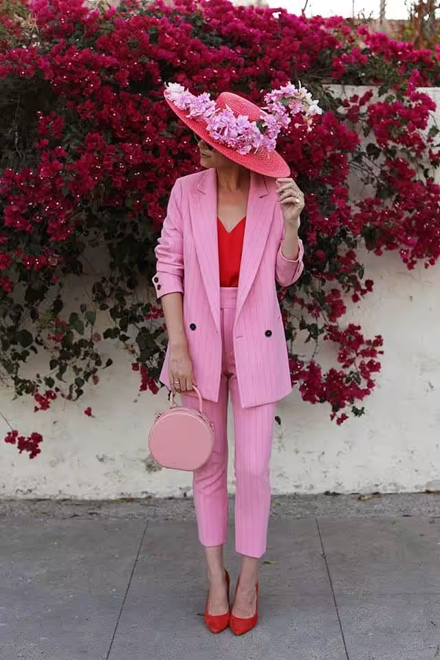
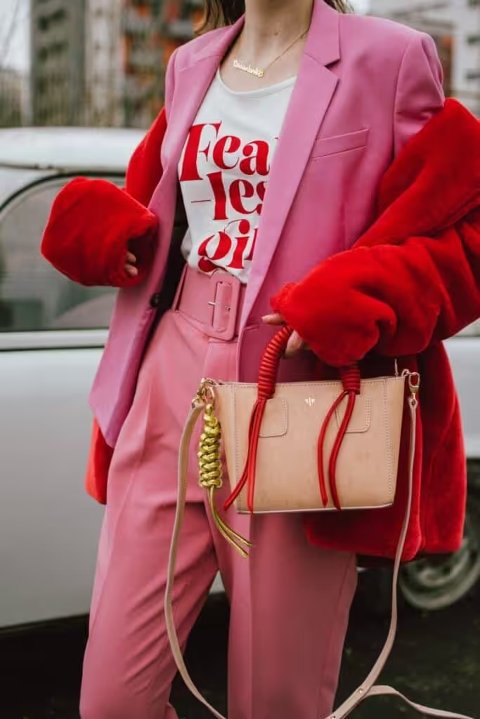
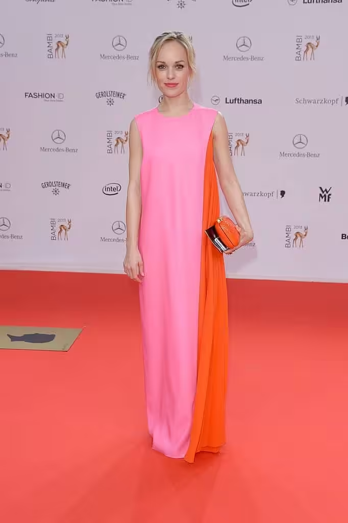
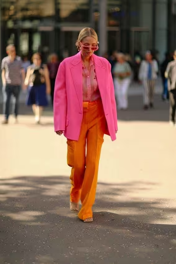
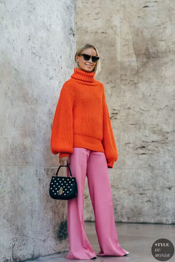
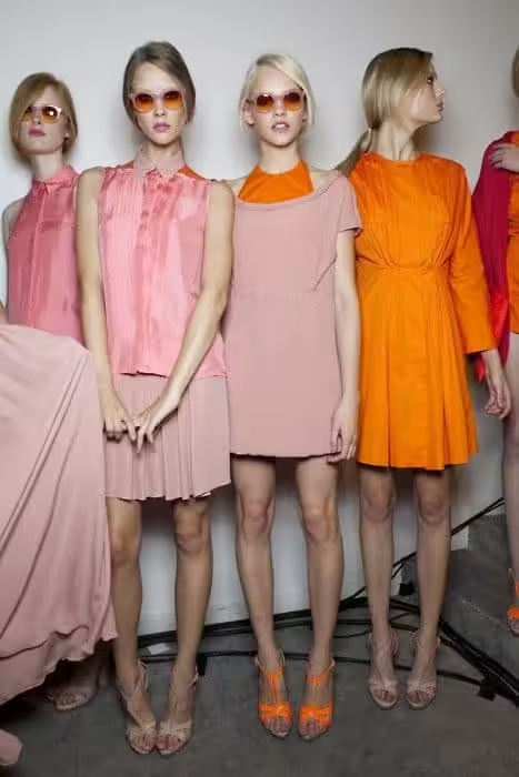
A combination of pink and orange. Juicy and original. This is a breeze of glamor and high society. Until recently, the tones were considered incompatible, but recently the view on this pair has changed to a diametrical one. Palettes with the same saturation and lightness are more appreciated. Contrast can find its fans too. The palette is composed with the participation of shades: light peach, peach, bright orange, fiery, red-orange.
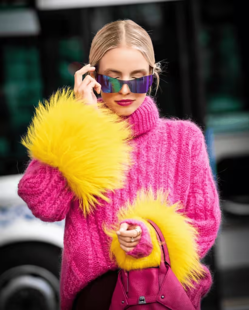
Color combination: pink and yellow. Delicate, bright, and positive, it is expressed feminine, with a touch of glamor. If the tones of yellow go to orange, then the effect of the overflow of tones is enhanced. For this range, use: pale yellow, sunny yellow, corn, golden, amber.
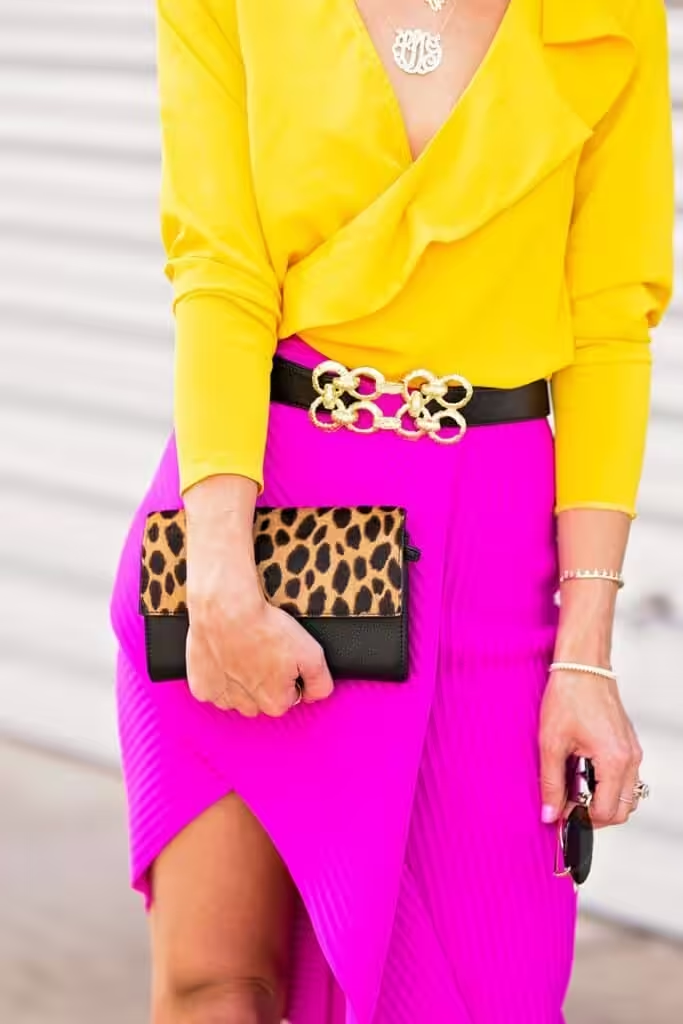
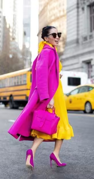
The combination of pink and warm green is built on the contrast of cold and warm. A sunny, pleasant combination that fills with energy and enthusiasm. Consider pairs with light green, yellow-green, kiwi, moss, greenery. Will remember to maintain the average brightness for the pair to maintain the expressiveness of the gamut.
Combination of pink with cold green
Pink blends with cool shades of green to create a trendy, fresh pair. The palette retains the contrast of warm and cold but increases the balance and its harmony. The combination has the exoticism of warm countries. Try tandem with shades of green water, menthol, mint, patina, malachite.
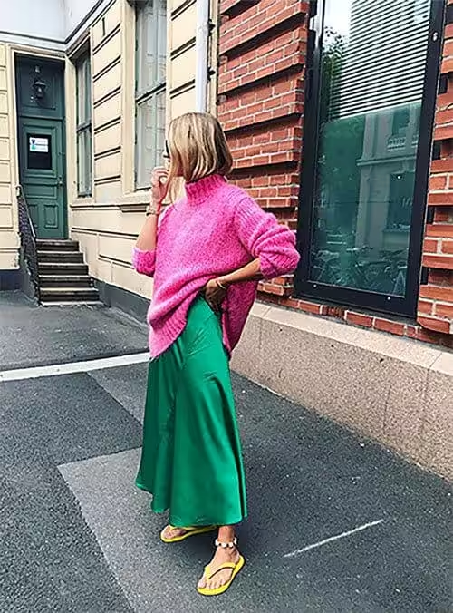

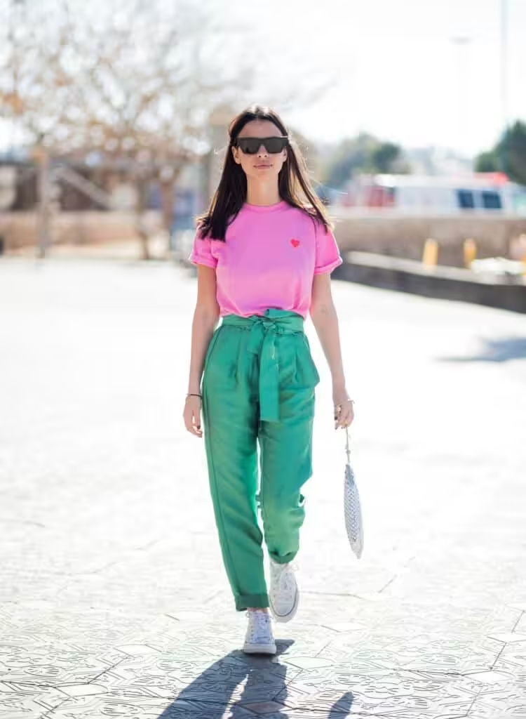
The combination of pink and blue is cool and harmonious. Warm shades of blue such as water color, bright blue, turquoise, cyan, dark turquoise, Prussian blue create a fresh effect. The juicy and vibrant combination symbolizes relaxation and balance.


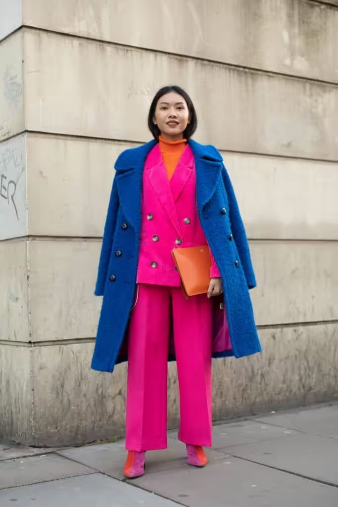
The combination of pink and purple – illusory expands the number of shades between us since both colors have purple in their composition. A bright, mysterious and sensual palette opens up like a rare flower of rich colors. A color scheme with blue-violet, lilac, purple, red-violet, grape will be beneficial.
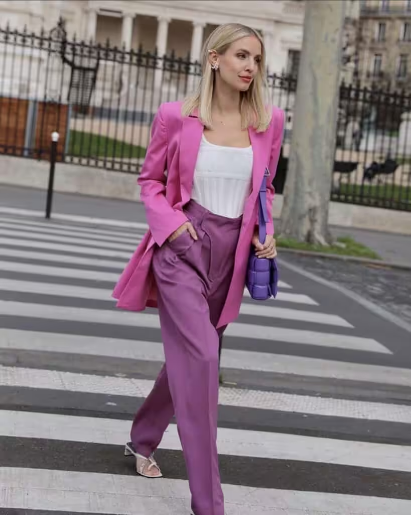

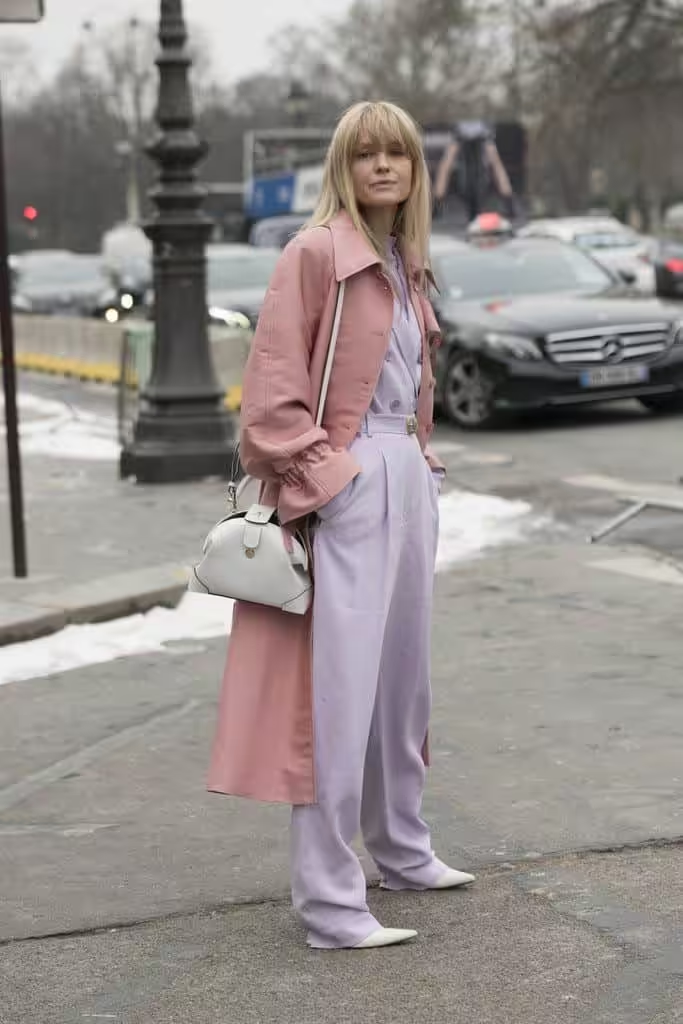
Pink and brown are combined according to the principle of contrast, where the tones of the second are darker than the first, but they retain their saturation. And yet brown is less expressive than pink, so the latter comes to the fore. For a combination, take the color of cinnamon, bronze, mahogany, dark chocolate.
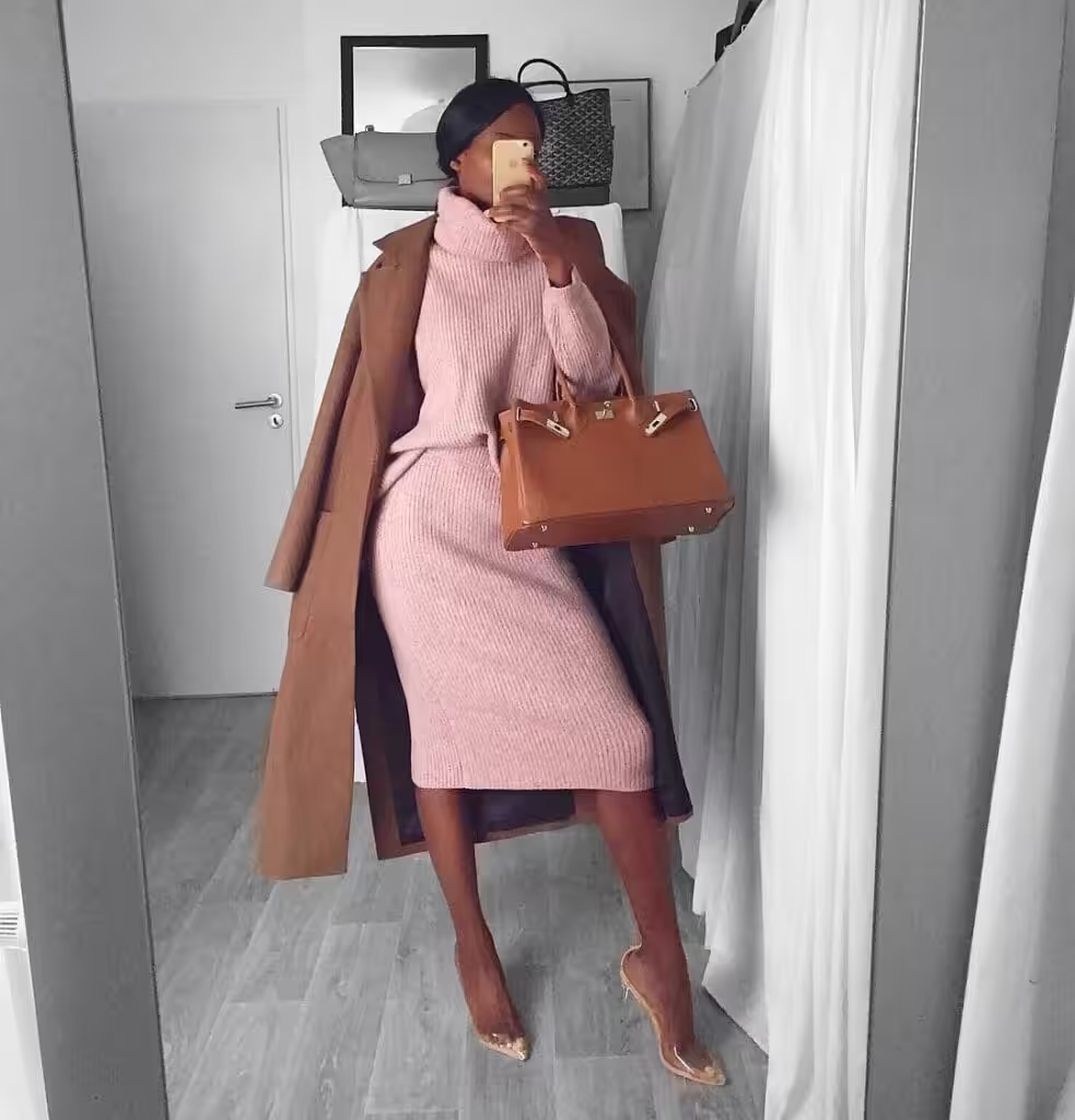
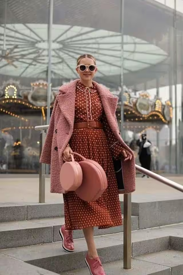
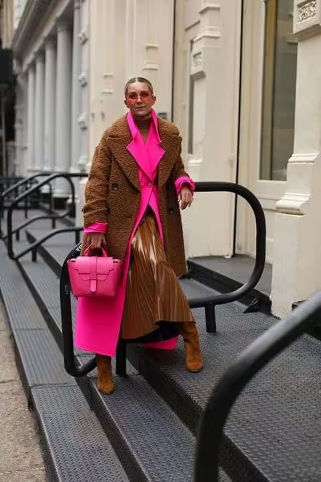
combination of pink and gray
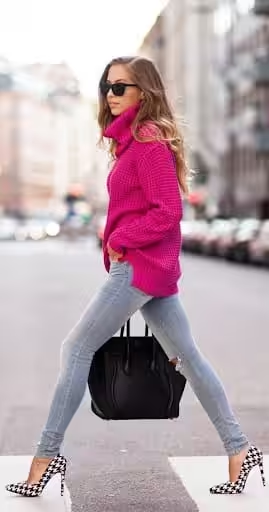
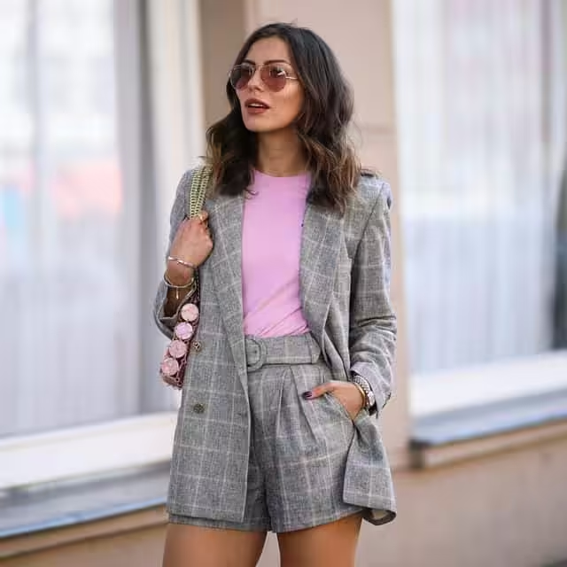
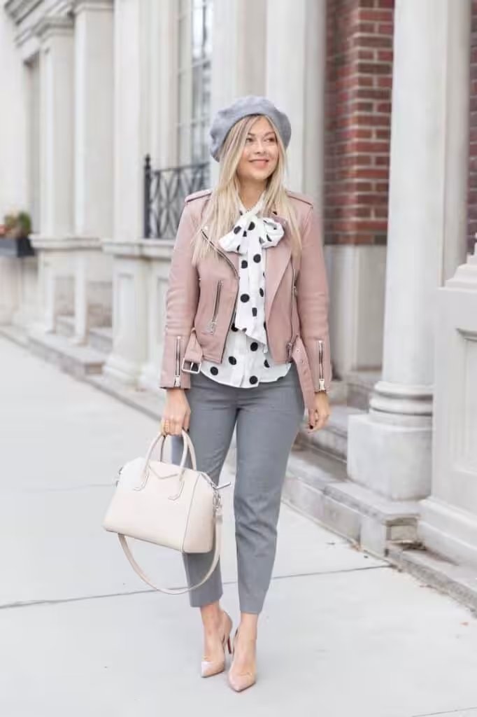
Pink and neutral, which include creamy, light beige, steel, anthracite, gray and black-gray, combinations where the pair fades completely into the background of the main color, maintaining a contrast in lightness. Light neutrals lend a soft and positive vibe to pink, while dark shades add piquancy and expression.
Dusty Pink/ Mauve Color Palette Combinations
Rose ash (mauve) / Dusty Pink is a warm lilac shade, soft, delicate, and seductive. Despite its pretentious name, which many may remember from the book Singing in the Thorns, the color is often found in everyday life and often visits the catwalks. Like many muted shades, it is close to nature, natural and organic in combinations.
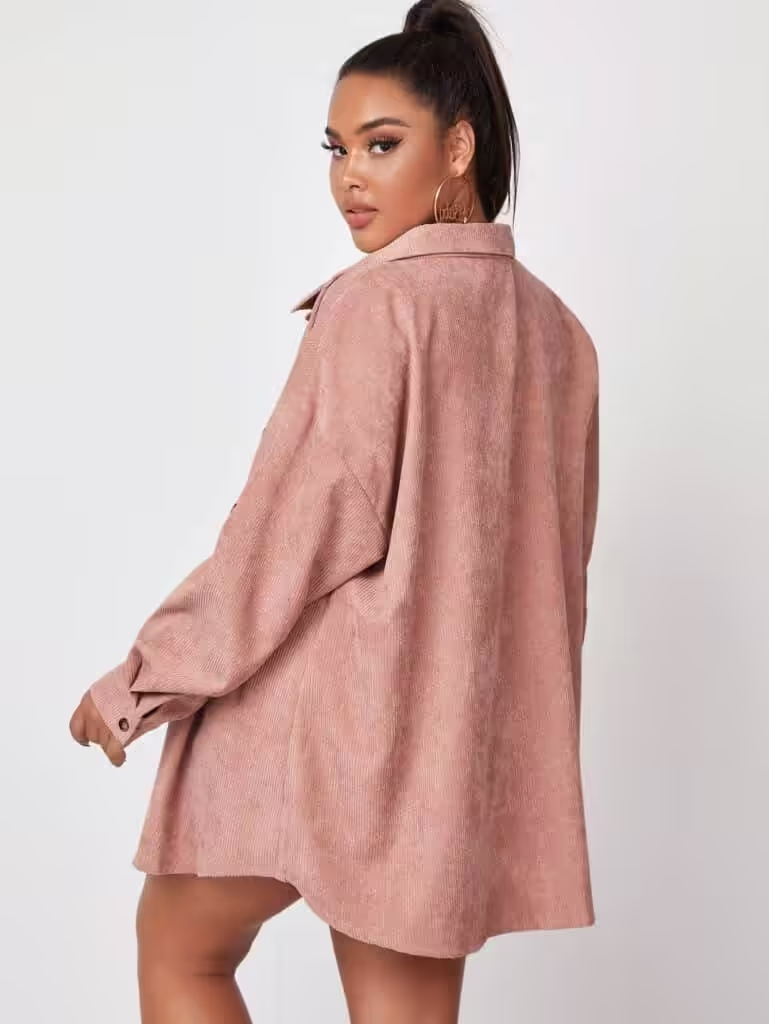
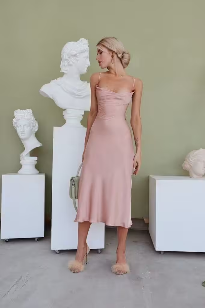
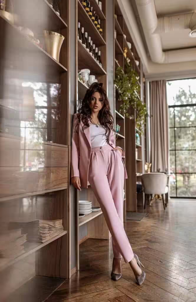
More often than not, it is simply called lilac, without emphasizing its warm origin. But if we still consider it separately, then the initial tone will be red, as a living principle, strongly diluted with white – maternal patience, then clouded with blue – spiritual ideals and/or gray – calmness, stability, as a result, a complex tone, feminine, calm, is obtained. but at the same time active.
Shades of rose ash (mauve)/ dusty pink
Ash rose shades range from pastel (very light) tones to very dark colors. Although the colors are built on a warm base, the overall gamut is still cold due to the strong dilution, turbidity of the original tone.
Which colors go with dusty pink
- with aquamarine – gives freshness to pink-lilac, entering into a light contrast of warm-cold. The overall feeling of softness does not change, and the contrast between light and dark is barely discernible.
- with the color of cinnamon – slightly shading. The contrast of the pair is minimal, but it gives a sense of the presence of additional shades that our eye completes.
The combination can be complemented with milky white, olive, black.
Color combination: rose ash (mauve) and other tones
What color does dusty pink match with?
This complex shade he prefers muted tones, however, as an accent in it, brighter shades may appear. For you, the tables of the combination of ashy pink. It will expand your perception of this shade as a whole and the available colors. You can use one or more shades for the composition.
The combination of rose ash with pink is a scale in one tone. Lighter and darker colors deepen the main shade, giving it a lively radiance, volume. Complex pink tones, such as royal pink, clover, orchid, dark purple, lingonberry, will look more advantageous.
Dusty pink and red: expressive and controversial combination. Shades of red, too bright for mauve, can coexist with it in the form of an accent if they are as muted as possible: either lightened with the addition of gray or moderately darkened. For example, watermelon, coral red, ruby, ruby burgundy, wine.

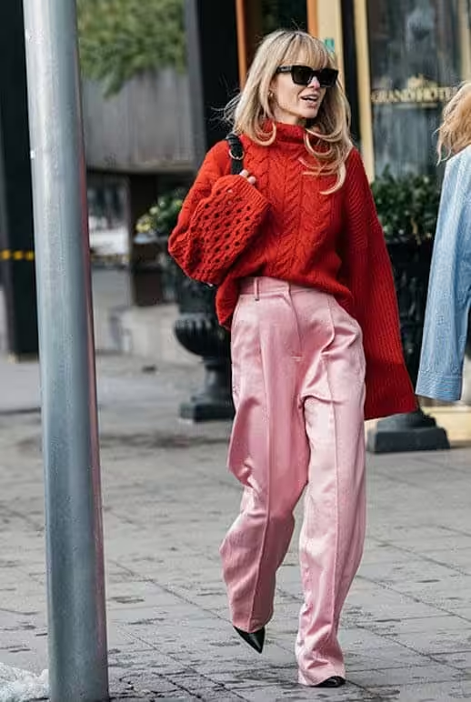
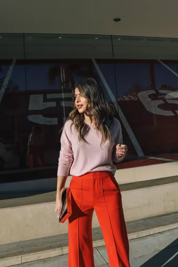
How to combine dusty pink and orange? Soft shades of orange can be good companions for mauve, entering into a warm-cold contrast, they add balance and lightness to the composition. The palette is composed of peach, orange-coral, pumpkin, brick, red.
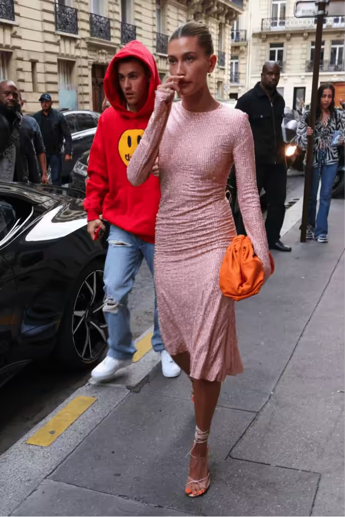
The combination of ashy rose with yellow enhances the femininity and softness of the main color, enters into a warm-cold contrast with it, but remains in the light range. Shades of yellow should contain a gray, blue or red subtone, which ensures the harmony of the combination. Consider a combination with champagne, honey, yellow gold, corn, amber.
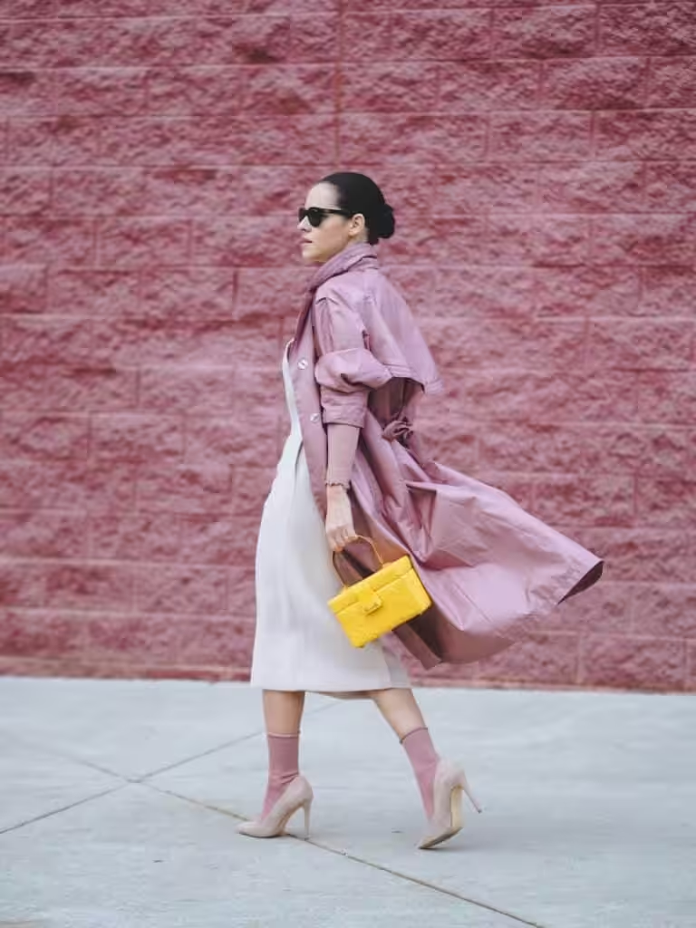
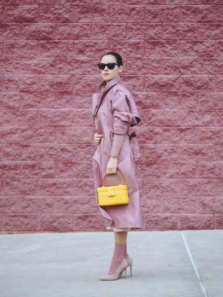
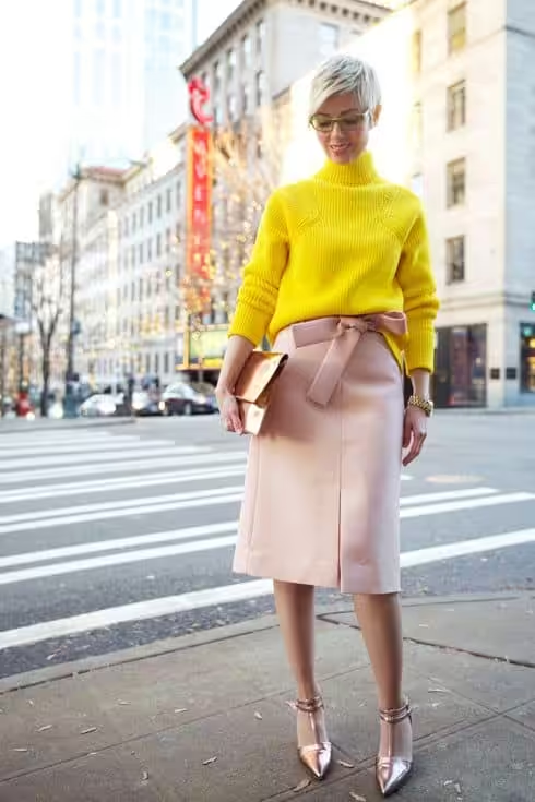
Ashy rose and warm greens combine to create a pleasant, natural pair that can be enjoyed in the garden. Rose ash is a heavenly tone that has descended to earth, and soft greenery will be the perfect decoration for it. The composition involves pale green, chartreuse, marsh, coniferous, brownish-green.
Ashy rose is combined with cold green with a slight warm-cold contrast, which refreshes the eye, just like predawn greens are juicy, with morning dew. Although such satellites are just as complex and multifaceted, the combination is expressive due to the contrast of light. Consider a combination with watercolor, wormwood, emerald, gray-green, malachite.
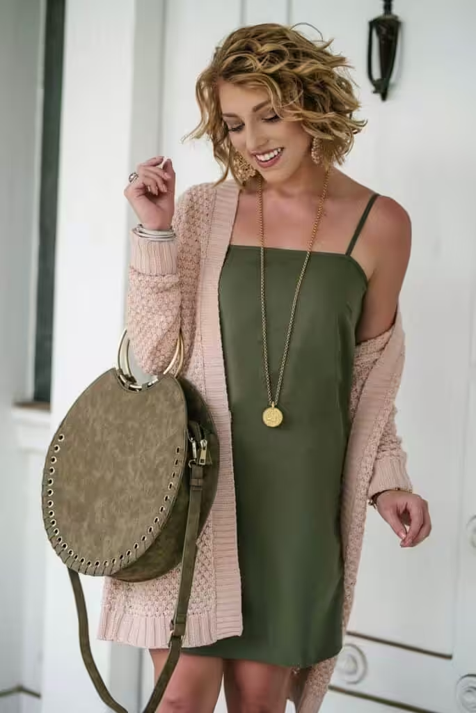
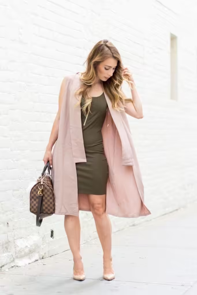
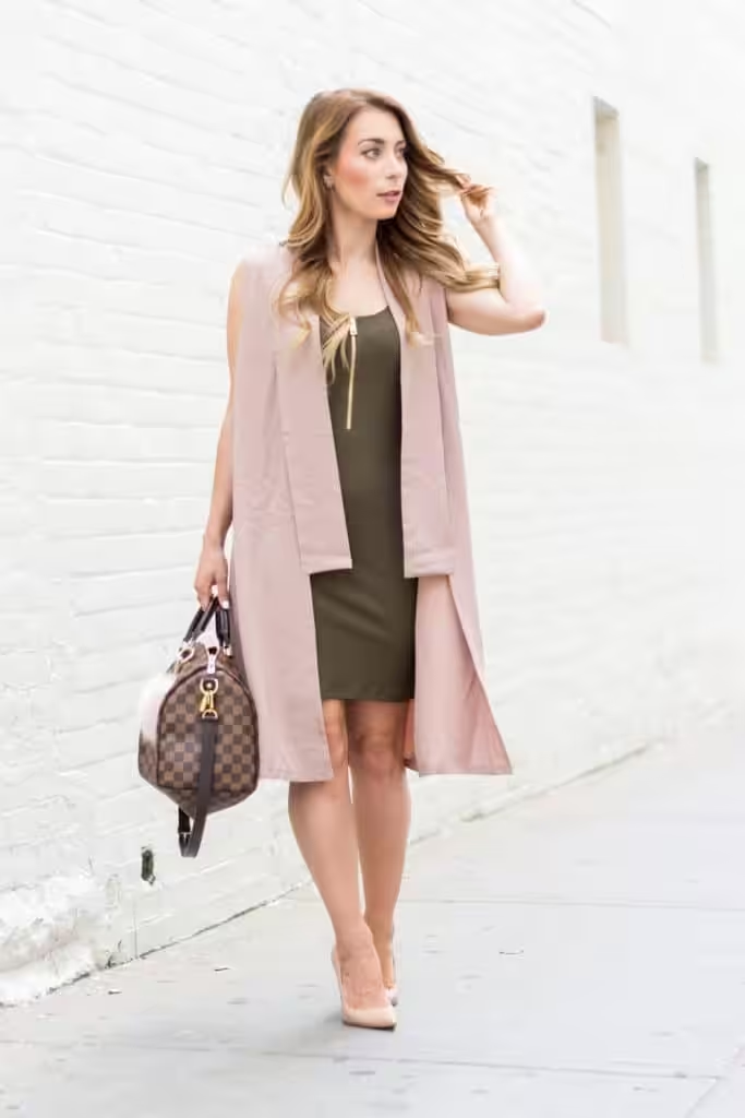
Blue and dusty pink combine to create a color scheme that is combined with a blue tone, which is also part of mauve. This contributes to the creation of a harmonious duet, the contrast of which is enhanced by the warm-cold, light-dark difference. The palette includes aquamarine, gray, royal blue, sapphire, cobalt.
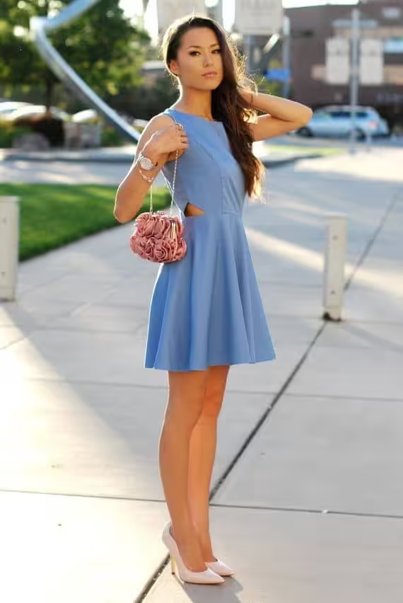

The color combination: dusty pink and purple are related, as mauve is a transitional form from pink to purple. The best option would be shaded with a red tint, darker than the main one, which causes light contrast. The combination is made up of blue-violet, amethyst, blackberry, grape, eggplant.
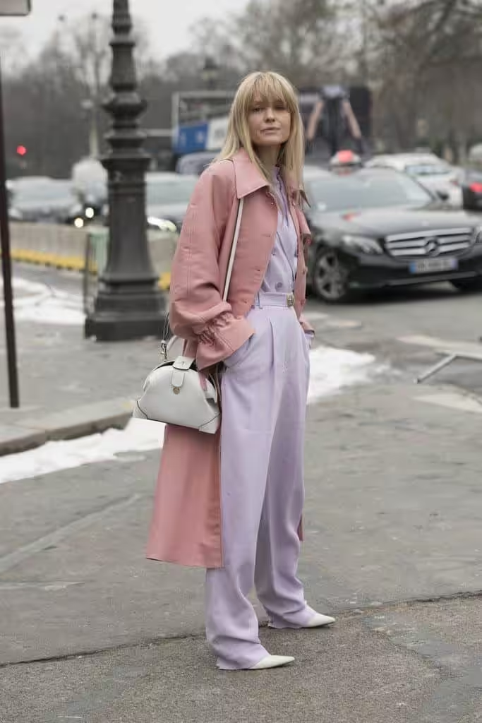
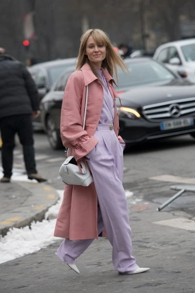
How to combine dusty pink with brown? Pink-lilac, like brown, has red and blue in its composition. In addition, both colors are complex, therefore the combination will be pleasant, without sharp corners, but bright and juicy in the case of saturated shades of the latter. The color scheme consists of yellow-brown, umber, mahogany, dark chocolate, dark chestnut.
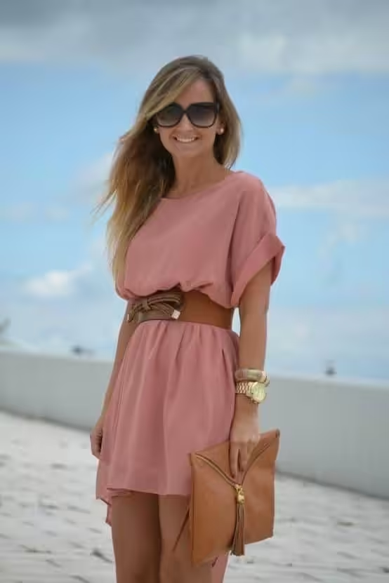
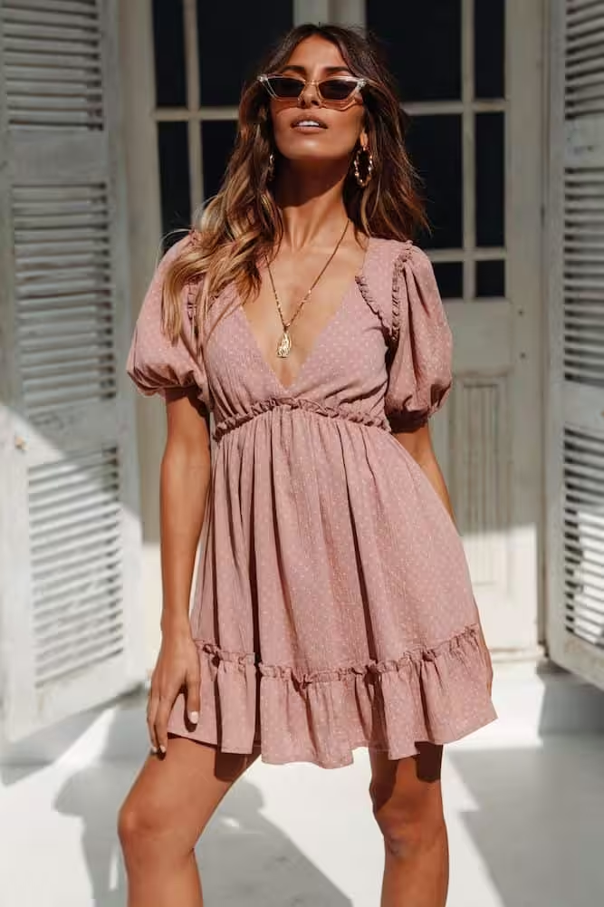
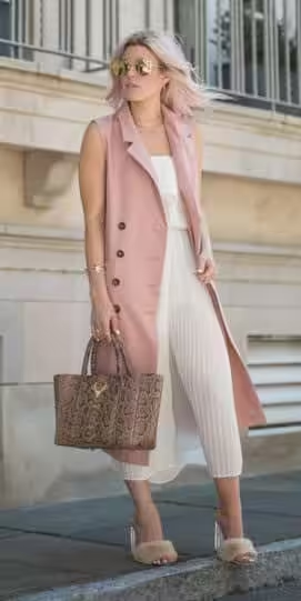
combination of dusty pink and white, beige, gray, black
The combination of rose ash with white, beige, gray, and black is the most common because neutral tones will help the mauve colors fully open up. White ones will add delicate freshness, gray ones – softness, beige ones – natural unobtrusiveness, black – will emphasize the originality of the color. Consider a palette with creamy, beige, marengo, anthracite, black and gray.
Dusty pink color in wardrobe
Rose ash is one of the softest and most attractive shades with low contrast, which is inherent only in representatives of the “summer” color type, and since there are many people with such an appearance, the tone is very popular. Soft and naive, it is still not devoid of restraint, modesty, therefore, it is very convenient in everyday use. Its relaxing effect and closeness to natural skin color make it indispensable in-home wardrobe, as well as underwear and leisurewear. The sophisticated, sophisticated character makes it possible to express yourself well in the evening style.
A stylish striking contrast is achieved with a combination of hot pink and black.
White color enhances the contrast of the composition, but nevertheless, next to dusty pink, it is worth using complex tones of white, for example, milky, creamy, ivory. Pure white should be supplemented with intermediate white-purple.
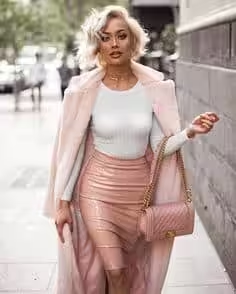
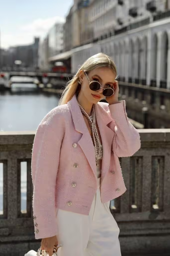
Gray is the perfect match for mauve, but it will be beneficial to enhance it with light bey, milky, or white and purple.
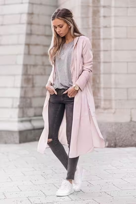
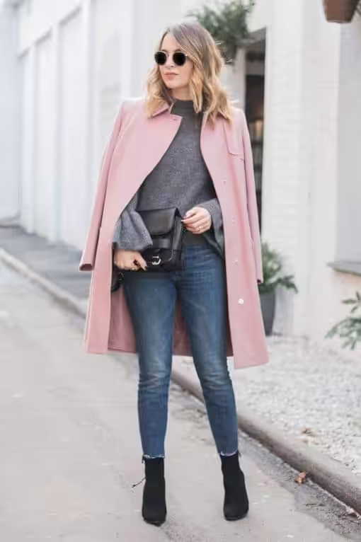
Black and dusty pink are not an obsessive pair, the contrast of which can always be increased with white or light beige.
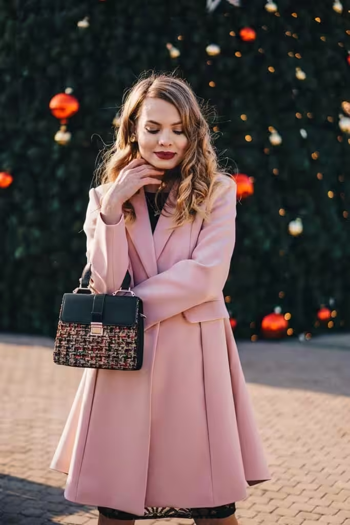
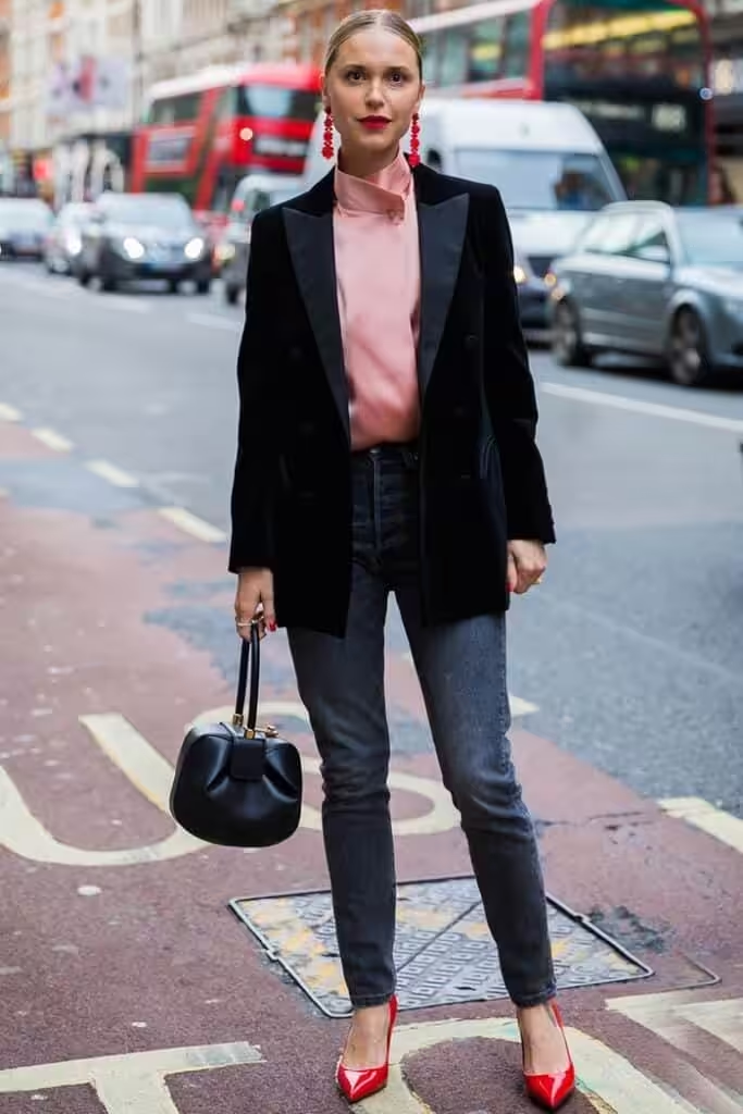
The beige and taupe tones almost hide the dusty pink color, but the overall look gets an elegant retro slant.
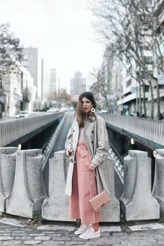
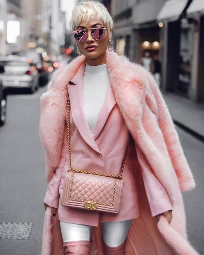
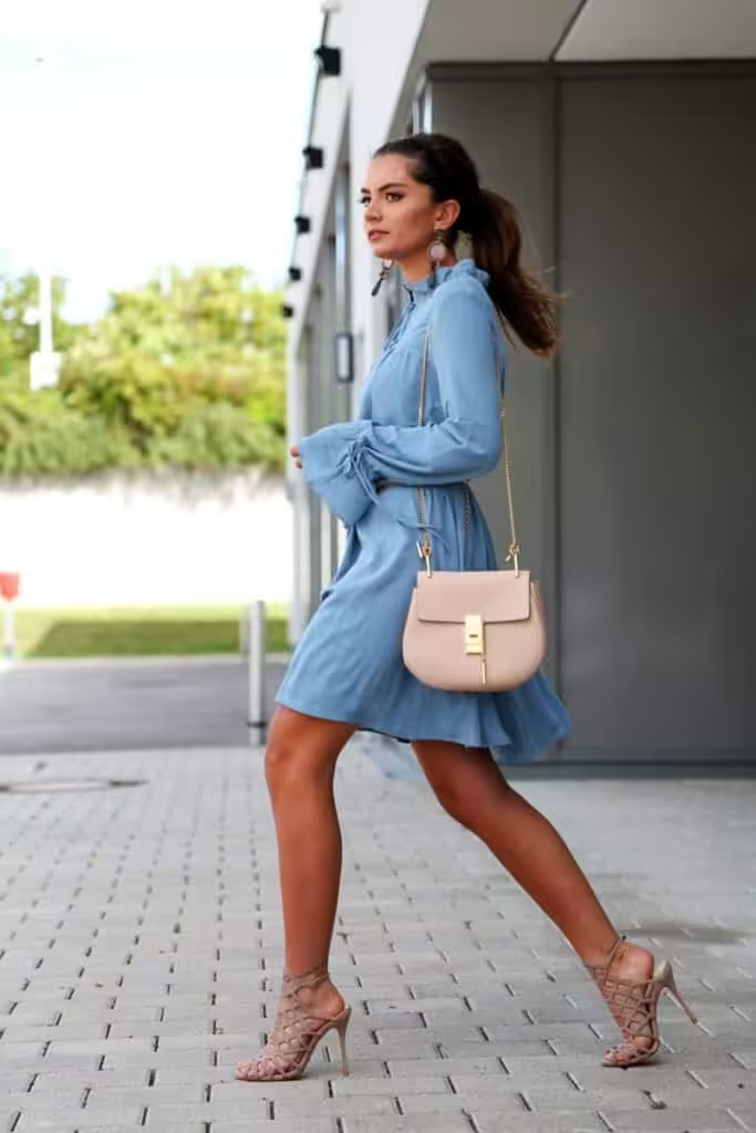
Denim blue is one of the most comfortable pairs to dusty pink. It brings freshness to the pair, which can be enhanced with whites, tan, or blues.
Soft tones of orange and yellow-orange transform the bow, giving it dynamism. You can add zest with chocolate, blue-green, gray, and contrast with white.
The sparkle of gold and the softness of green are interesting tricks for an evening wardrobe. They will make the ash pink look expensive and luxurious.
Cool green tones will add expressiveness to soft pinks. The pair can be thinned with white, gray, or purple.
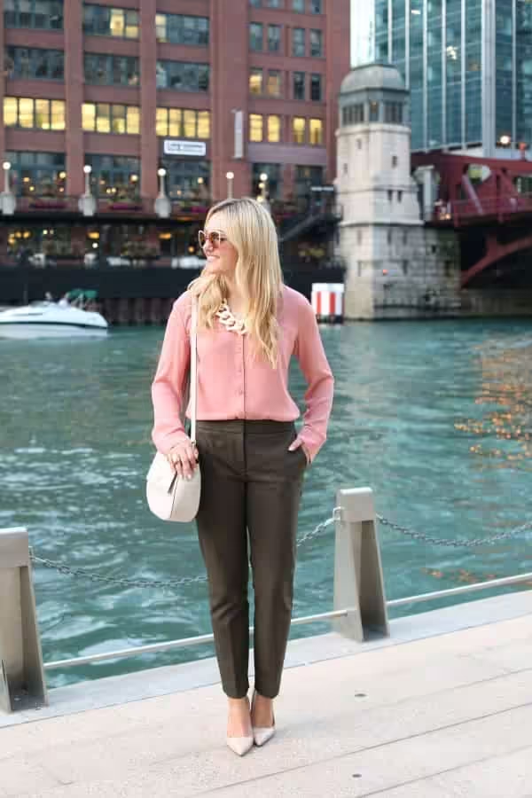
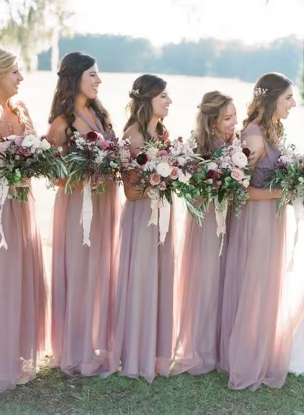
Purple will add contrast to the image without overshadowing the main tone.
By using other shades of pink, you will deepen the tenderness and tremor of rose ash.
Fuchsia is a rich shade of pink
Combinations of this color, both bright and with an emphasis on the main tone are used in clothing.
The fuchsia color is taken from an evergreen shrub with flowers of a deep pink shade with a purple undertone, was discovered in 1696 near the Dominican Republic by Charles Plumier. He named this plant after the German botanist Leonard von Fuchs (in French it sounded: “Fuchsia Triphylla Flore Coccinea”). So this houseplant became popular in the late 18th century and reached its peak in the Victorian era.
Its main advantage is the presence of a bright “cap” of all shades of purple and pink all year round. Its range was distinguished by its intensity, dissimilarity to other familiar shades, as a result of which the color received the name of the plant.
This tone is similar to magenta, our shade is distinguished from it by a more red undertone, it makes it warmer and less strict. Even more reddish her shade, the so-called Hollywood cherry – a favorite flavor of celebrities.
Deep pink is very attractive, sexy, sophisticated. His shades are often in fashion, and love for him – once and for all.
This rich pink has a wide range of shades: bright and light, medium and dark. They are distinguished by their expressiveness and inner strength.
Fuchsia shades in the Pantone system
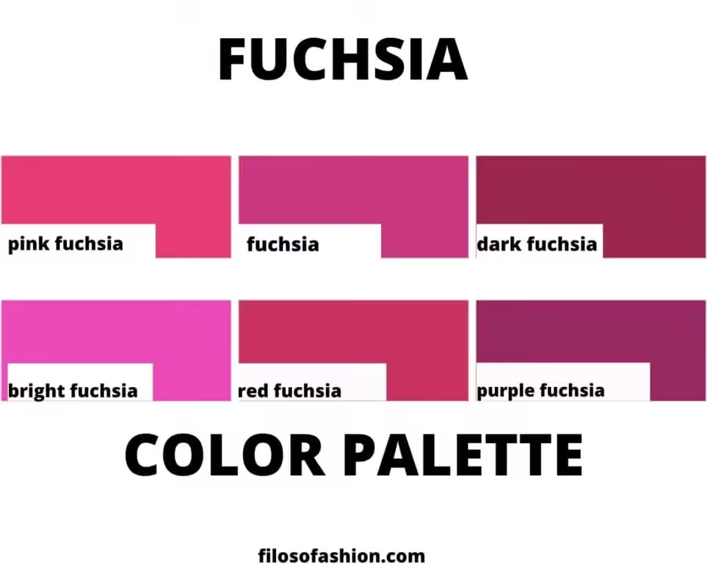
Pink fuchsia – rich, energetic, moderately cold, expressive. In any combination, she comes to the fore, loves shine.
Classic fuchsia is a tone that has caught the balance between pink and purple. Bright but not annoying. It stands out in combination but can stand on a par with other rich tones.
Dark fuchsia – deep pink with a hint of arrogance. It looks rich, does not hurt the eyes. With other shades, he “cooperates” more than interrupts.
Bright fuchsia is a luminous, ultra-bright color. It confuses courage with vulgarity, but its appropriate and correct presentation always reduces the negative aspects.
Fuchsia red – echoes the crimson color. Soft, unobtrusive, elegant. This color is intended to enchant and inspire hope.
Purple fuchsia is a shade that tends to be purple: deep, rich, evening. The tone will not leave anyone indifferent, and not only because of the powerful aesthetics, but also because of the hypnotic inner strength.
Which colors go with fuchsia?
Fuchsia is combined with the same expressive tones as itself: be it red or green, the degree of brightness of the hue sets the base color. She is often involved in thermal contrast and creates luscious vapors. She also has access to light contrast with dark tones. Next, we present a table: what colors do professionals combine it with? There are 10 palettes with 5 shades for you.
Color combination: fuchsia and pink is a combination of related shades that deepen it, giving it a lively shine, a play of chiaroscuro. For a couple, you can take royal pink, lilac-pink, hot pink, red-pink, raspberry.
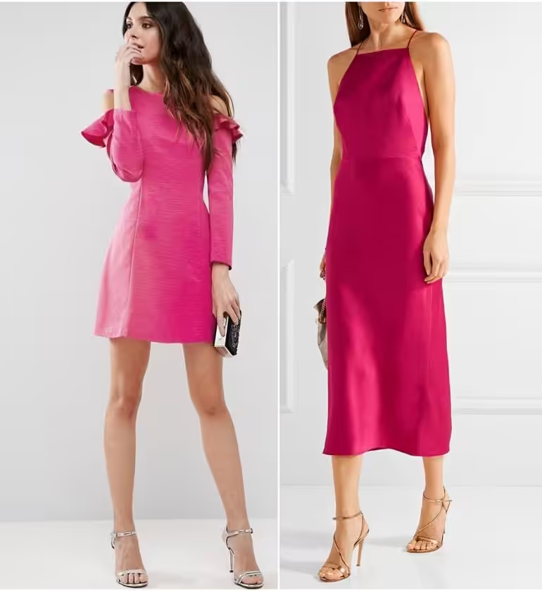
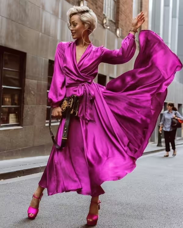
combination of fuchsia with red
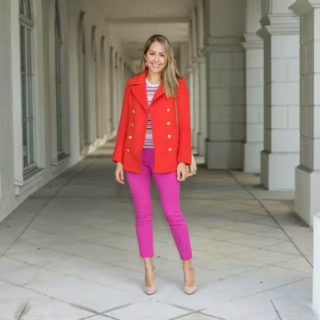
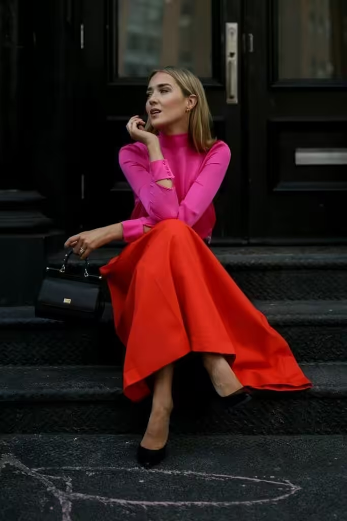
The combination of fuchsia with red is a shocking tandem of related, bright colors: flashy, dramatic and at the same time mesmerizing with their strength and energy. Choose a pair of tones of scarlet, Chinese red, carmine, bright burgundy, wine.

combination of fuchsia with orange
The combination of fuchsia with orange is one of the most popular over the past few years. In addition to the saturation of both shades, there is also thermal contrast (orange, as the hottest tone of the entire color palette). Build a combination of peach, orange-coral, bright orange, fiery, red-orange.

combination of fuchsia with yellow
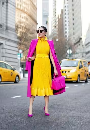
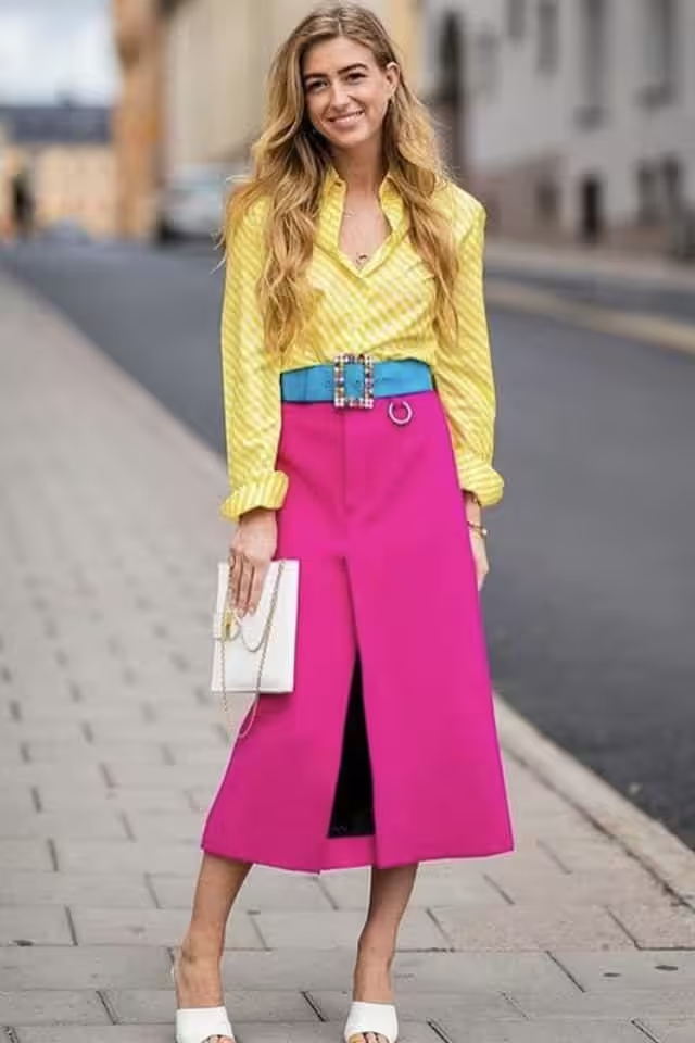
Fuchsia is combined with yellow Juicy, warm yellow shades give a rich pink summer, sunny look. This is both a contrast in warmth and lightness. Choose for the combination apricot, sunny yellow, corn, mustard, amber tones.
combination of fuchsia with warm green
Fuchsia is combined with warm shades of green to form a natural couple, infused with summer and relaxation. The expressiveness of this combination is also in the fact that the yellow-green tones are complementary to this shade of pink. Pair with chartreuse, yellow-green, greens, brown-green, dark green.
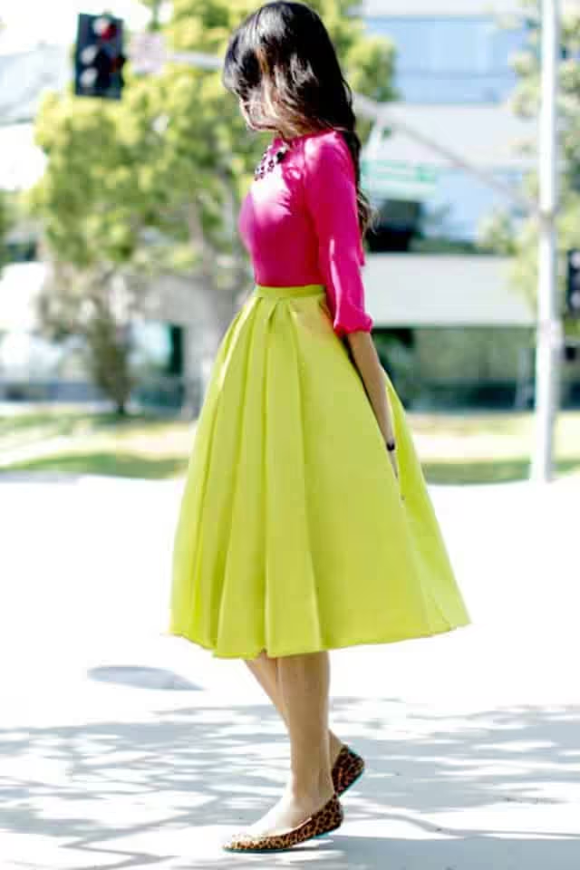
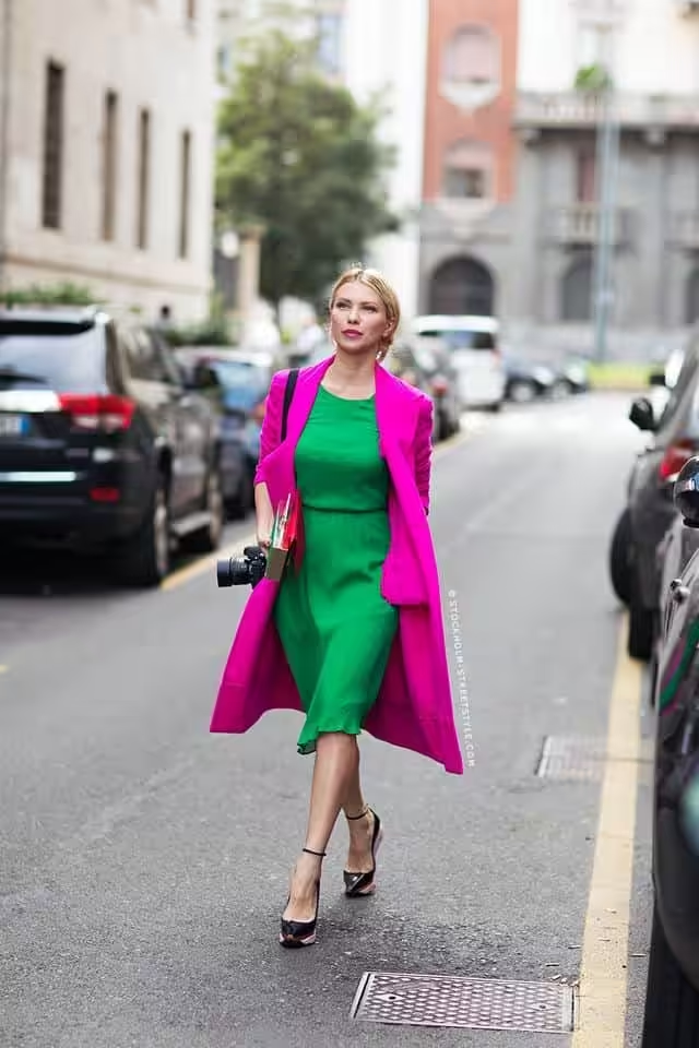
Fuchsia is combined with cold shades of green, resulting in an exotic palette of complex, rich and “expensive” colors. The gamma is reminiscent of a spa vacation. Combine it with tones of menthol, mint, kelly, emerald, malachite.
combination of fuchsia with blue
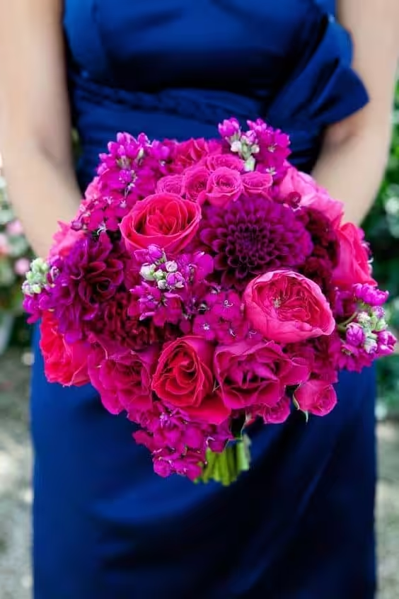
The combination of colors: fuchsia and blue – a bright warm-cold contrast. There is a blue undertone in the main shade, which makes this combination especially harmonious. Take a pair of soft blue,
color topaz, electric blue, Prussian blue, cobalt.

combination of fuchsia with purple
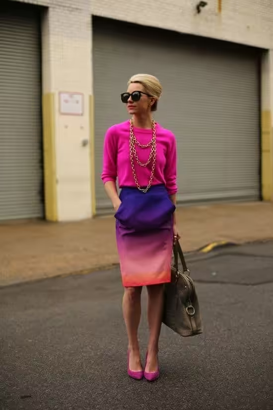
The combination of fuchsia with violet is built on the similarity of shades, where violets are built from red + blue, it can be considered as white + purple, which consists of red + blue. Combine it with blue-violet, lavender, purple, grape, eggplant.
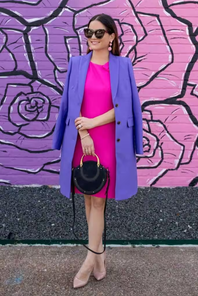
combination of fuchsia with brown
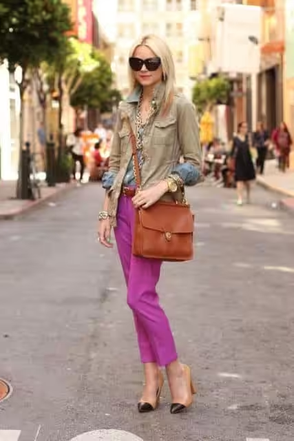
The combination of fuchsia with brown is softer and more ordinary than with orange. It is he who tries to fight the obsession of the main tone, and only he succeeds in slightly dampening it. Combine with oak, tan, bronze, tea, dark chocolate.
combination of fuchsia with gray, black
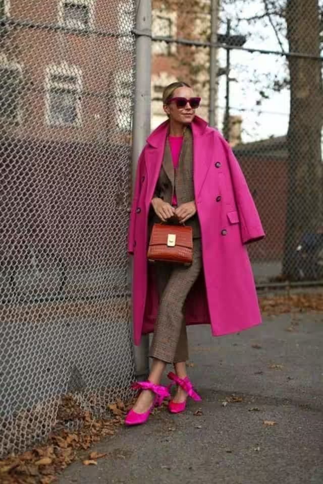
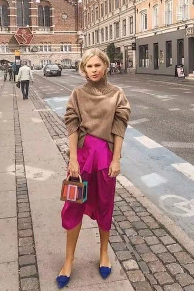
Combination of fuchsia with white, gray, and black. I want to highlight such a catchy and attractive tone, and the best background for it will be neutral tones: white, gray, silver, and black. They will maintain the cool undertones of the color and provide the necessary contrast. Pair with creamy white, white-gray, steel, anthracite, blue-black.
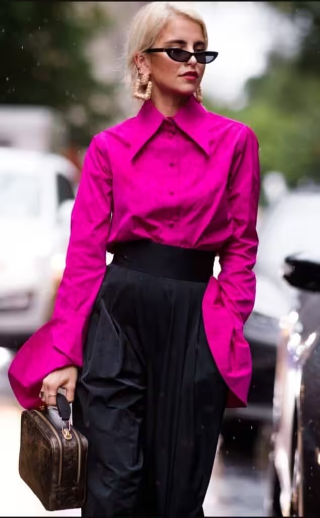
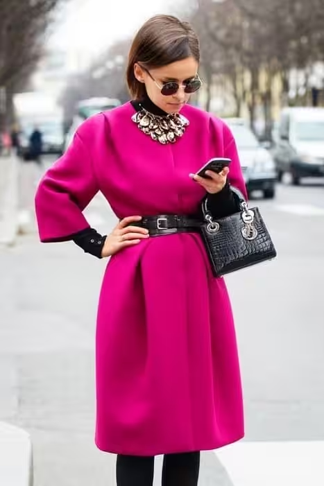
The combination of fuchsia pink is based on a dignified, contrasting frame that emphasizes the dignity and luxury of this shade. The tone has an effect on an evening wardrobe, but in everyday wear, it can act as an accessory. And all this is only in the presence of a contrasting appearance (see: who suits the color).
Combine it with carnation, light coral, dark red, mango, bright orange, pear, mustard, kiwi, emerald, dark turquoise, dark blue, purple, plum, light chestnut, beige, wet asphalt.
How to wear bright fuchsia?
Bright fuchsia is combined with equally piercing colors. If we take up the image of “pluck out the eye”, then the path retains its original harmony. To do this, you will need the following range: sakura color, coral pink, scarlet red, yellow-orange, orange, canary, signal yellow, toad in love, kelly, turquoise, blue-blue, lilac, purple, bark color, light beige, wet asphalt.
This tone is dangerous: not only does it overwhelm the psyche, but it can also highlight all the existing flaws in the figure: the color fills, creates the illusion of a more gray complexion. therefore, be sure to follow the recommendations regarding the color type of appearance.
Fuchsia red is combined with both bright and dusky rich tones. This is because the tone has a thin middle ground between standing out and showing regal restraint.
Match him with a pair of the following colors: pink peach, pure pink, ruby, coral, fire, banana, golden, mint, malachite, royal blue, cobalt, grape, purple, chestnut, anthracite, dark black.
Fuchsia purple color in clothes
The combination of purple fuchsia always has a slightly evening character. The velvety purple tone surrounds itself with mysteries and promises. Match it with shades that are slightly darkened, but saturated, such as white-lilac, lilac, coral-red, tangerine, red-orange, corn, yellow-orange, kelly color, emerald, Prussian blue, thunderstorm, charoite, eggplant, dark chocolate, lead, blue-black.
Bright and unprincipled – this tone always attracts attention. Put on dresses in a shade of deep pink and will always be closely watched wherever you go.
Fuchsia in clothes is a provocative color. You declare in it your “I”, the desire to participate in public life, to make decisions, and although it is a subtone of pink, it still has its own unique character, where “care” is expressed in the key of “patronage”.
It was first used by fashion designers in 1936. Then the preference was given to intense pink. Since then, this color has constantly come into fashion. Perhaps this is due to the change in the status of housewives by women to work. After all, deep pink (like magenta) carries both masculine and feminine features in its character. This is a kind of challenge to the male half: “We are also strong, we are also brave, and we are women.”
This color is rather festive, on weekdays it is too flashy and can be annoying. Therefore, dresses and blouses are more offered in this color.
Who can wear fuchsia in wardrobe?
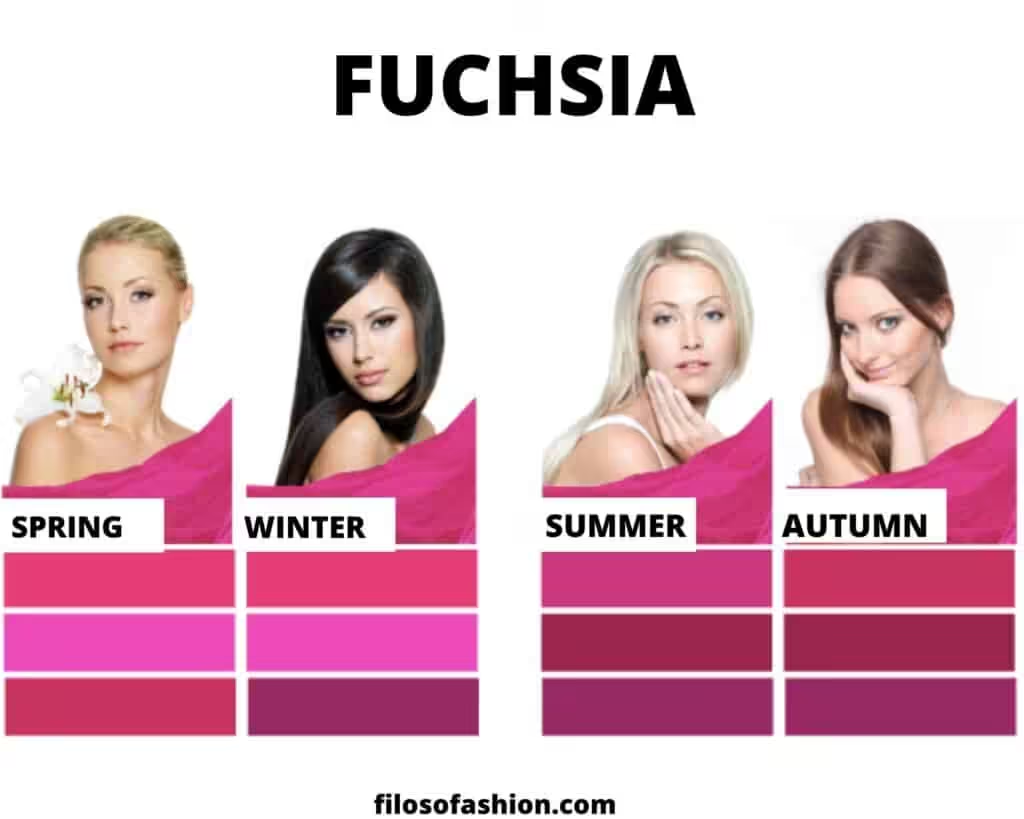
This rich pink isn’t for everyone. First of all, it can be used by representatives of the “winter” color type. For “summer” this color is too bright; more muted or dark shades of fuchsia pink will suit them. Oddly enough, deep pink looks good in “spring” due to bright makeup, which betrays the contrast of appearance. For those who identify with the “autumn” color type, a rich pink might clash with their natural coloring. Instead, they can look for warmer, earthier tones that align with the true autumn color palette explained. By embracing colors that complement their characteristics, individuals can enhance their overall appearance and express their style more authentically.
Remember: very bright colors can seriously spoil your biological appearance. Follow the recommendations for color types to always look your best
- “Spring” should choose the following fuchsia tones: pink, bright, red.
- For “winter” there will be a similar set: pink, bright, purple.
- “Summer” should be content with medium-fuchsia, dark, and purple.
- “Autumn” will be able to be content with red, dark, and purple shades.
The combination of fuchsia in clothes: selection of wardrobe
Most often, fuchsia in clothes is combined with basic colors. This allows her to be at the forefront, always surrounded by beneficial contrast.
The constant companion of deep pink is white. It gives the basic tone freshness, allows it to shine without hindrance with a unique flavor, and this pair can always be complemented with any suitable tone. Often it is gray, black, beige, brown.
Bright combinations in clothes with this color can be made with turquoise, yellow-green, emerald, yellow, pink, orange, and purple shades. Additionally, these hues can create an eye-catching ensemble, perfect for making a statement. When considering styles for special occasions, remember that colors that complement gold outfits can enhance the overall elegance of your look, adding vibrancy and charm. Experimenting with varying shades can also help in finding the perfect balance that speaks to your personal style. Incorporating deeper tones, such as rust and burnt orange, can further enrich your outfit, especially during the fall season. For those interested in exploring seasonal trends, a true autumn color palette overview can provide inspiration for creating warm and inviting looks. By harmonizing these suggestions with your unique fashion sense, you can achieve a stunning and cohesive aesthetic.
Hot pink color palette

Hot pink color palette- does not apply to spectral colors, however, it can be extremely bright in its average light value.
Like any bright tone, hot pink strikes with its expressiveness, glow, which sometimes causes irritation. With respect to truly cold colors (such as blue, white), it is closer to warm, but in the line of pink shades, it tends towards the cold side of fuchsia.
Fuchsia, in turn, comes from purple. Hence, the meaning of bright pink will be, as feminine royalty, patronage, self-confidence, at the same time inflated conceit, and also not the objectivity that pink as such carries in itself.
In nature, such a flavor is practically not found, which suggests that it is a cultural product. It’s not for nothing that hot pink is often associated with the glamorous trend of advanced youth. This desire for novelty, the desire to stand out, to lead, advises the immature psyche and the view of everything through the prism of limited experience.
However, it is possible to use this tone meaningfully, and not at the call of an impulse. Color focuses attention on itself, making you feel protected. It also provokes sexual sensations, which is good for show business. The ability to competently evoke the right emotions is art, and a hot pink is a powerful tool for this.
Shades of hot pink
Hot pink can be either warm or cold. Between these poles, there are also tones of deep pink.
The combination of hot pink with other colors
The bright pink color is juicy and bright combined with other colors. It can “speak for itself” choosing the same sonorous colors or maybe paler colors – then we see a bright contrast. Dark shades look just as good with it, but it is especially attractive and noble – neutral tones that do not argue with a shade, but calmly give it primacy.
Combination of hot pink and pink
The combination of hot pink with pink is a range made up of shades of the same color. Additional pink tones will help the main one to increase its expressiveness, achieve a lively shine, volume, and place accents. The palette is composed of colors of carnation, sunset pink, fuchsia, purplish-pink, crimson.
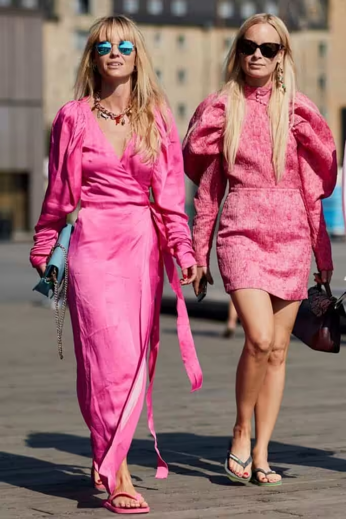
Combination of hot pink and red
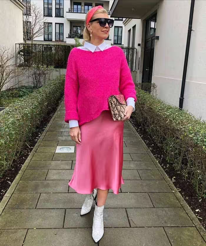
The combination: bright pink and red, significantly sets off the latter. This tone can look like a cold shade of scarlet: this is the result of their comparability in brightness and the presence of a red spectrum in bright pink. There is also a slight warm-cold contrast. The range lies in the tones of coral red, port, ruby, bright burgundy, wine.
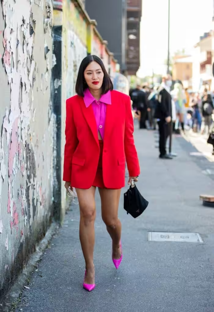
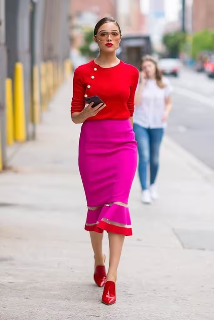
Combination of hot pink and orange
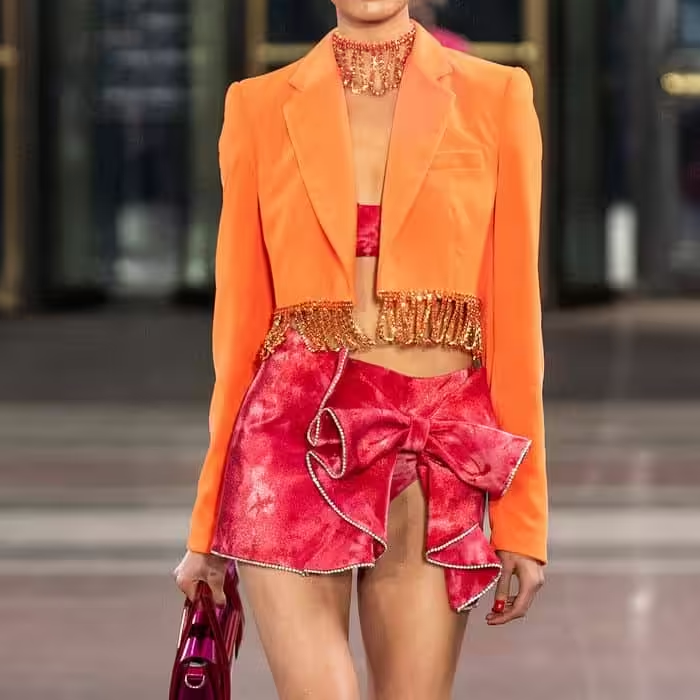
Hot pink and orange combine to create a striking, fashionable pair that is designed to surprise with its warm-cold resonance. Shades can be of the same brightness and lightness, but it is advisable to dilute them with neutral tones, for example, white. Consider steaming for a base tone: light peach, coral orange, bright orange, reddish-orange, ginger.
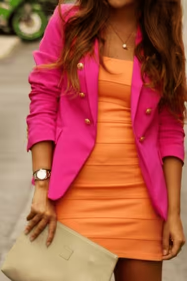
Combination of hot pink and yellow
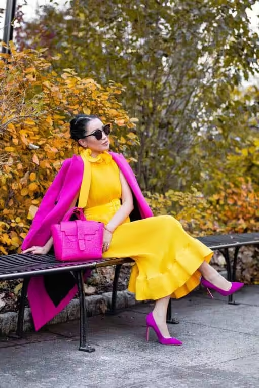
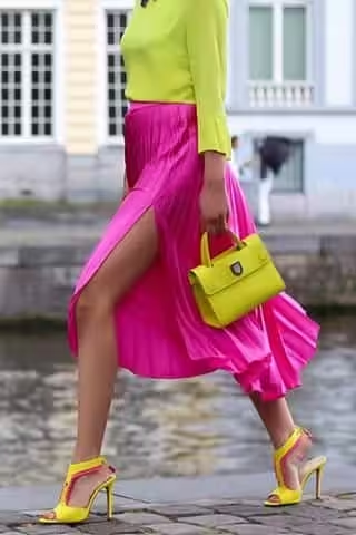
The combination of hot pink and yellow is light, rich, frivolous. This festive combination maximizes the feminine expressiveness of the main tone. Pale yellow, sunny yellow, corn, bright gold, amber participate in the palette. These vibrant hues create a joyful ambiance that is perfect for summer celebrations. To enhance the overall look, consider incorporating soft summer seasonal palette details, such as gentle pastels and muted shades that harmonize beautifully with the bold colors. This approach brings depth to the ensemble, allowing each shade to complement rather than overshadow, creating a balanced, eye-catching aesthetic. Incorporating soft summer color palette essentials will not only soften the vibrancy but also introduce a refreshing contrast that enhances the overall look. Think of adding elements like dusty blues and muted lavenders, which will perfectly contrast the bold yellows and pinks, resulting in a sophisticated yet cheerful style. This thoughtful blend of colors invites a sense of harmony, allowing the outfit to resonate with warmth and positivity, ideal for any summer gathering. This vibrant mix can also be elevated by incorporating elements from the true summer color palette explained, which emphasizes softer, cooler tones that can balance out the warmth of the hot pink and yellow. Additionally, integrating subtle patterns or textures, such as light floral prints or delicate lace, can add an extra layer of interest to the overall ensemble. Ultimately, this creative interplay of colors and textures crafts a unique summer look that exudes both joy and elegance. Exploring summer clothing color ideas can also lead to unexpected combinations that refresh your wardrobe. Consider pairing hot pink and yellow with unexpected neutrals like soft taupe or creamy white to ground the vibrant hues. This not only enhances the overall palette but also adds versatility, making it easier to transition from day to night during the summer season. Incorporating elements from the soft autumn color palette can further enrich this summer aesthetic, introducing warm, earthy tones that beautifully complement the brightness of pink and yellow. Shades like rust, terracotta, and olive can create a stunning visual contrast while still maintaining a cheerful vibe. By layering these colors thoughtfully, you can achieve a look that is both vibrant and grounded, perfect for any summer occasion. Additionally, experimenting with soft summer color combinations can yield delightful results, allowing for creative pairings that elevate your style. Opt for softer shades of pink or buttercup yellow to create a nuanced look that is breezy yet refined. This thoughtful exploration can inspire new outfit ideas that perfectly embody the carefree spirit of summer while maintaining a sophisticated edge. Exploring the distinction between cool summer vs soft summer colors can further refine your style choices. Cool summer tones, with their crispness and clarity, can beautifully juxtapose the warm vibrancy of pink and yellow, creating a refreshing balance. By thoughtfully integrating these cool shades into your outfits, you can enhance the overall palette and elevate your summer wardrobe to new heights. In addition to experimenting with color combinations, understanding your personal style through the concept of seasonal color type explained can be incredibly beneficial. This perspective allows you to choose hues that not only suit the summer season but also align with your coloring and personality, ensuring a harmonious look. Embracing this knowledge can lead to a more cohesive wardrobe that resonates with your unique sense of style, making every outfit feel intentional and radiantly elegant. Incorporating seasonal color analysis techniques can enhance your ability to curate outfits that truly reflect your personal style and seasonal trends. These techniques help in identifying which colors harmonize with your natural tones, allowing you to select pieces that not only accentuate your features but also blend seamlessly with your summer wardrobe. By embracing this strategic approach, you can develop a signature style that feels both authentic and effortlessly chic. Additionally, incorporating true winter color palette tips can elevate your summer aesthetics by introducing rich, cool shades that complement the vibrant pinks and yellows. Think of deep navy or bold emerald, which can add a striking juxtaposition while infusing a sophisticated edge to your ensemble. This thoughtful mix not only enhances visual interest but also allows for a versatile transition as summer fades into the cooler months. By exploring bright spring color ideas, you can further invigorate your summer wardrobe with lively hues that celebrate the season’s vibrant energy. Shades like coral, turquoise, and lime green can effortlessly complement the existing palette of pink and yellow, adding an uplifting touch to your outfits. This infusion of spring-inspired colors will keep your look fresh and exciting, perfect for embracing the warmth and joy of summer gatherings. Additionally, considering elements from the bright winter color palette can bring a refreshing vibrancy to your summer outfits. Incorporating bold shades like fuchsia, icy blue, or bright white can enhance the lively atmosphere of your look while providing a striking contrast to softer tones. This fusion of colors not only boosts visual interest but also ensures your ensemble appears dynamic and full of energy, perfect for any summery occasion. In addition to these vibrant and fresh elements, integrating some dark winter wardrobe essentials can provide a striking contrast that enhances the overall look. Deep hues like charcoal, burgundy, or forest green can ground the brightness of pink and yellow while adding sophistication. This thoughtful addition creates a well-rounded aesthetic that bridges the gap between seasons, ensuring your style remains captivating throughout summer and into the cooler months ahead. By incorporating soft autumn color palette insights, you can further enhance your summer style by interspersing muted warm shades that evoke a sense of tranquility. These gentle tones not only complement the vibrancy of your ensembles but also offer a refreshing balance that adapts seamlessly to the transitioning seasons. As you play with color, consider how textures such as lightweight knits or airy fabrics can add an inviting touch, making your outfits not only visually striking but also comfortably chic. Exploring the nuances of deep winter vs bright winter colors can provide valuable insights into creating striking summer outfits. By carefully selecting shades from each palette, you can achieve a sophisticated balance between vibrant and rich tones, which can elevate your overall aesthetic. This thoughtful approach ensures that your ensembles not only celebrate the lively spirit of summer but also maintain a sense of depth and elegance. In addition to incorporating the aforementioned colors and textures, integrating true spring wardrobe essentials can further enrich your summer aesthetics. Items such as light cardigans in soft pastels, airy blouses with delicate prints, and playful accessories can seamlessly elevate your outfits. This thoughtful layering not only enhances your overall look but also ensures you are prepared for fluctuating summer temperatures while maintaining a fresh, vibrant style. Incorporating light spring wardrobe essentials such as lightweight scarves and breathable fabrics will enhance the versatility of your summer ensembles, providing an effortless transition into the warmer months. Consider including playful accessories like statement earrings or colorful handbags to add an extra layer of flair to your outfits. This approach not only showcases your personal style but also captures the essence of summer vibrancy and joy.
combination of hot pink and green
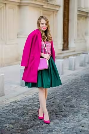
The combination of hot pink and warm green could be called natural, but it is exaggeratedly bright for nature. The composition includes light green, chartreuse, light green, moss, needles. The combination is expressive due to the proximity of hot pink to red, which is complementary to green.
Hot pink and cool green is colorful combination based on the difference between cold and warm. For even it, a sense of balance, harmony is achieved. The combination includes neon green, jade, mint, emerald green, malachite.

Combination of hot pink and blue
The combination of hot pink and blue is similar to cool green, but this pair is more pronounced in its contrast: blue is the coldest shade. Saturated, pure tones of blue successfully support the main color, for example, paired with aquamarine, bright blue, turquoise, blue-violet, indigo.
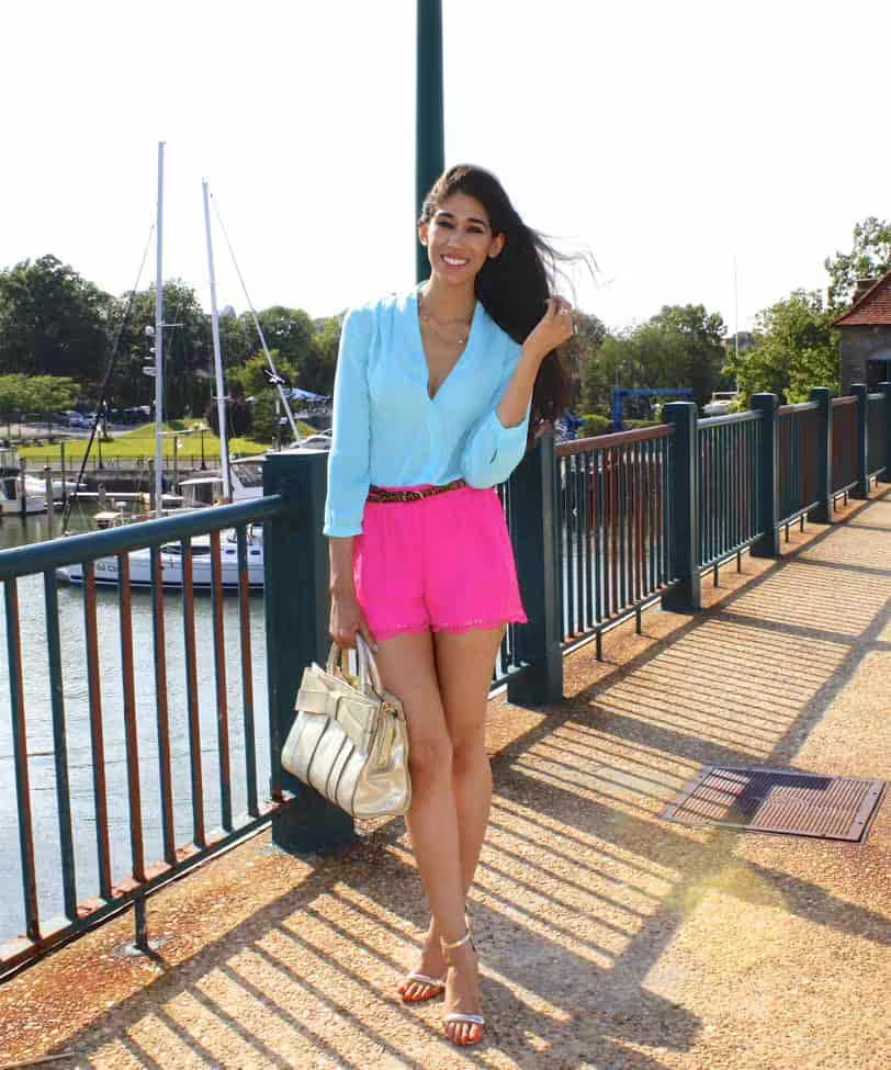

The combination of hot pink with purple also refers to a combination with similar colors. The contrast of a pair consists of the difference in brightness and lightness of colors. The main tone glows against a background of purple hues. The range is composed of blue-violet, lilac, purple, red-violet, grape.
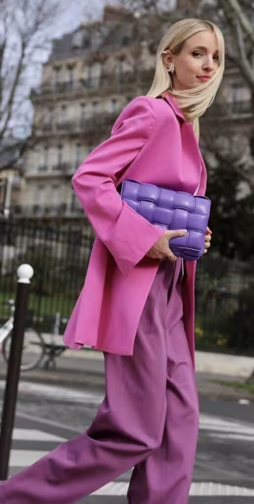
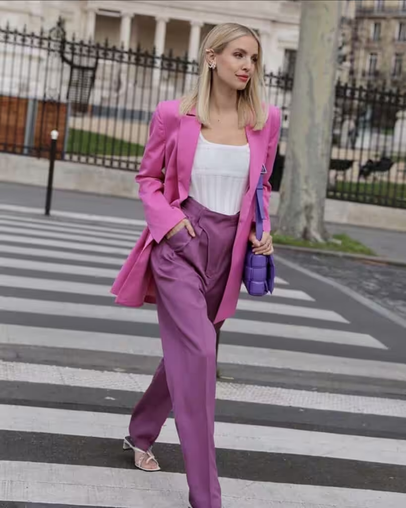
Combination of hot pink and brown
Hot pink and brown – a combination to lower the catchiness of the first: shades of brown give elegance, harmony to the pair. Contrast is built on the difference between a bright and complex, muted color. The composition includes camel, yellow-orange, red-brown, chocolate, bitter chocolate.
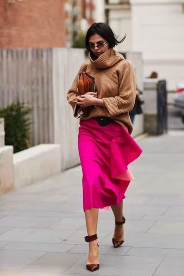
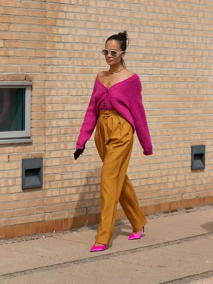
Combination of hot pink and gray
Hot pink and neutral are combined in a contrasting combination of saturation and lightness. Tones such as white, gray, black are the perfect match for very bright colors, of which hot pink is no exception. Consider combinations with creamy, papyrus, light gray, anthracite, black.
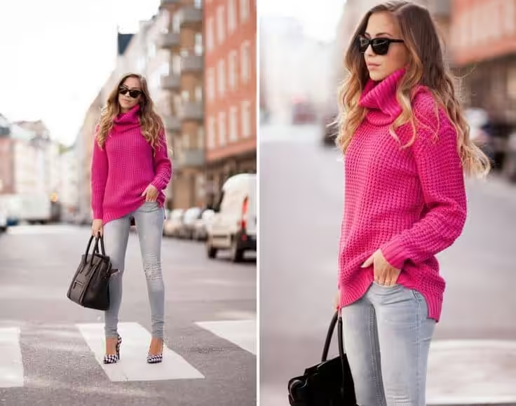
Hot pink color in clothes
Hot pink in clothes and does not suit everyone. In addition to the fact that it is flashy, elegant, it also has negative sides: the tone plumps it, enhances skin defects. Therefore, you should be very critical of yourself in its selection, so as not to harm your appearance. This shade is suitable for representatives of the “spring” and “winter” color types. Their pure skin tones will not be able to spoil the brightness of this shade, but, on the contrary, will emphasize the warm skin tone of the “spring” and the contrast of the appearance of the “winter”. When considering a light spring color palette comparison, it’s important to remember that softer, pastel shades can complement the vibrant hot pink, creating a balanced look. Accessories in these lighter hues can enhance the overall outfit while softening the boldness of hot pink. Additionally, experimenting with different textures can further elevate the stylistic appeal, ensuring that your look feels cohesive and intentional.
This shade is definitely festive. It is unlikely that you will be understood if you put on a wardrobe item to work. It tones up, excites, encourages action. In clothing, he symbolizes self-confidence, leadership, and femininity.
Choosing a wardrobe with hot pink
A stylish striking contrast is achieved with a combination of hot pink and black.
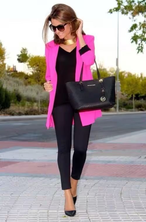
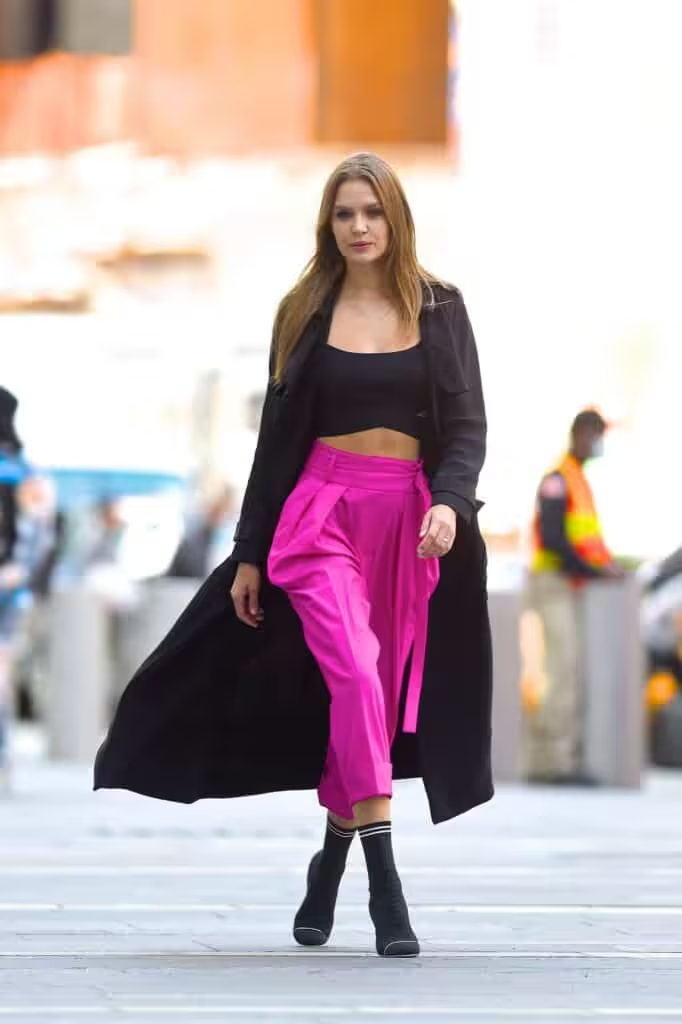
And if you add white to this pair as part of the border pattern, the effect will be amazing.
White in combination is freshness, lightness. Such a couple enhances the mood and creates an image of infallibility.
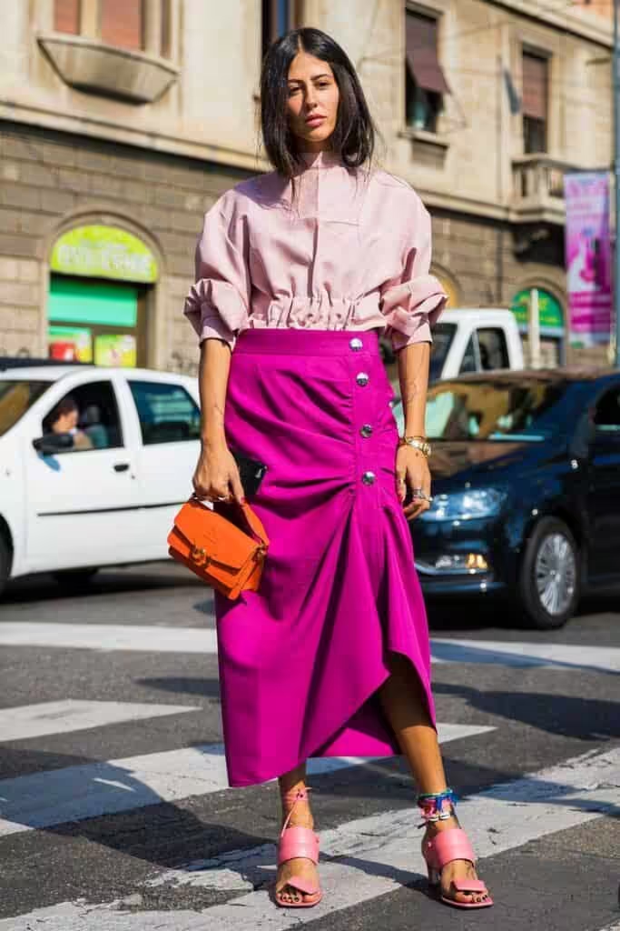

Beige adds style to a bright, sometimes even vulgar color.
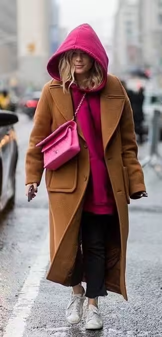
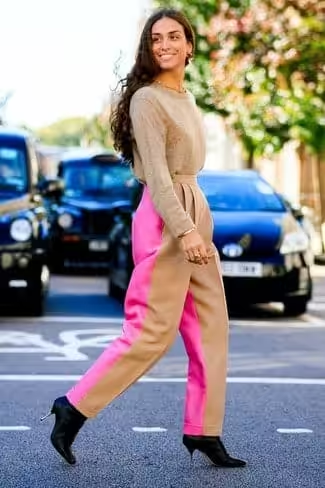
Combinations with red and orange will be exotic, graceful.
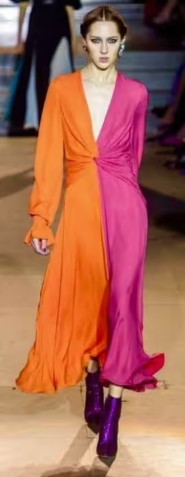
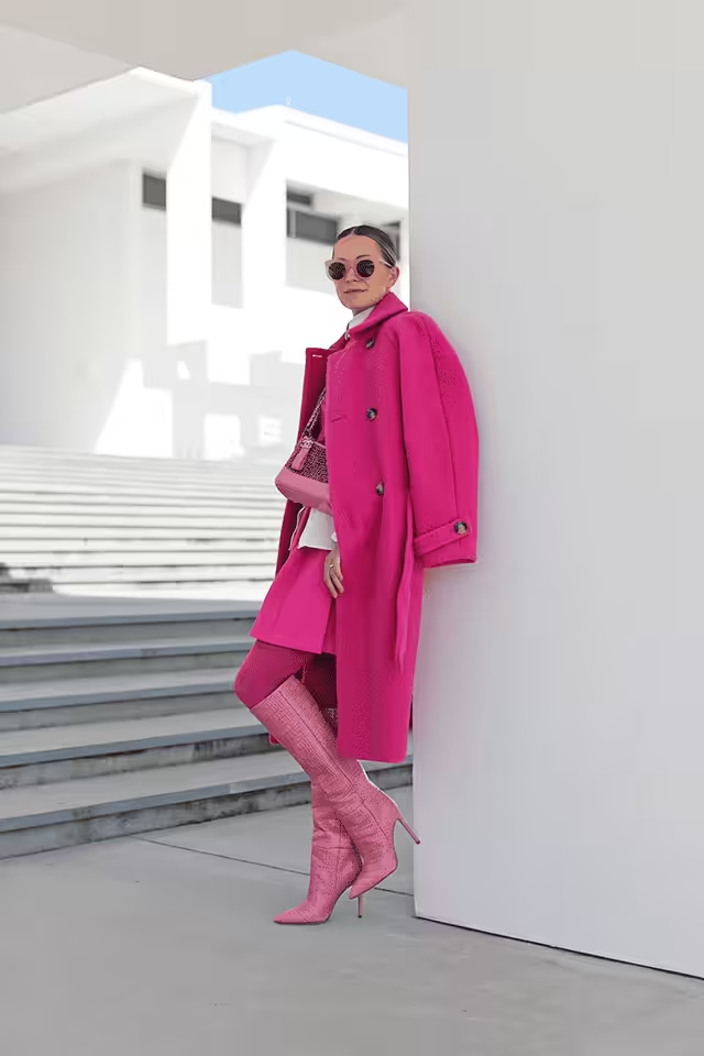
Yellow enhances hot pink. The combination is intense and eccentric.
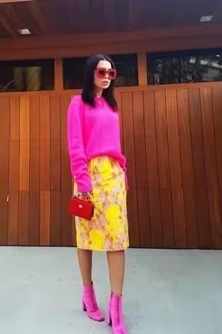

Blue, like the color of water, refreshes the main color, gives it tenderness. Blue – adds rigor.
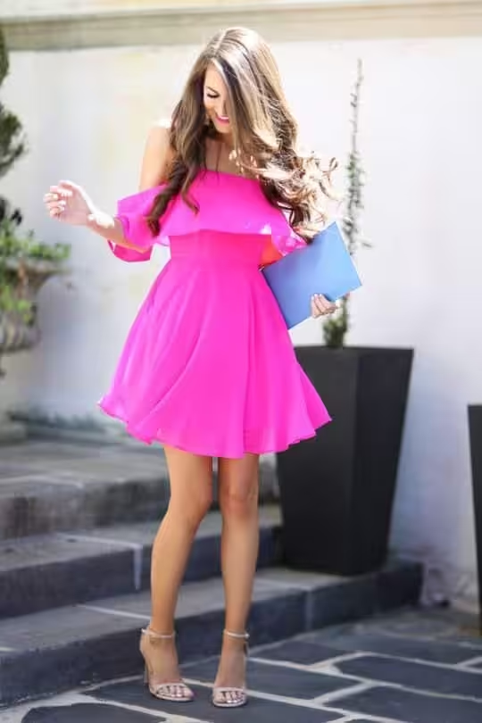
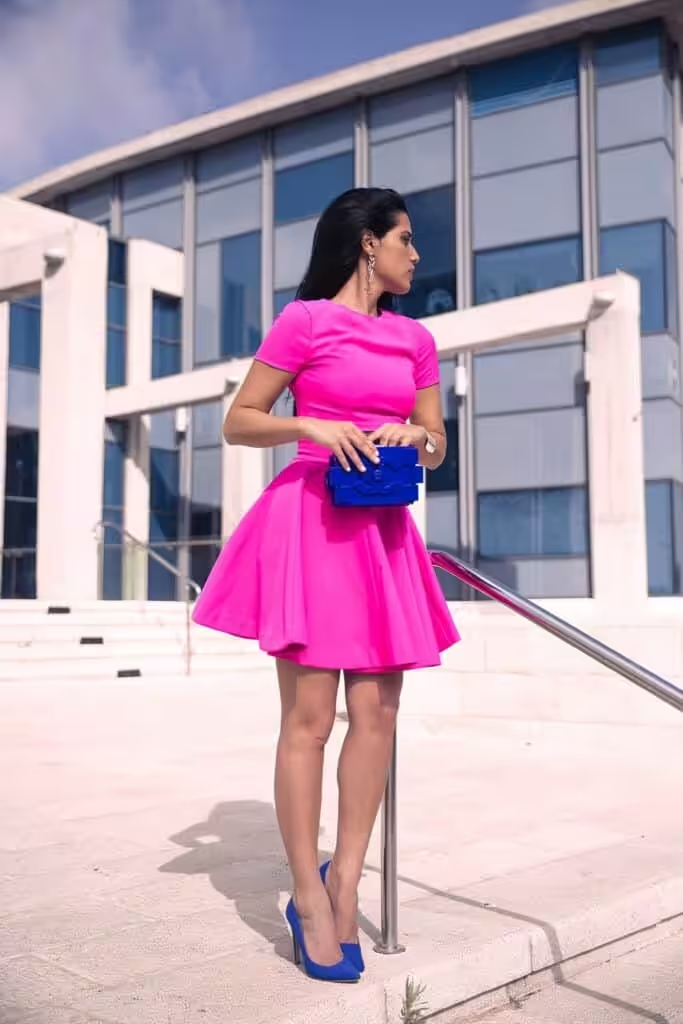
Green – enhances the saturation of the tone.
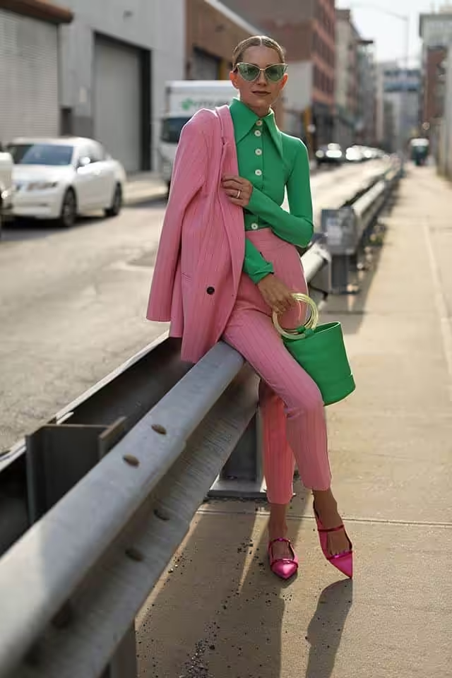
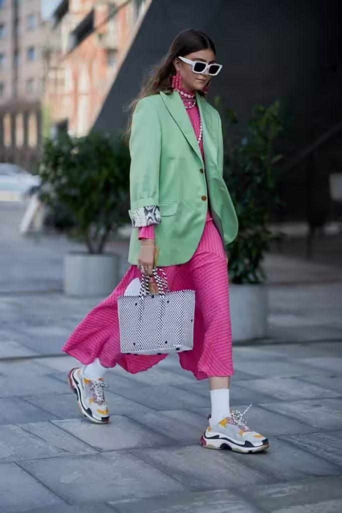
Soft pink tones smooth out the sharpness of the main shade, giving more femininity.

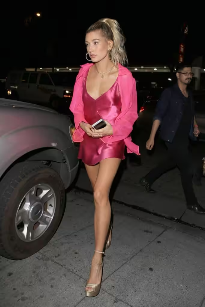
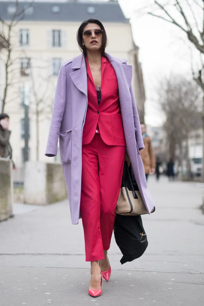
Purple makes hot pink “glow in its background.”
READ MORE:
COLOR PALETTE WITH PURPLE FOR WARDROBE
COLOR PALETTE FOR GREEN FOR WARDROBE
COLOR PALETTE FOR YELLOW FOR WARDROBE
COLOR PALETTE FOR ORANGE FOR WARDROBE


